What do you think for the thirty logo challange
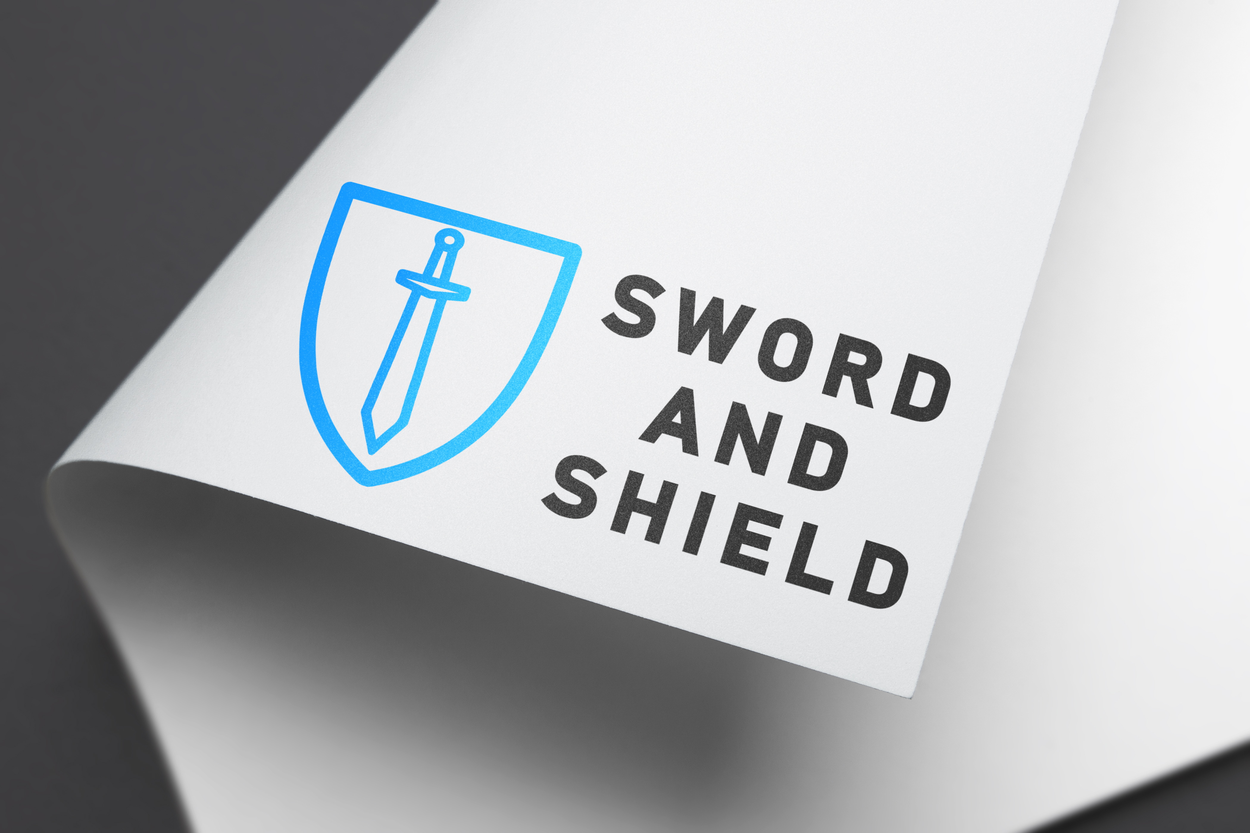
You have done an icon illustration of the company name. I wouldn’t call that design exactly.
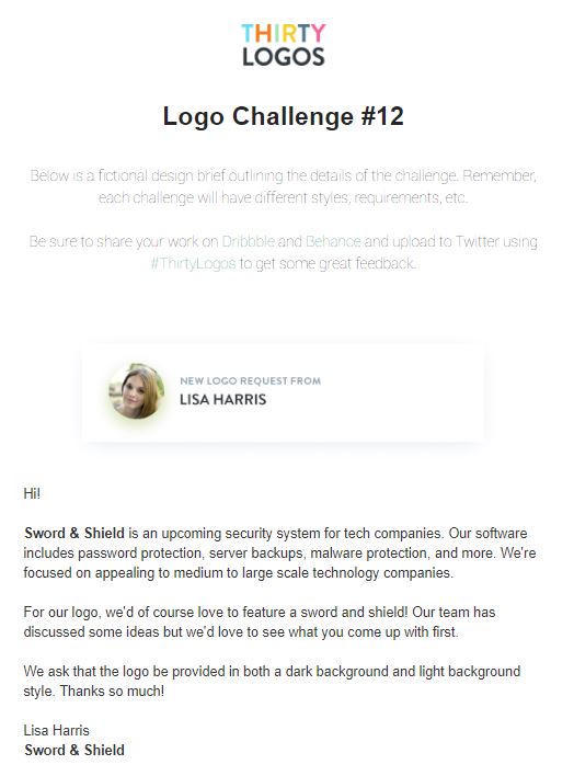
You’ve come up with a solution that some might consider too basic or obvious. What other ideas did you come up with? It’s important to brainstorm before you start executing. Brainstorm at least different 10 concepts. Sword and shield icons would be the first concept a designer would come with but the interesting stuff starts happening after concept #4.
When I was a student, we had to show workings of all our concepts before present a few to our class before we went ahead with executionn. If a whole class of students were working on this logo brief, how many similar icon sword and shield logos do you think there would be?
2 Likes
Thanks for the feedback i’ll start doing more concepts
According to the brief, the name of the company is “Sword & Shield” not “Sword and Shield”
They’ve also requested two versions, one on a light background, one on a dark.
Both errors would be a “Fail” in my virtual classroom.
1 Like
Ampersands are a glorious opportunity to add that just right amount of bounce.
So too are the much maligned apostrophe … another rant for another day.