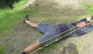
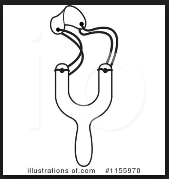
When I was a kid, we called these kinds of things flippers. The best flippers were Wrist Rockets. Slingshots were very different and were of the sort that David supposedly used to kill Goliath. Both were lots of fun, though. I just checked with Google, and it appears the internet doesn’t share my distinction between the two.
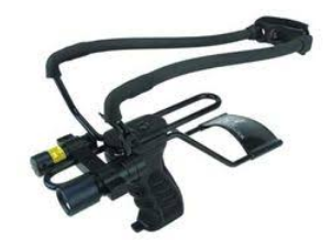
Eh, that’s just an updated version of the Wrist Rocket that B mentioned with a scope and red dot on it.
Had a wrist rocket as a kid. Used to go the local junkyard and get old wheel bearing rings by the bucketful and hammer the ball bearings out of them. But rocks would do in a pinch.
B, we called the David & Goliath things just plain “slings.” There is also a thing called a slungshot (better known as a Monkey Fist) that I used a lot in my agricultural days but has now been banned in this state as a weapon.
It’s all fun until someone loses an eye. Closest I came to that was a pub dart in the shoulder… Sharp objects and alcohol. What a great idea!
Thanks for the interaction (and gags) and apologies for delay.
I tidied the image up for your perusal but due to the clean text (thanks to no serif and equal line spacing) I played with one of my old designs which now looks a lot better.
I’d be grateful for feedback of all types once again.
Thanks
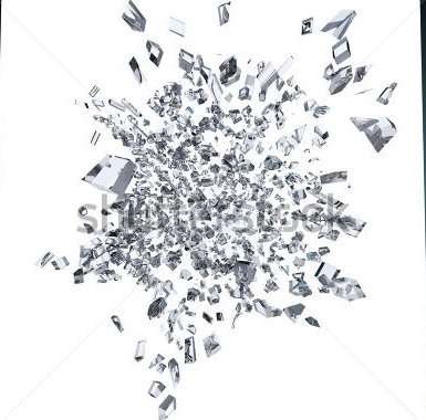
The shattered glasses in the first alternative is nicer compared to the previous ones.
I think you can always make nice composition of tiny triangle shapes at this part but without overdoing it. Putting the number of tiny triangles too well-balanced at the top of the ball and the bottom of the ball will make it look less artistic to the whole logo or that it’s kindda too (horizontally) symmetrical.
Maybe you can use a nicer composition of the triangle like this example, and it will bring a bit of surprise at the end side of the logo.