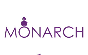
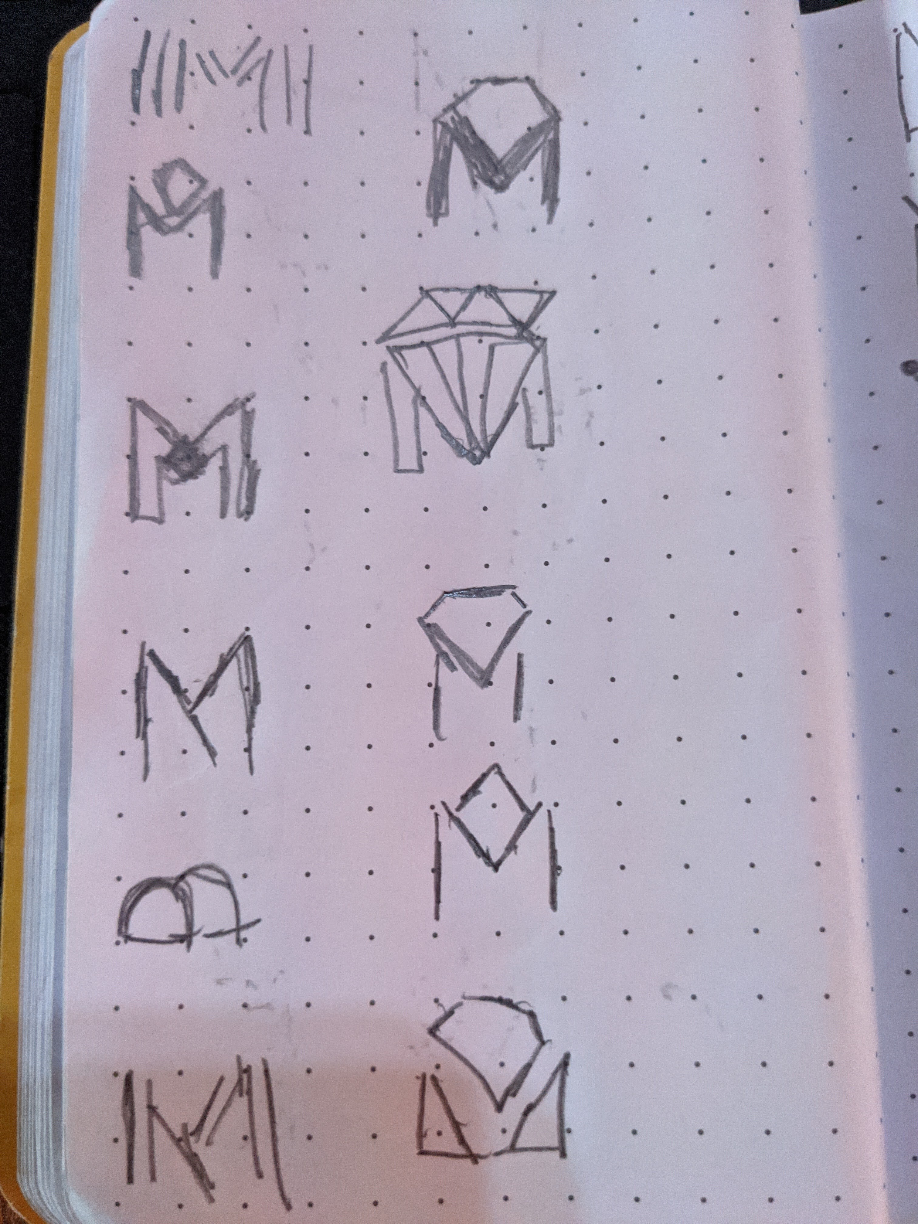
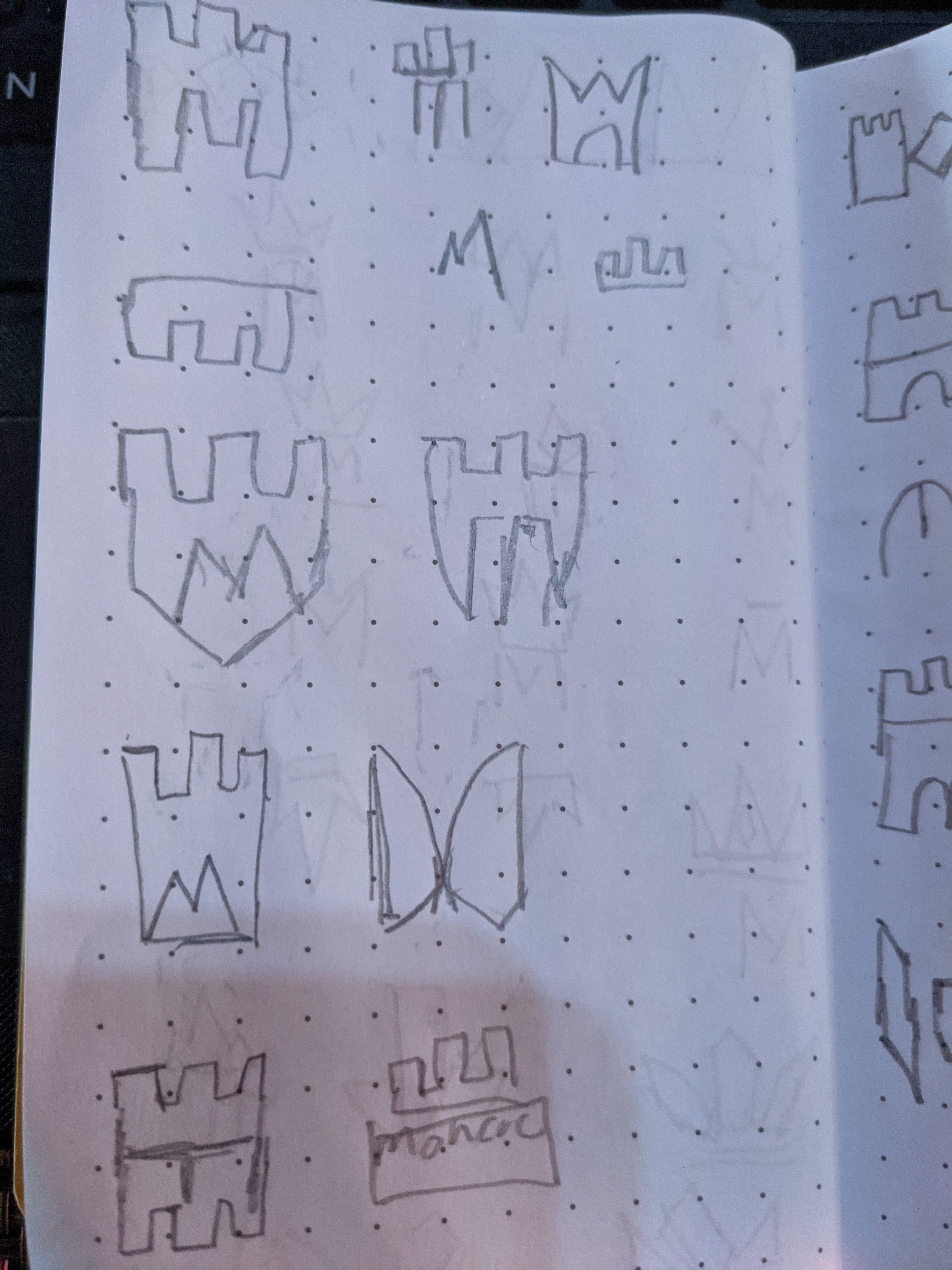
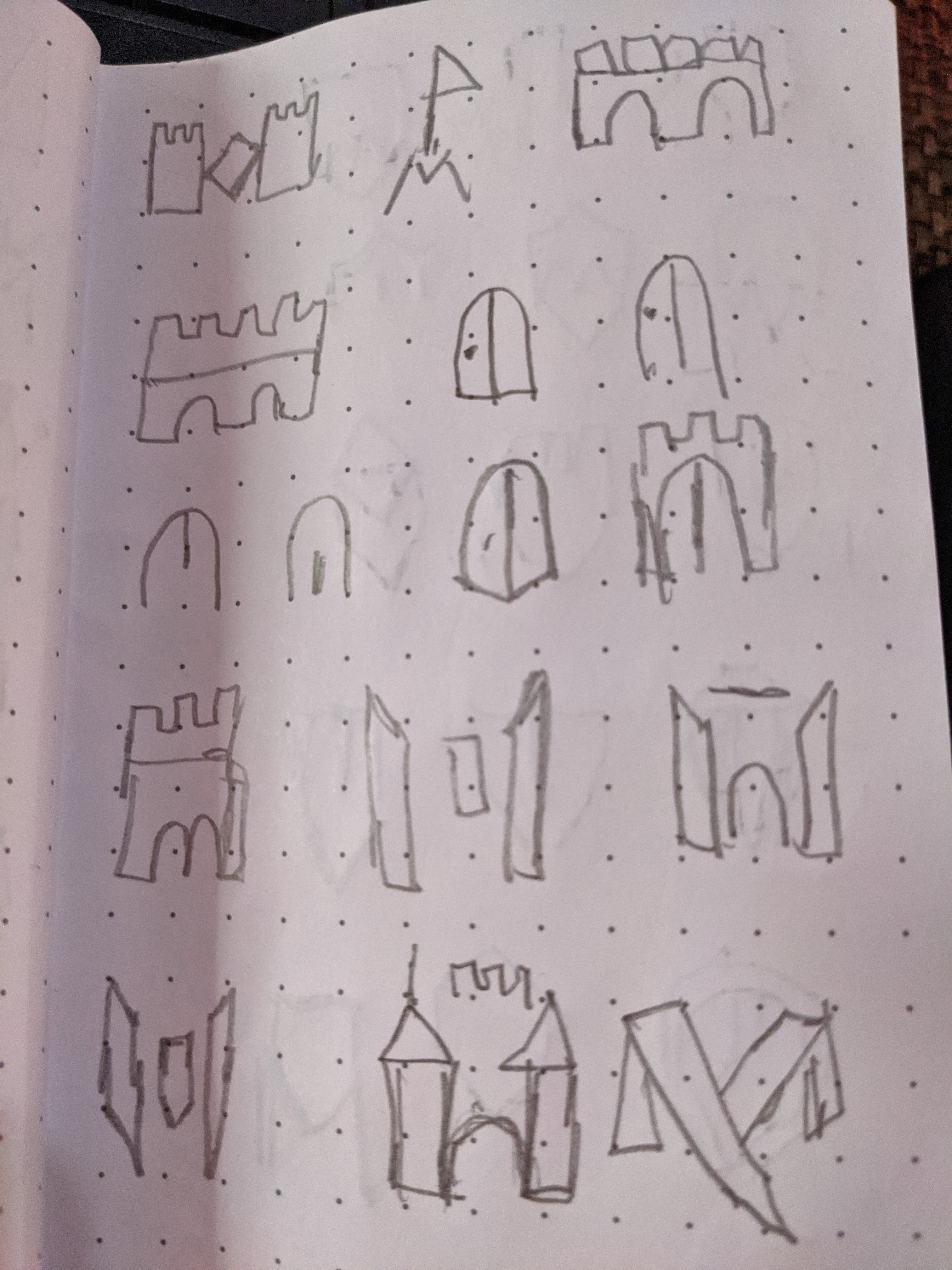
Here is another practice logo concept
Monarch is a luxurious hotel. Aimed at business executives, and the very rich. They wanted to convey a sense of luxury but did not want to feel dated, wanted to feel a modern
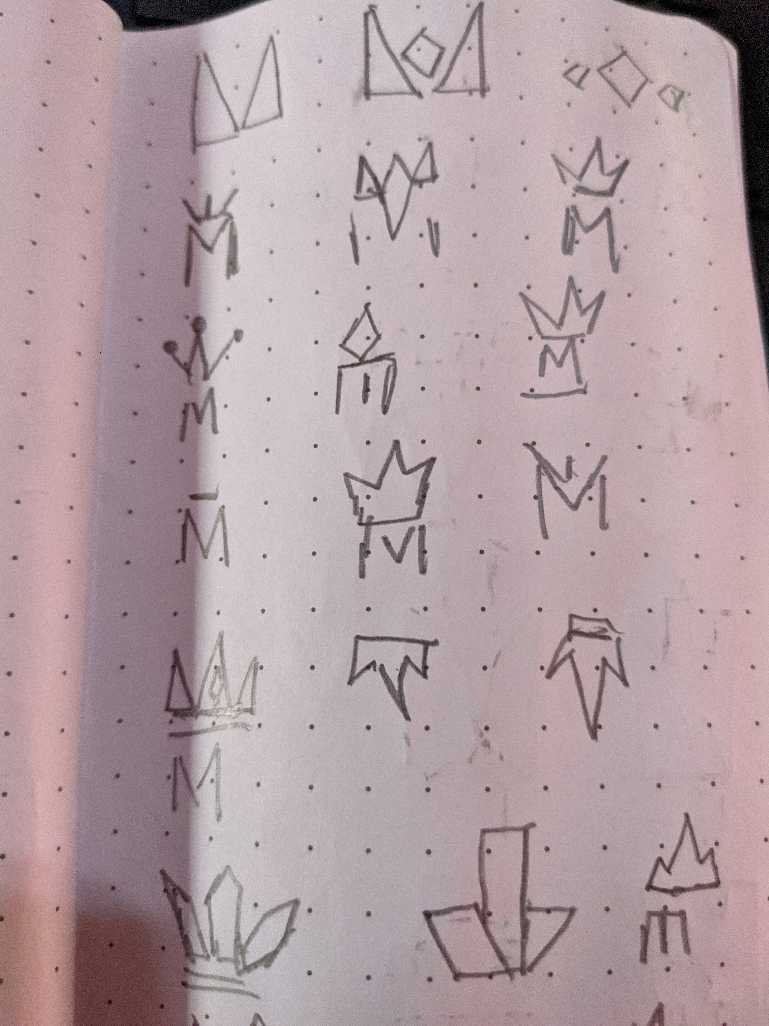
Here is another practice logo concept
Monarch is a luxurious hotel. Aimed at business executives, and the very rich. They wanted to convey a sense of luxury but did not want to feel dated, wanted to feel a modern
I’d call that a decent start, conceptually.
Suggested refinements:
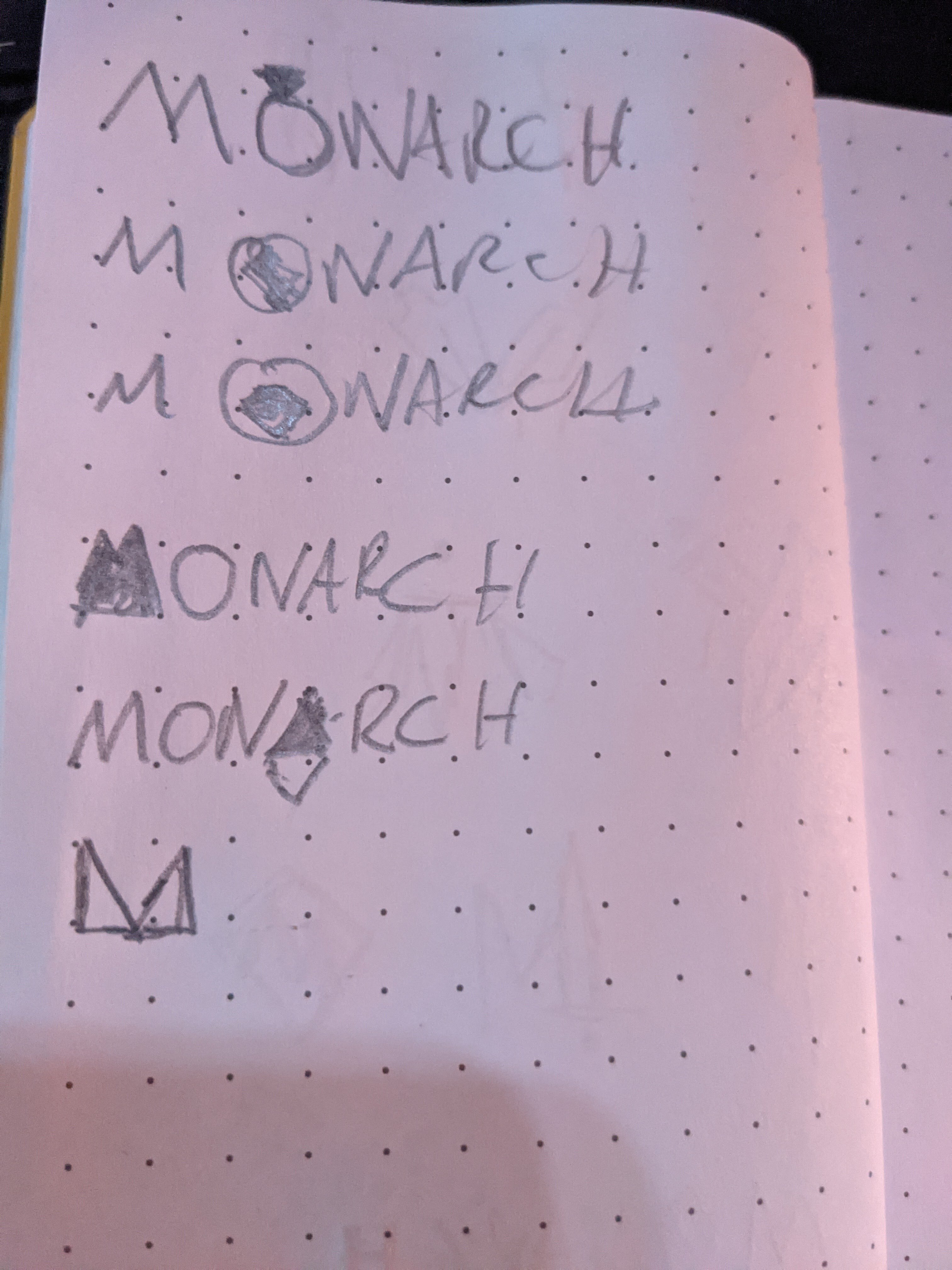
hey thanks so much for our comments. It icon is actually a king piece from chess. I think this may be a curse for me but i did resarch and every logo had a crown and i had issues coming up with a design for a crown that “hasnt been done before” so i started to think about other implementations of a king and chess board came to mind. but i see what you are saying about the font and letter C and R i did not notice these things b4…but this is the reason i am posting thanks
It looks either a Luftwaffe sign, or a Mandarin head gear.
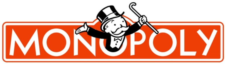
The typeface, the first three letters, and a single point of interest associated with one of the O’s made me immediately think of the MONOPOLY logo.
Your logo does have an understated luxury look to it, with the crown over the O also reminding me of a ring with an expensive jewel of some sort attached to it. If it were me, I’d change the shape of the crown so that it didn’t look like a king from a chess piece.
You wanted modern, but I’m not sure how modern an Art Deco typeface, like Futura, is. It suggests the 1930s to me. One problem with Futura (and similar knockoffs) is that it really is a bit wonky. The big, round letters don’t really match the skinny letters all that well, and the R, at least to me, never looks quite right. For a similar look that doesn’t depend on Futura, you might try Verlag, Gotham, Monserrat, Avant Garde, Proxima Nova, etc.
Monarchs could be as tyranny and oppression especially from lands they conquered - I’m not sure a Crown fits luxurious, but rather it’s a ruling aspect, bow before your king/queen etc.
Although Monarch is a type of butterfly, but that might not convey rich - but it would convey a sense of freedom and expression through many different types of monarch patterns etc.
Might be a better route to go.
You get some things right with this. It’s one color, easily reproducible across a wide array of printing techniques, it shows restraint, and it has a modern feel. That said, this is a pretty generic solution. Also, one of the dominant hotels in this segment, The Ritz Carlton, uses a crown in their logo.
Don’t scrap this project altogether. Keep the brief, keep the name, and push the creative to see what else you can come up with.
thanks for your response. In my research i did discover the monarch butterfly and please tell me if i was thinking too much into this but i didnt find it appropriate to use as a butterfly as a logo to represent something where target is business men. please correct me and tell me if i am over thinking which is something i am trying to work on in my idea process
Thanks i will. hence why i went with the chess king thought process.. i felt that direction would have taken me into a more interesting direction. As a disclaimer all of my practice logos come from good breif website honestly the brief and the name seems disjointed but i try not to discard it because i think in real world that will be a legit problem to run into and you can ask a company to change their name lol
Are all powerful people in business ‘men’?
Monarch has nothing to do with chess. Unless somebody was into chess (like I am) they might spot it (I certainly didn’t) - as the crown is over the word Monarch - and not over the word Chess.
thanks i will go back to sketching… i appreciate it..
Of course there is over critique going on here with us.
I am worried that it would alienate certain people. There is a way to say high end business without monarch crowns. The fact that it says monarch leads you down that path. It’s very literal and pardon me for saying, a bit contrived.
Just want you to push yourself further and examine Monarch as different aspects of what that could mean, how it translates to a hotel and the UK clients they want to attract.
Persoanlly I’d have gone with a deep purple or a royal blue.
I will say I was harsh, but that’s what it’s like in the real world. There’s nothing aesthetically wrong with what you have created.
As others point out, it will work great across different substrates and mediums.
But I have a feeling you CAN do better. You CAN do it!
Hey ya. I came here to be pushed to be the best that I can be. I recognize that I have set to achieved the level with process or even use of software. I will take all of your advice and re trace my steps and see what I can come up with. Hopefully I will have a new concept to post..thanks for your help. keep it coming
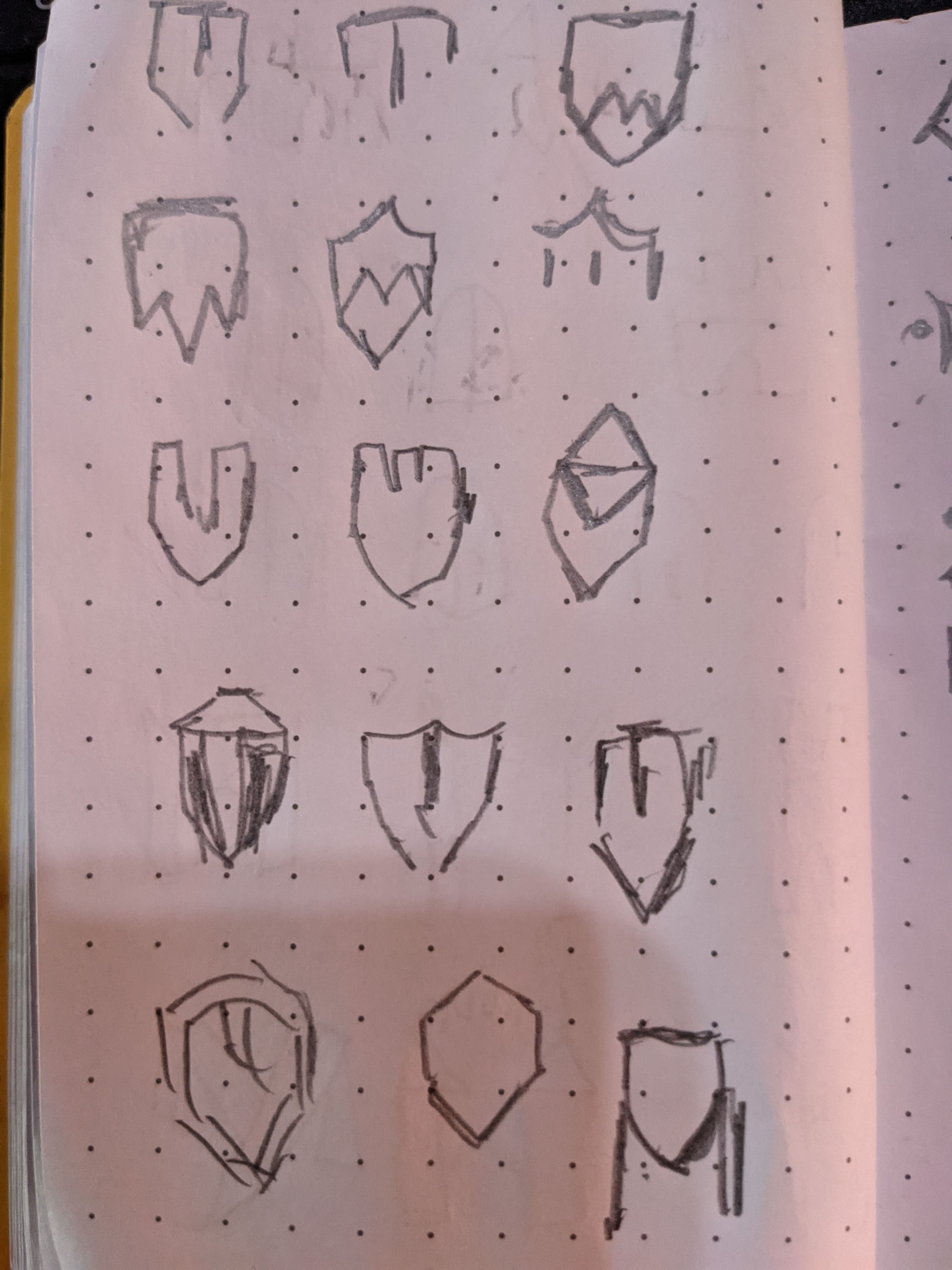
I tried to get back at this. I tried sketching and came up with a concept and a quick Google search not only I discovered the exact concept but studio much better executed than what I visioned. I recognize that my use of software needs work but I feel stuck in how to proceed. How do you guys handle such a situation when lightbulb goes off but you find a better execution. I try to use them as inspirations but seeing so much I feel like I end up copying which is not good… Trying to push through this
And there lies the rub. That’s the difference between the thousands of wannabes on crowdsource logo sites and those who build a sustainable career. Ideas.
It’s all about experience and learning how to put your own head in that place that allows for non-linear thoughts to happen. Everyone has a slightly different approach and method, but there are some common factors. Usually, it requires a decent amount of research, sketching things out until you get past the cliché stages – the ideas that everyone can come up with and the ones they usually stop at. Monarch = Crown. Job done.
This is the stage you have to get through to get to the place that will give you your eureka moment.
Kudos to you for knowing you have to go further – that, in itself, is becoming an increasingly rare commodity, in the pursuit of what people perceive as a cool, easy-come-by job. Like anything worth having, it’s not easily come by.
Once all your groundwork has been done, you then need to do something counter-intuitive and walk away from it. Do something completely different.
Nature often works. Walking in countryside. Re-connecting yourself with the non-pedestrian. There’s a reason the enduring, romantic image of the tortured poet walking alone across rolling hills is so entrenched in our collective psyche. It works.
For you, it may be listening music, playing an instrument, meditating, flying a kite, restoring a classic car. Doesn’t matter what. Anything where the conscious mind is focused on something else, allowing your sub-conscious, with all the ammunition you have given it, to get to work.
It’s not a coincidence that Archimedes had his eureka moment in the bath.
Another is sleep. Take a nap thinking about a problem and in those moments of waking, you often have new thoughts, or at least new avenues to explore. You just can’t tell your clients, your taking a bath and having a snooze on the clock!
I use all of the above, along with picking up a bass for half an hour. Improving manual dexterity often allows the brain to slip into that place.
Takes time, but experience and practice will get you to this place more and more quickly the more you do it. It seems like an insurmountable hurdle, in the same way learning anything else does, then one day, with enough persistence and practice, something just clicks and you find you can just do it.
The software and tools bit is the easy part. That is just simple conscious-level learning. Hard yards.
Stick at it.
Slow clap…thank you very much for your words. I have to remind myself this is new to me and I am trying to teach myself having no formal graphic design training. I read, YouTube and even had a subscription at skillshare. As you rightfully said the tools and software is easy part, coming up with the concepts is hard part.its why I searched for a forum to push me to that level. As you said I think I came to concept of crown and stopped there.. I googled saw logos images with crown so in my mind I thought I. On the right track I just have to find a way to represent crown different and I felt like it was challenging..then idea of chess piece came to mind which led me to the design I posted maybe execution was not great. After posting and reading feedback the thought to represent luxury visually led me to thought of diamond + M for emblem..I did few sketches and googled and I felt deflated because kinda like with idea if crown I saw other and better iterations online. So hencr my last post I just feel like my ideas been there done that..
I am interested in just how to overcome such..some of things u mentioned I do currently.. like trying not to focus always on design. Computer network is actually my first love and I’m currently studying so logo design is actually a break from that and vice versa.
But I will stick with it and see how to push pass this..but I really appreciate your response
Hi Guys
I am really struggling. I dont need someone to think for me but i really need some help. I think about an idea i sketch it out and to make sure i am not just re creating something i saw before i do a google search and i found not only what i came up with but a much better execution of it. I am really lost.. i am trying here but im just blanking out…sigh