The top one looks like a football. The bottom one looks like a pair of lip badly in need of chapstick.
Those last two are a no for me. They are backwards steps. Way too clip arty.
In my opinion, you were on to something with this
It’s by far your best effort… again in my opinion.
Just keep in mind your centering and spacing.
![]()

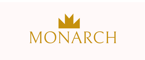
Thanks i think i had something going on with that but i decided to take a break and this came to mind. i still like the crown concept, the m may not be as obvious in the mark u may even see you see a V but it makes up the base of the mark…
thanks for all your comments and help
1 Like
An important attribute that contributes to good design is knowing when to stop and move on to the next challenge.
The following one was pretty good (overlooking the obvious centering problem). I might have introduced some subtle curves into the lines to better match the personality of the typeface, but all in all, it’s pretty good. In other words, there’s no more need to explore a whole bunch of additional ideas.
If this is a real job, you’re wasting time (which is the equivalent of money). If it’s a practice exercise, you’re still wasting time by developing the bad habit of overthinking things.
2 Likes
thanks I am trying
it seemed much more difficult than i thought

I like it. ![]()
dont play with my emotions lol
im glad and thanks for the push
This one is amazing. I am just starting off with typography and this gave me the feels, as in, this work adds the weightage of the word “Monarch” is.
1 Like
Gold on black looks really plush. I like it.
1 Like