Hi Chloe.
I checked your website, and you’re apparently a writer with an artistic bent, so with that in mind.
For a logo that needs to run small on occasion (as most do), the mark needs to be kept simple and legible at those sizes. On the other hand, if the logo will be seen 99% of the time considerably bigger, it doesn’t make much sense to compromise the looks of the larger logo simply for the sake of making the rarely used smaller logo more legible.
There are several ways around this dilemma. For example, the logo part of the logo can be separated from the name of the company. For example, the name of the company (always in the same typeface) might appear out to the side or below the logo depending on the circumstances. Some designers call these different arrangements of the same logo “lockups.”
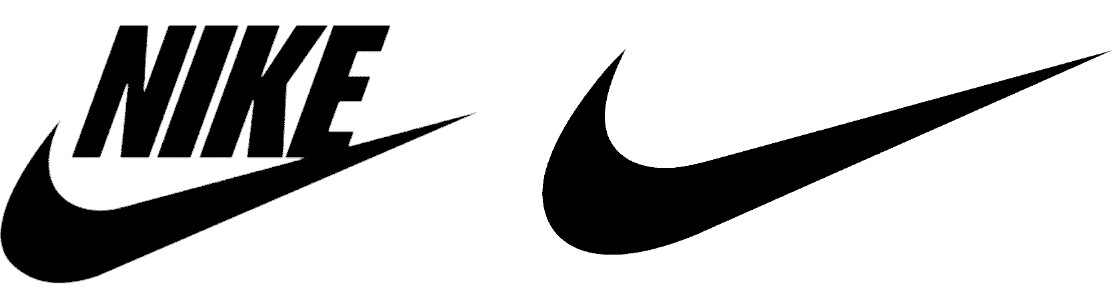
Below is the Nike logo. When it’s appropriate, the name appears with the logo. When the name word mark seems out of place, the swoosh is used by itself.
In addition, if your main logo is too complicated to be legible in small sizes, sometimes a logo can be simplified for those small sizes. For example:
Logos don’t need to have hidden shapes or messages. When they do, great, but the most important thing is to keep them simple, memorable, and legible.
I hope you don’t mind, but I’ll use your Voice Life Media logo as an example. The best logos contain no more than one clever idea (if there are any at all). Yours has two: the microphone and the parenthesis-like symbols on either end that I’m guessing represent sound. Either of those ideas could be great, but when you combine both together, along with italic serif caps and Roman lowercase, it gets a bit busier than it needs to be. Consequently, it becomes less legible at smaller sizes. In other words, boil the elements down to their essence. Remember the design aphorism that says “Less is More” (especially with logos).
I’ll let someone else tackle the color part of your question. It’s 1 a.m. here, and I’m starting to zone out.