Hi, the Logo Stands for an Signet for an Artist.
So, the purpose of this logo is to use as a “artist signature” or mark on a piece of art?
I can only reiterate what I said earlier. Start sketching more concepts. If you have a hard time putting pencil to paper, than start by writing words or mission statements, then sketch concepts based off that.
1 Like
Without having seen the evolution I’m not sure I’d connect this with a castle anymore.
1 Like
Hi alltogether,
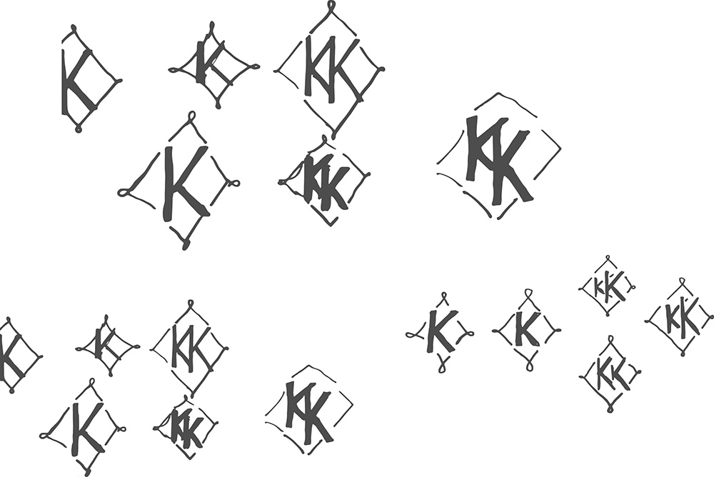
after some thinking I discarded the brush castler and tried something different. The artists name contains two “K” s as first letter. So I started sketching a monogramm
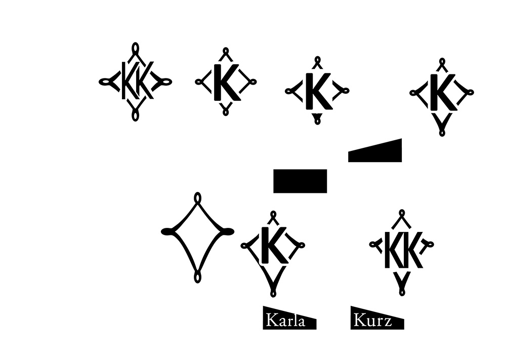
and finally added the name:
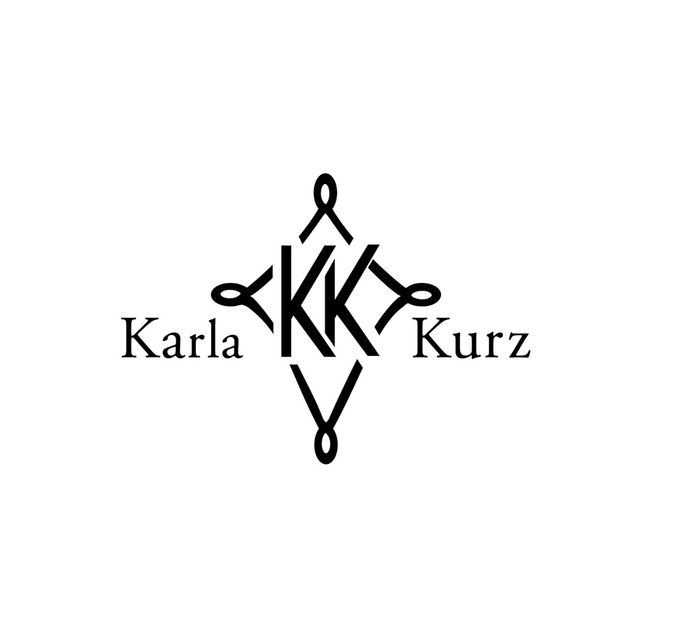
I am finally not sure about the font decision using an antiqua font. A grotesque font would be better?
looking forward to feedback
I’d probably go with a more squared diamond shape and align ‘Karla Kurz’ to the centre as opposed to the base line of the ‘KK’.
I’d thin up the lines of the shape, so there is more contrast between the thickness of the ‘kk’ and the shape, it will also make it look more elegant and not clunky.
As for font, I’d suggest using the same font for ‘Karla Kurz’ as the ‘KK’. My argument for that would be they represent the same thing, so there is no reason to differentiate the typeface.
Thanks
Will follow your Suggestion
Any more comments?
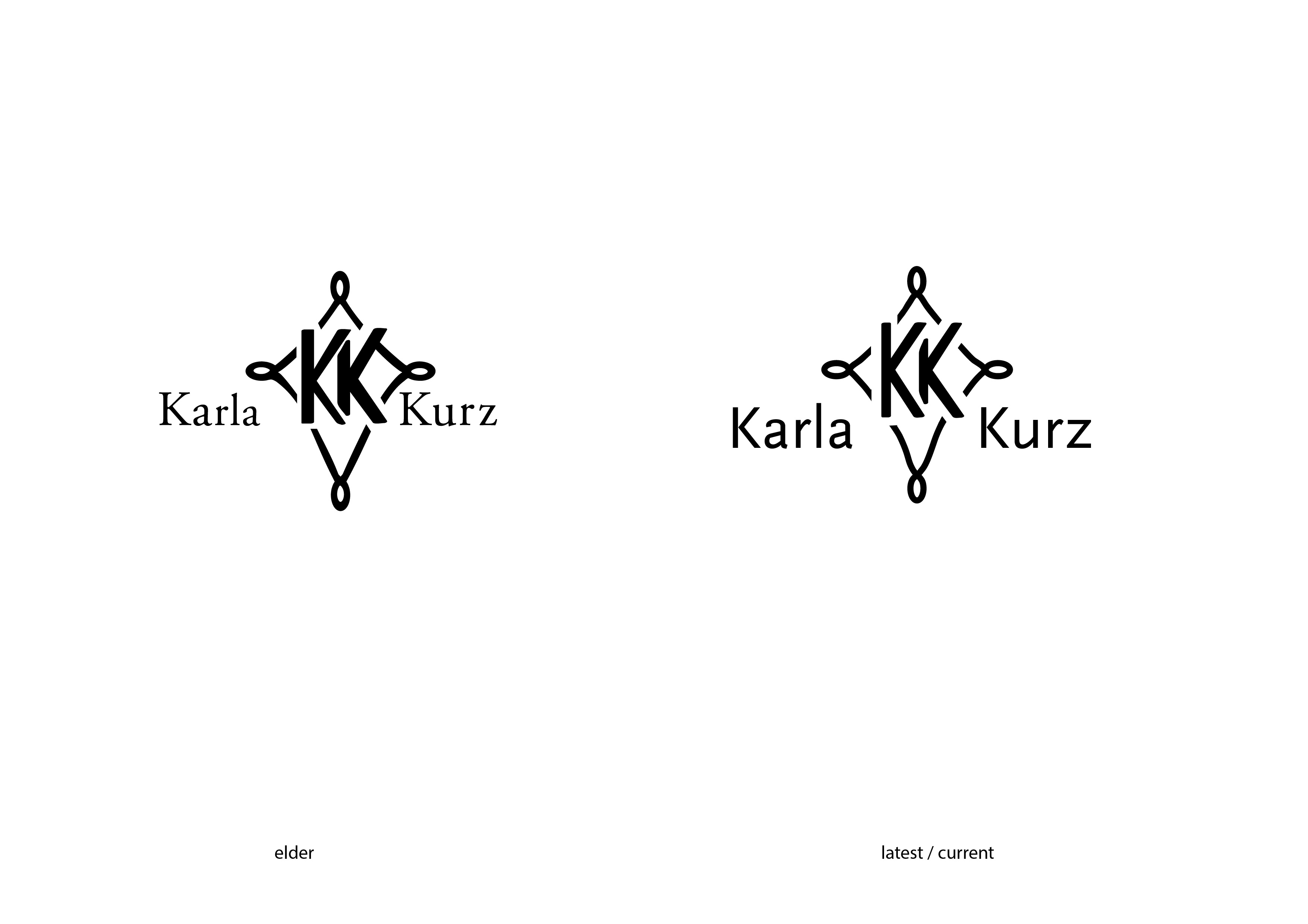
Hi alltogether,
I went further with my logotype and followed your suggestions. But honestly I am not sure about the typeface useing for “karla kurz”. And I am also not sure about the position of the name referring to the monogramm in the middle…
What is a graphic designer do?
Reworking someone’s logo is not allowed. And showing a few sketches is not a brief clarification ![]()
May I argue that my critique was difficult to explain in words, and therefor I sketched an example to clarify in regards to my post on January 11 ![]()
If not, I now know where the line is drawn in subjectivity, and will not cross it again.
I did not thr rules either ![]()
thanks anyway for your engagement and support
Hi alltogether,
I went on and chose antother font for my logotype. How do you like it?
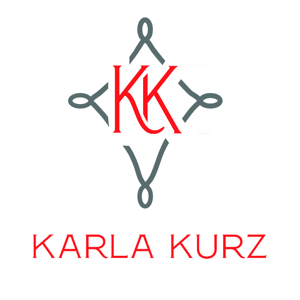
Does it look too much retro?
As you showed your measurements on paper & you want your final logo to be like that example logo, just be careful about both side brushes height with the castle, if you are using the same brush just flip the brushes to look like a mirror image of brushes on the side of the castle.
But if you are using different brushes, then keep both side brushes sizes equal. I hope it will work for you.