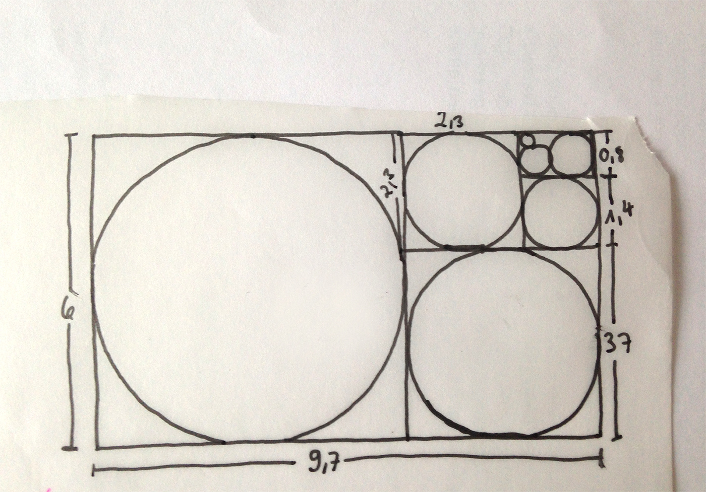
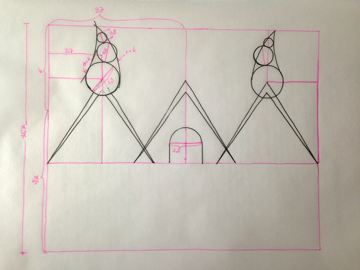
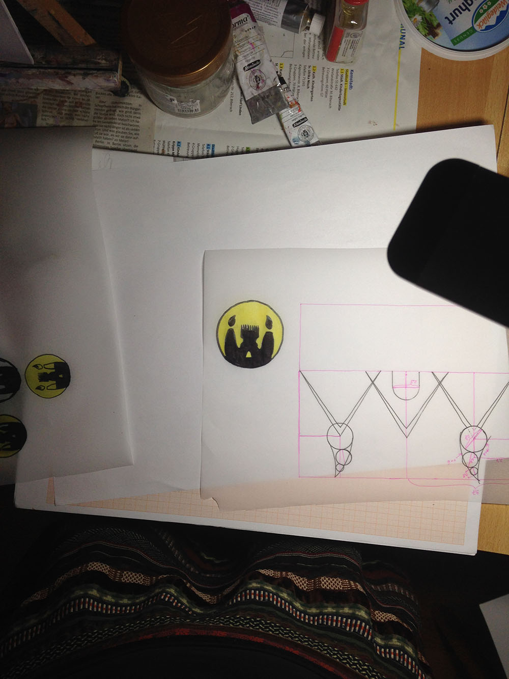
1.: Could you superimpose the ratio on your logo at the top of the post?
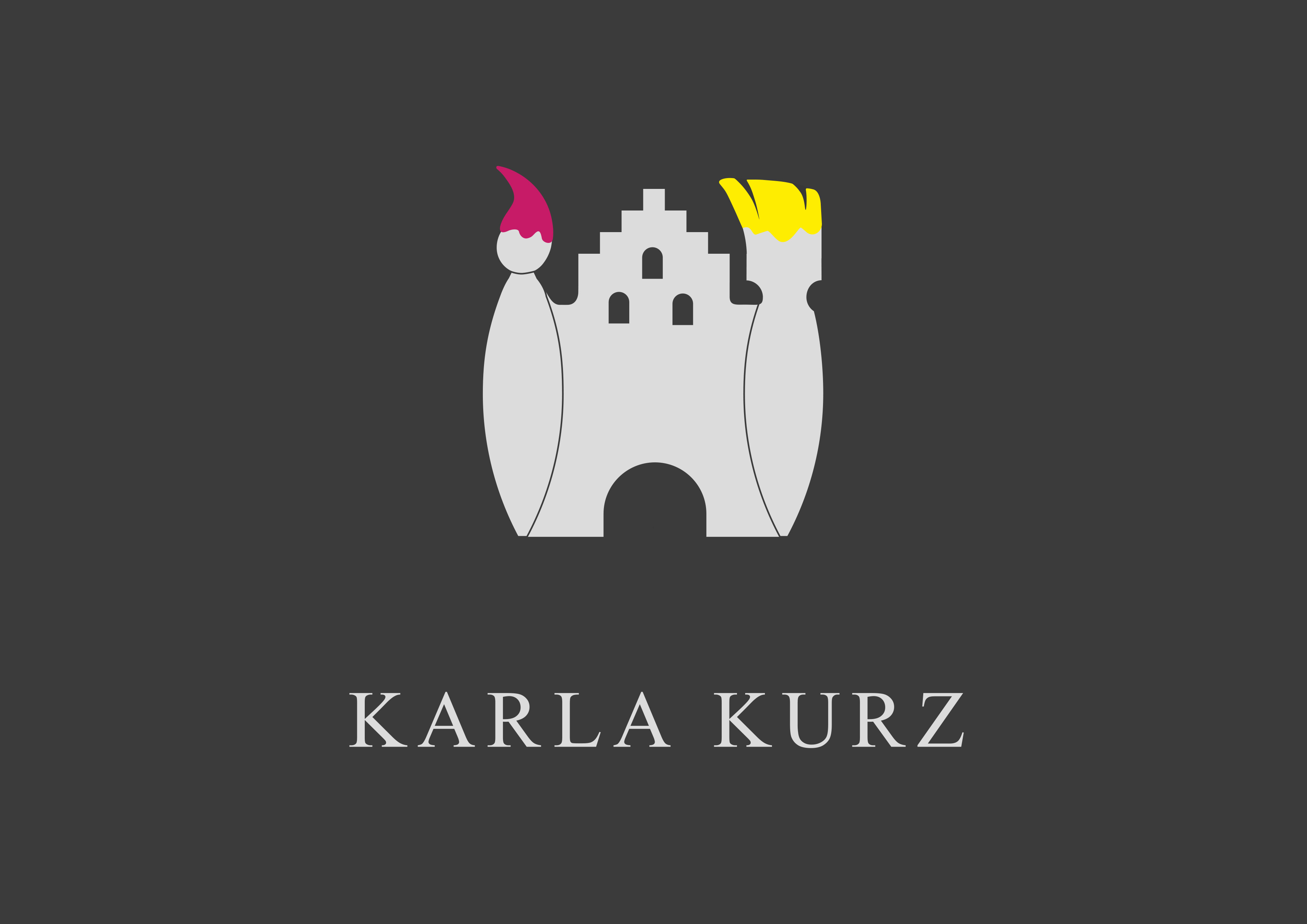
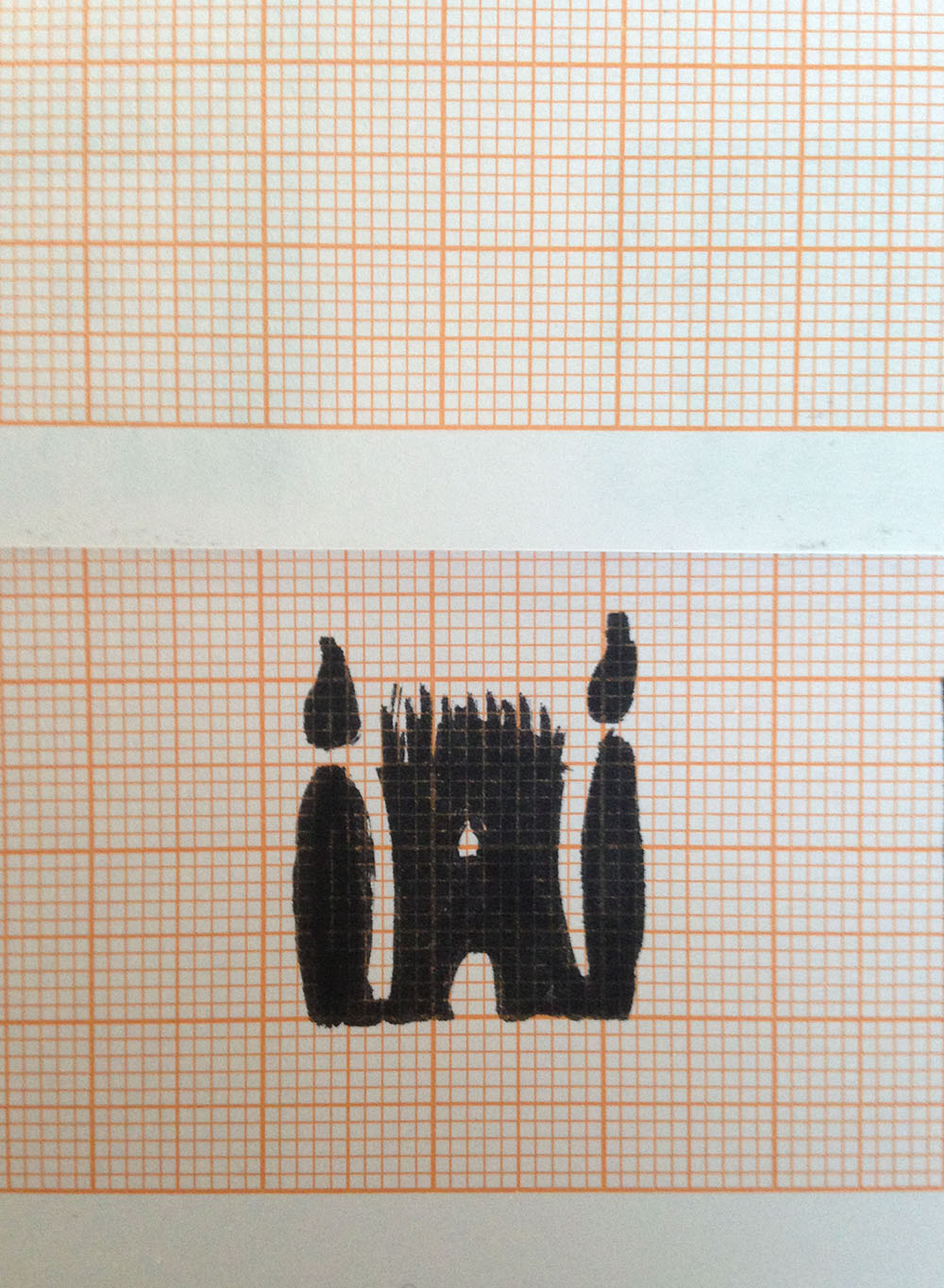
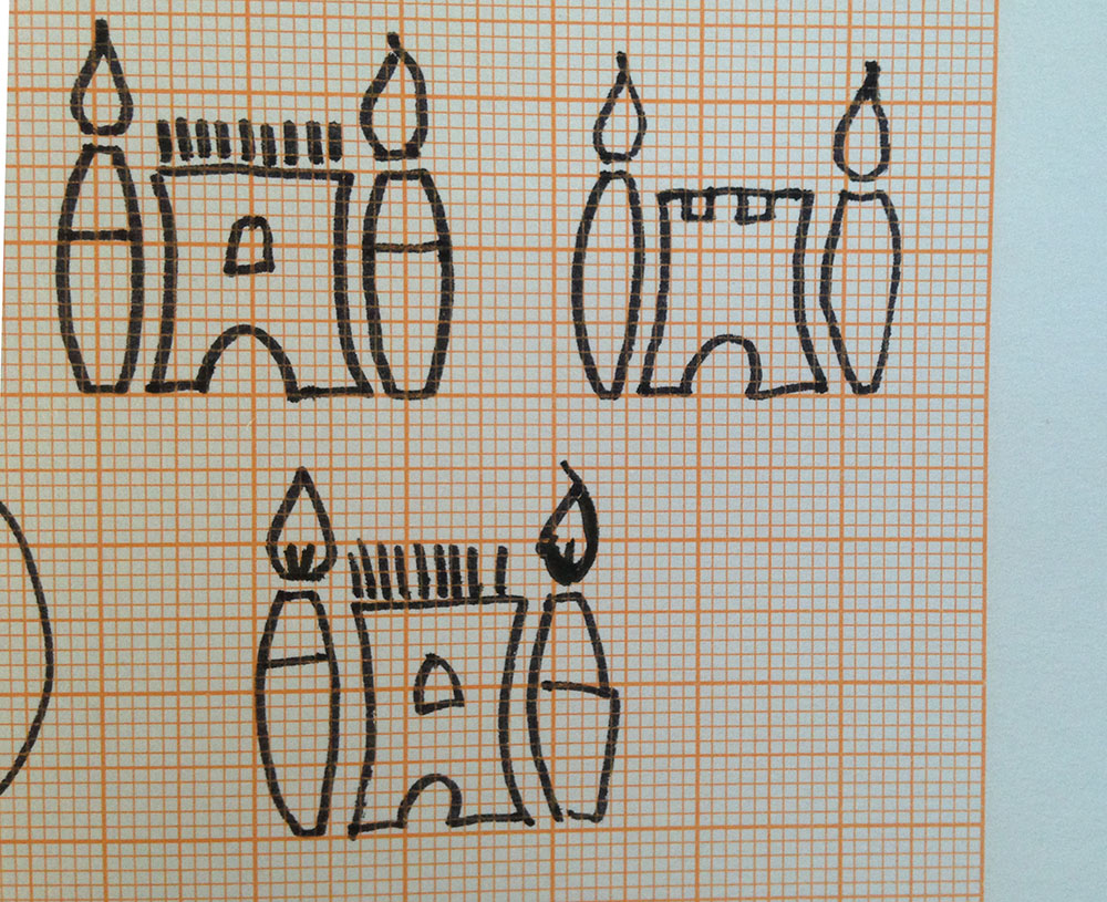
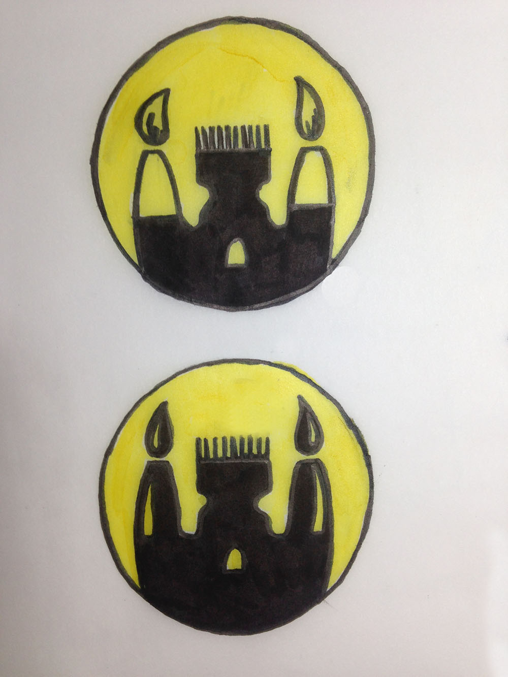
2.: What kind of castle did you base your logo on? Maybe you could show the pic you used. (To me it looks more like a medieval merchant house.)
And I suppose your answer is your reason, although “constant” doesn’t really apply since it means unchanging and this isn’t an animation, and as for uniformity, the golden ratio doesn’t really deliver that in a direct sense.
Anyway, the point is that if you have a desire to do this for your own reasons, then have at it, but if your pursuit is predicated on a belief that the result will be an improvement of some sort to the eyes of your audience-at-large, you may find you’ve wasted the effort. Many cosmic harmonies align with mathematics, but humans consume aesthetics on a more instinctive level. Even if your logo turns out to be stunning, the underlying mathematics will be no more than an anecdotal novelty.
Typografia, I agree that simple mathematical relationships can impart visual order and cohesiveness.
All kinds of interesting shapes and relationships can be based on the Golden Ratio. Its properties when used to create fractals are especially impressive. Compositionally, Golden ratios can impart a natural balance, but so can other, more easily recognized and intuitive relationships, like thirds or halves or fifths — for that matter, they’re probably better at it.
The Golden Ratio seems to have developed a reputation for compositional properties that seem more magical than real — maybe due to its ties to ancient Greece. Adjusting various elements in a composition to correspond in various ways to the Golden Ratio probably won’t help and can easily be counterproductive when those relationships are forced. And one thing the Golden Ratio can never do is make up for other, more fundamental, flaws.
I think this is kind of an interesting mental and visual exercise. The more things you try, the better honed your own design instincts will be overall. I could almost see this being used as an assignment in a design class. Redesign this piece based on the Golden Ratio. Evaluate if it was successful.
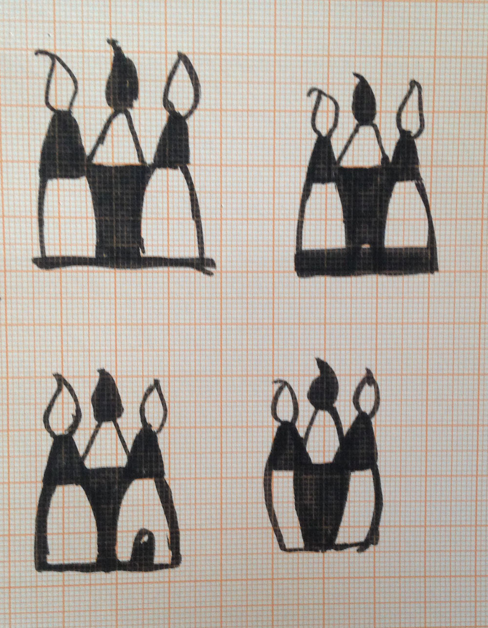
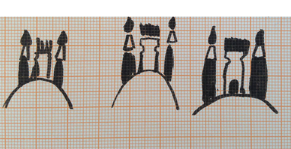
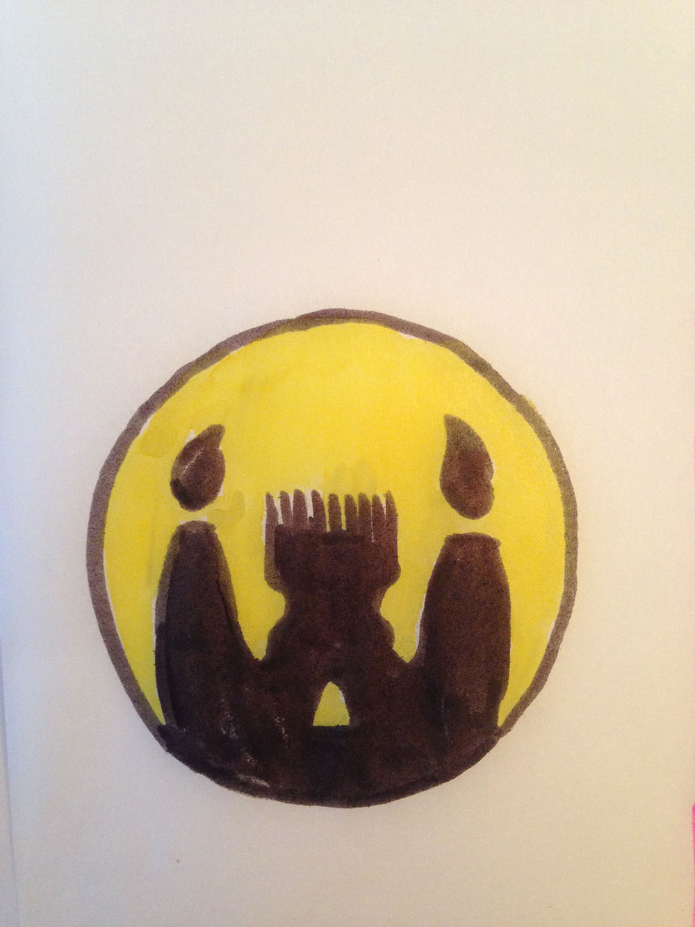
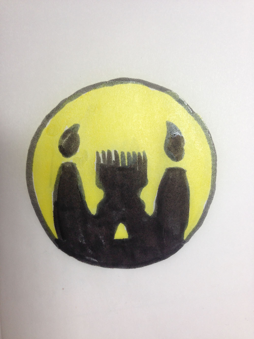
After receiving unfavorable comments I stepped back to sketching and drawing. I wanted to keep the orgiginal idea but neglect the golden ratio thing for the moment.
I too have been a victim of designing stuff in golden ratio, especially after my high school art professor, (also my mentor for getting into design college) completely filled my head with it. Unfortunately it often turns out to be “Sisyphean work” (Speaking of the Greeks…)
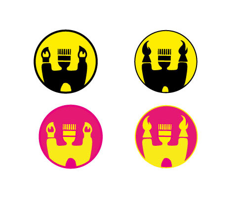
I think the circle idea might work but I’d definitely rethink the colours. Yellow/black combination in this setting reminds me of Batman a bit. Not a big fan of these colours generally, I usually refrain from using basic colours like red, yellow, magenta, …unless print is the association you want to achieve here, but even in that case, I think cmyk colour are being overused in print related logos. Also, try using colour combinations for a reason, e.g. combining complimentary colours, if you want to achieve the contrast. The combination of this yellow and this pink looks very amateur to me. Pink and yellow could work nicely together but not saturated like this. Maybe different shades? If you’re struggling with picking the right colours, see if Pinterest can serve as inspiration.
About the candle/brush issue, look up brush icons and see how they are outlined. Not saying copy them, but maybe you get a heureka moment and realise something you could change to make them look more brushy.
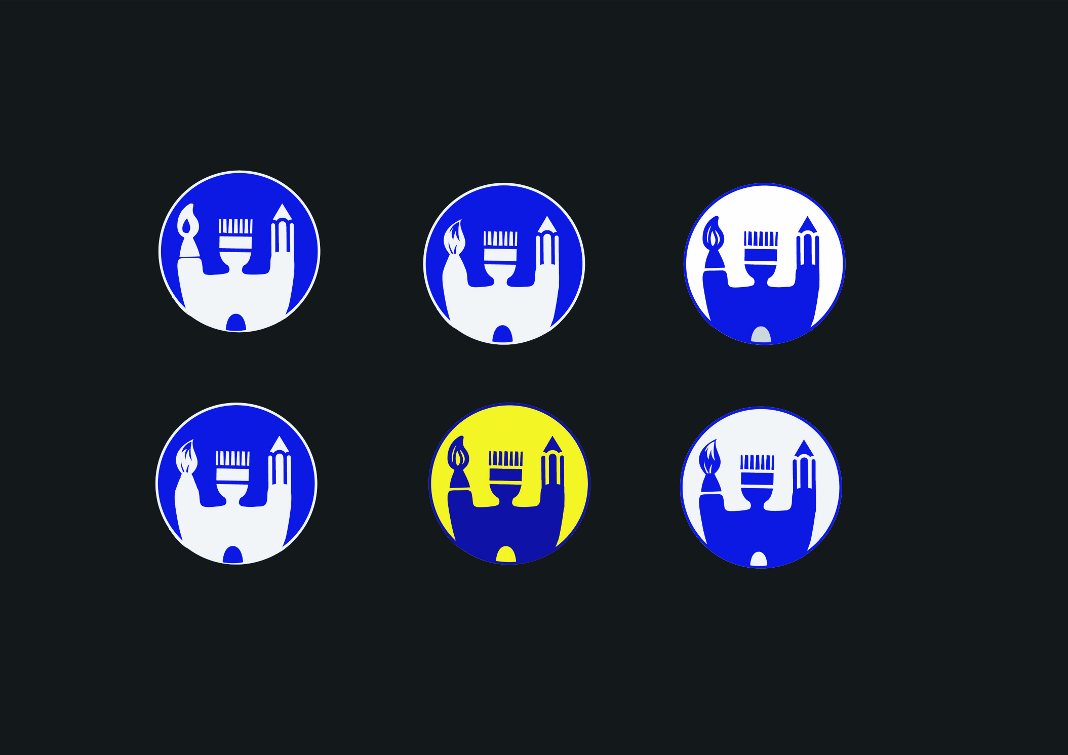
Have you tried using a flat brush on both ends as oppose to the round tip? I think the flat brush resembles a castle tower more than the round brush. You can also make the round brush thinner, and fray the tips in a way that look more like a brush and less like a flame. Also, more/different line variation may help.
That said, I think your stuck on the castle idea. I’d hit the sketchbook and create new ideas. You may land on something more impactful, or inadvertently solve the issue with your castle.
Normally a logo would be created for a specific company, with a specific goal and target audience. In my opinion, unless you have that as a starting point, all the exercises and work you’re doing are just exercises.
So how will you understand when it gets better or worse? What exactly is the goal for this logo?
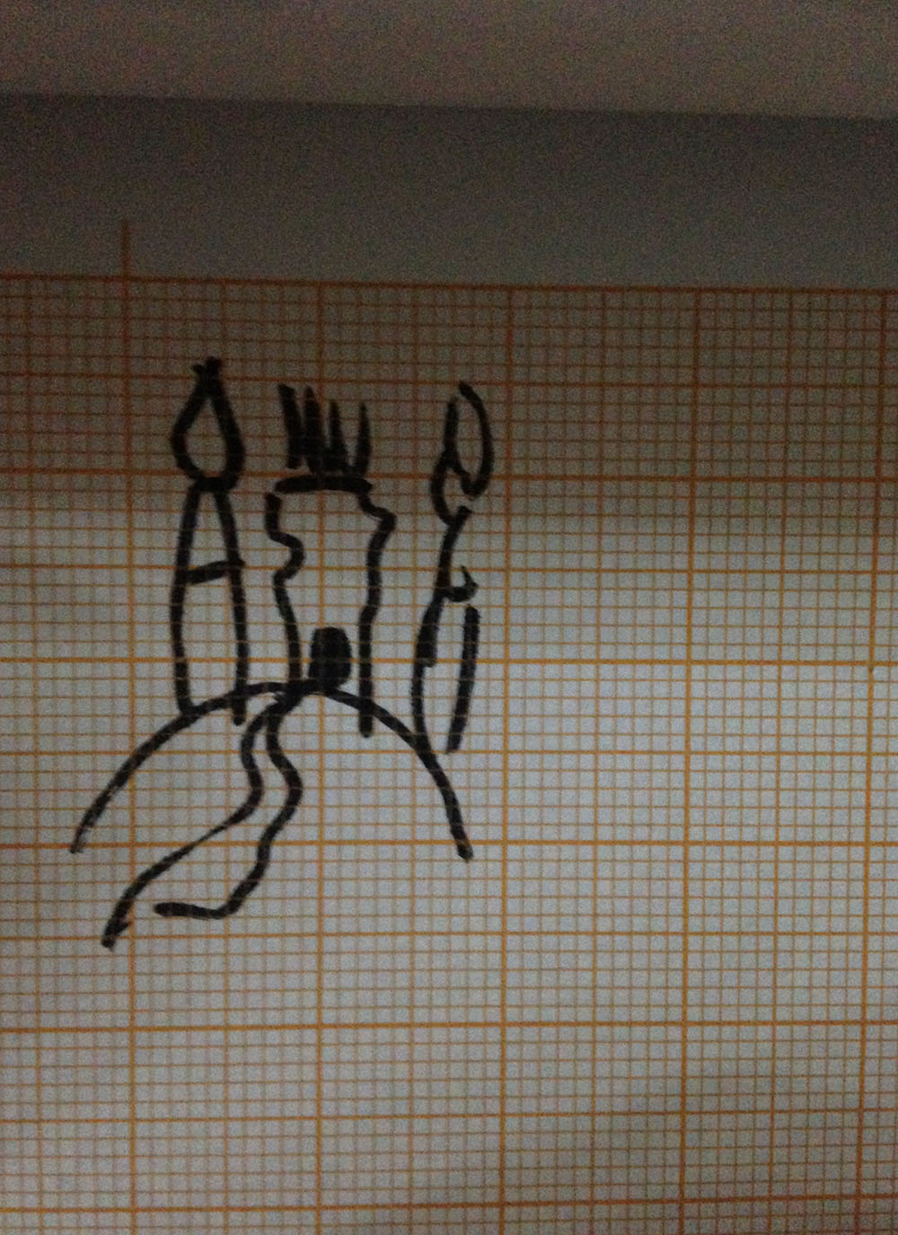
And here it comes, the current status. At the moment I like the blue on white circle castle below left best. I am considering to add a drop to the rounded brush, to eliminate last doubts about seeing a candle in the brush…