So im studying branding and my project is a center which provides free jobs training (main) and job opportunities for physical disabled person (who still have hand mobility), and the name is Reachout. Can you guys give me some advices for the logos ? I tried to combine the r letter with puzzle but all of them look kinda sad
I’d agree with you. Not sure this is a direction that is worth pursuing. I’d say back to the drawing board and spend more time fleshing out some different ideas.
I hate to be so abrupt, but I think you should abandon this idea and start over. I can’t see it going anywhere.
Is this student work?
yes ![]() it was my teacher’s recomm, at first I wanted it to be teared into small puzzle pieces but he wants one piece only
it was my teacher’s recomm, at first I wanted it to be teared into small puzzle pieces but he wants one piece only
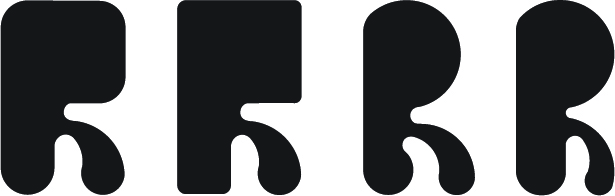
here are my old logos but my teacher doesn’t like it
the hand logos have 4 finger only
The first R logo is butterfly combining with letter r but lost half of a wing
and the last 2 are just disabled people with wheelchair but with motivation pos
I’m moving this to the student part of the forum where I think you will more targeted feedback.
In this situation, your instructor is the client. I don’t know why your instructor suggested a jigsaw puzzle piece since I see little connection to the subject. However, you need to make your instructor happy with the final piece.
There are probably tens of thousands of hand logos, but with a name like REACHOUT for disabled people who still have hand mobility, the hand idea is worth pursuing. However, I’d stay away from four fingers. Not only is it anatomically inaccurate but four fingers might even imply a hand disability, which you don’t want to imply.
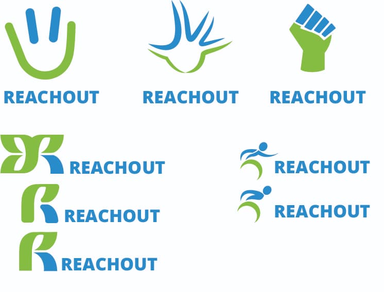
In general, I like the direction that you’re going with the three on the bottom left. I think you could springboard off of these and do some more brainstorming. As they stand, there are two issues. First, the typography isn’t particularly strong. Second, the green of the bottom two of the three (does that make sense?) reads as a P and is reminiscent of the Planned Parenthood logo. Independent of one’s own feelings about Planned Parenthood, that’s a politically charged connection, even if unintended, that would probably be best avoided. But I do like the idea of a stylized, typographic approach.
1 Like
i guess he likes letter logo. I have asked all of his old students and they all make logo as letter. I had an idea which combining R and O as people with wheelchair but it was soo bad
I’d stay away from the clenched fist. That has many other unwarranted implications.
I agree with Steve; the three on the left side are the strongest, but they need some work to make them a little more relevant to the subject matter.
I think I’d be coming up with a good rationale for your client/tutor as to why you should not use a jigsaw piece. To be honest, I am surprised they suggested. Along with crosswords, it is about the worst visual cliché you can use and should be avoided at all costs.
1 Like
It sounds like your teacher is trying to push you to not be so litteral with your design (i.e. depicting a disabled person or a hand).
One of the reasons why people often struggle to come up with great design ideas though, is because they don’t really understand the problem they’re trying to solve very well.
My recomendation is to push back on your teacher for more clarification of the brief and ask questions like:
- Does the center specialize in or is well known for any particular subject or thing?
- What are the demographics of the people that go there?
- What’s the educational style of the center like, is it informal or formal and strict?
- What’s the existing reputation of the center like (if it has one)?
- What challenges is the center facing?
The more clarity you have, the easier it’ll be to know whether you’re hitting the mark.
Hope this helps ![]()
1 Like
You’re an optimist, Pluto. On this particular subject, my experience with design instructors — even at university levels — has shown they’re often operating under a distorted academic mindset that has little relationship to real-world, practical situations.
3 Likes
Here are some tips that can help you create a logo that effectively communicates the values and goals of your project:
- Understand your target audience: Your logo should be designed with your target audience in mind. In this case, your target audience is physically disabled individuals who still have hand mobility. Research their preferences, likes, and dislikes, and try to incorporate them into your logo design.
- Keep it simple: A simple and clean design will be easier to recognize and remember. Avoid using too many colors, fonts, and intricate details. You want your logo to be easy to read and recognize at a glance.
- Use symbolism: Consider using symbols that represent your project’s mission and values. You could use images of hands, people working together, or puzzle pieces that fit together to represent the idea of providing job training and opportunities.
- Choose colors carefully: Colors can convey different emotions and meanings. For example, blue can represent trust and stability, while green can represent growth and renewal. Think about what colors would best represent your project and appeal to your target audience.
- Experiment with different designs: Don’t be afraid to try different designs and variations until you find one that works. Get feedback from others, and refine your design until it effectively communicates the values and goals of your project.
Did you use a chat AI to write this? If so, please stop. If you have something to say, please think it through and write it yourself instead of letting a robot do the work for you.
This topic was automatically closed 365 days after the last reply. New replies are no longer allowed.