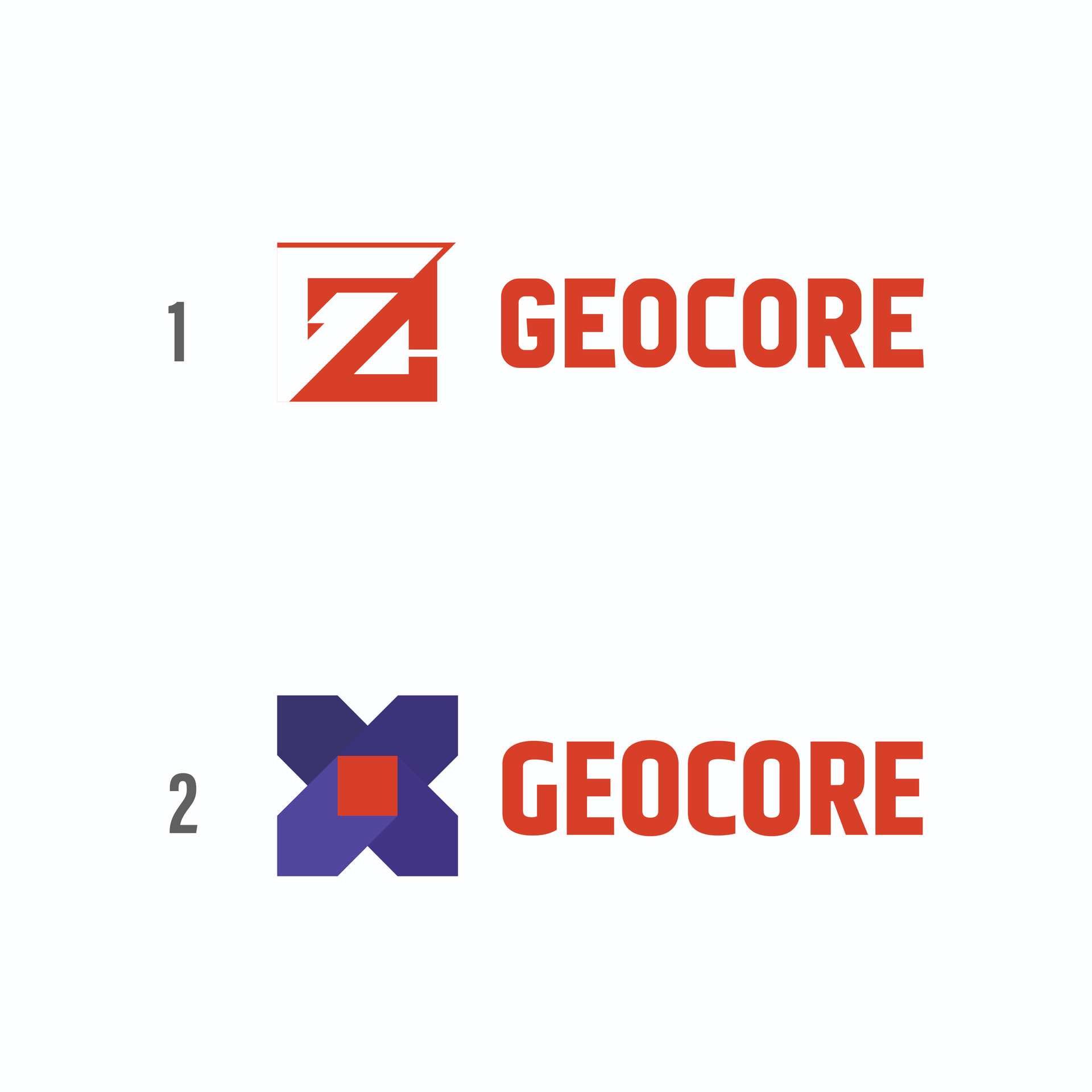
The first thing you should do is to decide which one is going to be selected as a prototype logo and the second thing you should do is the colour combination. That are my thinkings. For example, it is not a combination of Red, Blue and Black (there is no harmony).
Thank you for your suggestion. I appreciate it and would like to move forward with No. 2, as it feels most aligned with my strategy.
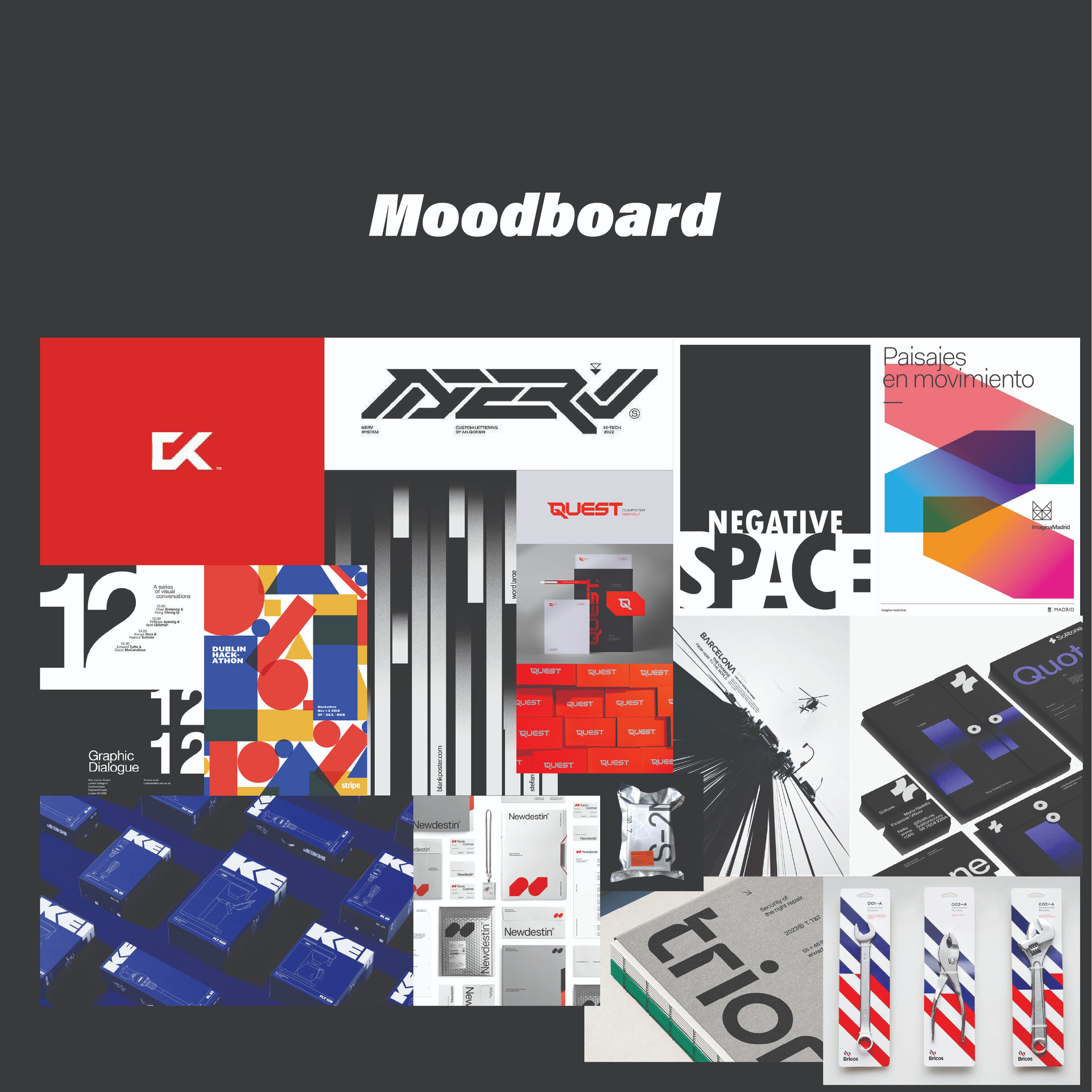
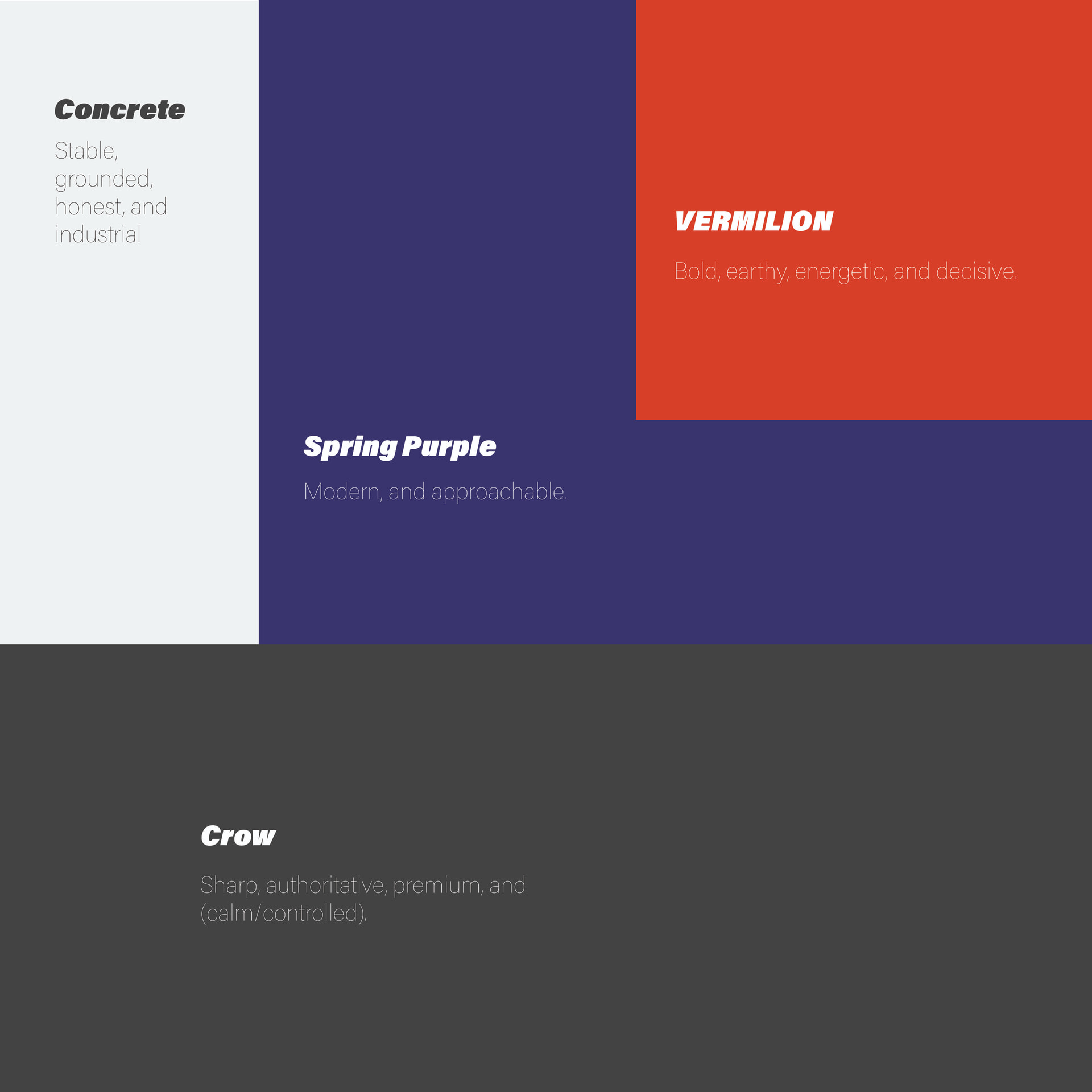
Regarding color harmony, I’d like to share some insight: the colors you see come directly from the moodboard, and the moodboard itself is built around the company’s personality and attributes. If you refer to my attachment, you’ll notice the color palette falls under the “Triad” category, specifically red and blue.
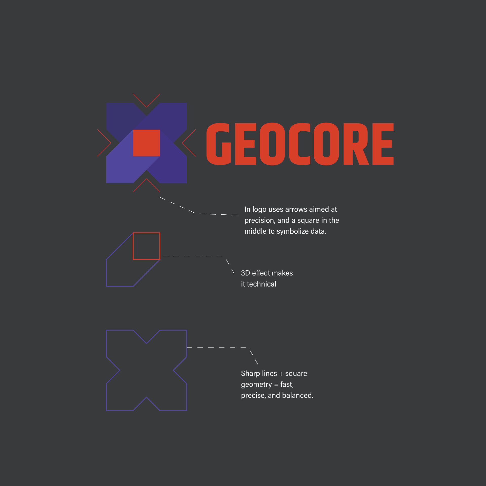
Now, moving to the No. 2 logo design decision: I have used several concepts here. The red square, for instance, represents “data” — and I connected its color to the company name to reflect what the company does.
Yes but you need to create a contrast, Dark Blue with black ? Your logo with blue dark and black ?, just watch the logo with white. Dark blue with black ? it makes more confuse to see the logo!.
Where’s the Pantone colours? All those colours will probably be out of gamut when it comes to print.
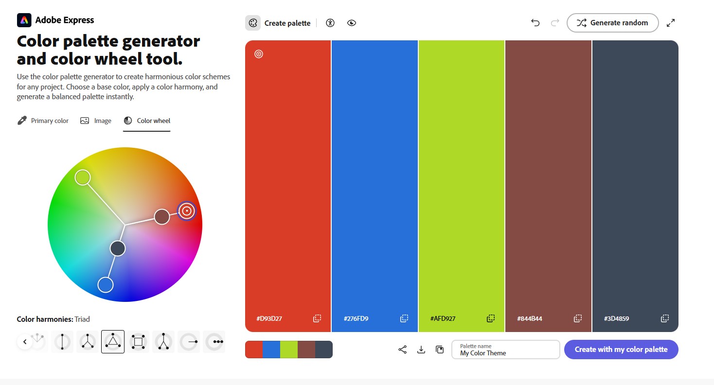
That’s pretty lousy tool from Adobe… it’s really only should be used for Web Content and not professional branding.
No CMYK/Spot(Pantone Colours)… disaster waiting to happen.
Thank you again. I have also prepared color contrast options using my color palette. I chose not to include my full graphic element strategy here, as I didn’t want to overwhelm anyone with too many pages. My intention with this post is to gather feedback specifically on the logo construction. Of course, colors remain a vital element as well.
I fully understand your point — I was just simplifying my explanation. To give you context, I bring 5 years of print shop experience as a graphic designer, during which I’ve prepared from bi-color up to 4-color single setup flim and CTP plate outputs.
I’ve been doing wide format for way too close to 30 years. There are instances where you do want to use RGB for print. Just not for corporate color Standards.
Consistency there is still, sadly, Pantone.
Even CMYK on one of my standard 6-color inkjet or CMYKOG inkjet machines won’t give you the same process color results as seps on a plate press (ie every machine/media combination prints the CMYK color callouts differently.) And I can get you far better image results using RGB image files. Wider gamut.
Adobe isn’t known for their friendliness to the print industry. That tool is a case in point.
Well I’ve been using Adobe for close to 30 years now, and I’ve exclusively worked in the print industry, so I guess horses for courses here ha ha ha - but yeh the Adobe Express is not meant to be delivering brand guidelines and colours as deliverables.
It’s a bit of a red herring. I wouldn’t touch Adobe Express.
I am a big fan of the 2nd logo! The arrows “coming out of” the core showcase exactly what you are trying to communicate, for me there is no confusion. I am however afraid that your design will get lost on dark backgrounds. My suggestion is a rule in the brand guidebook that restricts the usage of the logo on only light backgrounds. The message of precision and clear data kind of gets lost if the logo gets lost. Other than that, great job !
I’ll just toss in some personal observations. Take them for what they’re worth.
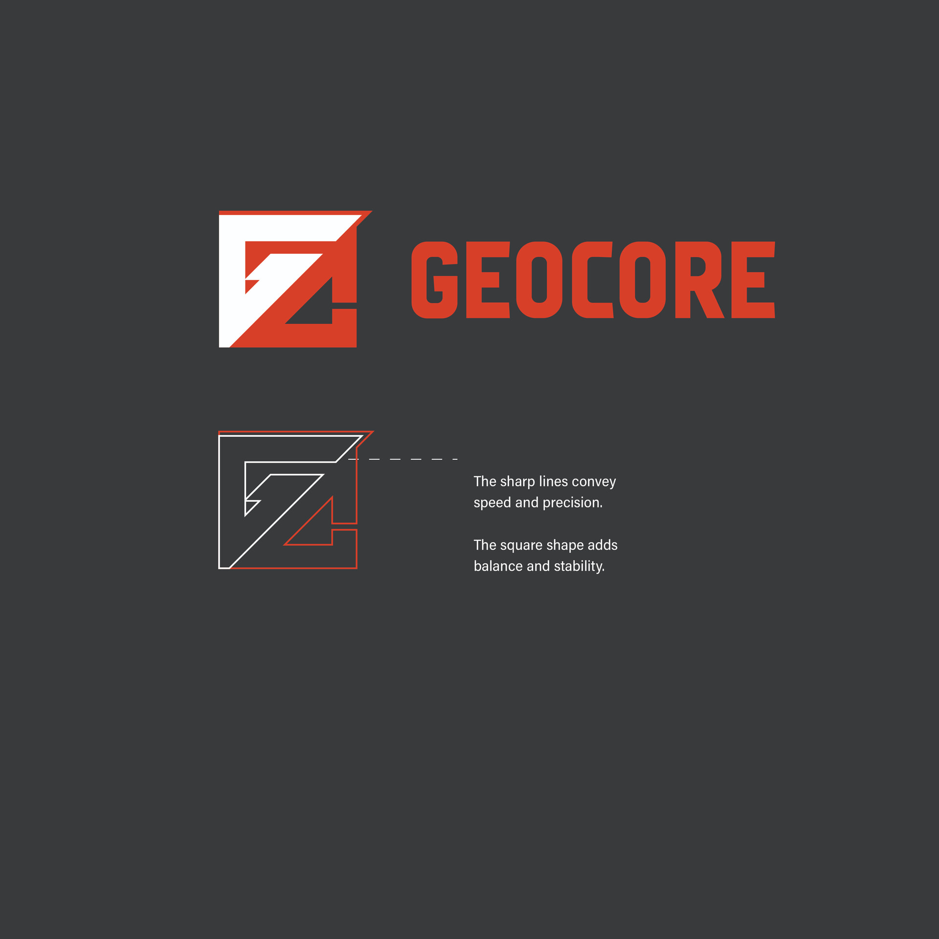
To me, the first logo comes across as a random collection of lines and shapes with little connection to the company. You mentioned it conveying speed and sharpness, but I don’t see it. From across the room, the first thing I see is a Z, which has nothing to do with the company.
The second logo has other problems.
First, it’s simple, which isn’t a fault per se. Simple is usually good. However, nearly all the simple logos are already taken. This one is no exception.
Second, the purple colors are too close to each other for good legibility. In addition, the dark colors will lack sufficient contrast for legibility on a dark background. Your example on a dark background shows exactly that. In these situations, dark and light versions are typically supplied to clients.
Third, I see no readily apparent way to recreate this in black and white (no grays). For a company like the one you’ve described, a logo that lends itself to the occasional use of a single color is a necessity.
In addition to that, you’ve conflated the logo and logo typography with their presentation. Doing that for a client makes some sense, but I’ve noticed a tendency for beginning designers to put more effort into the presentation than the logo itself. Personally, I prefer a tighter, focused, simpler presentation that doesn’t take away from the star of the show: the logo.
I think both concepts have potential, but I can understand why some people see the first mark as a “Z” initially. Concept 1 feels more unique and memorable, though it could use refinement in the structure and spacing for better readability. Concept 2 is cleaner and easier to recognize, but it feels a bit generic.
I’d recommend testing both logos in black & white, small sizes, and one-color applications instead of relying mainly on mockups. A strong logo should work clearly across print, signage, and digital use. Overall, you’re heading in a solid direction.