


It’s a new consulting company that my little brother works with, making them a website and believes a logo might help him a bit (He’s pretty much starting out). He asked me to help out with a logo because I ‘seem’ to be a bit more artistic, but I am by no means a logo designer. I really liked the black and white logo in the files I uploaded but for some reason when I add colors, it seems to get ugly. Any clues as to what to do?
1 Like
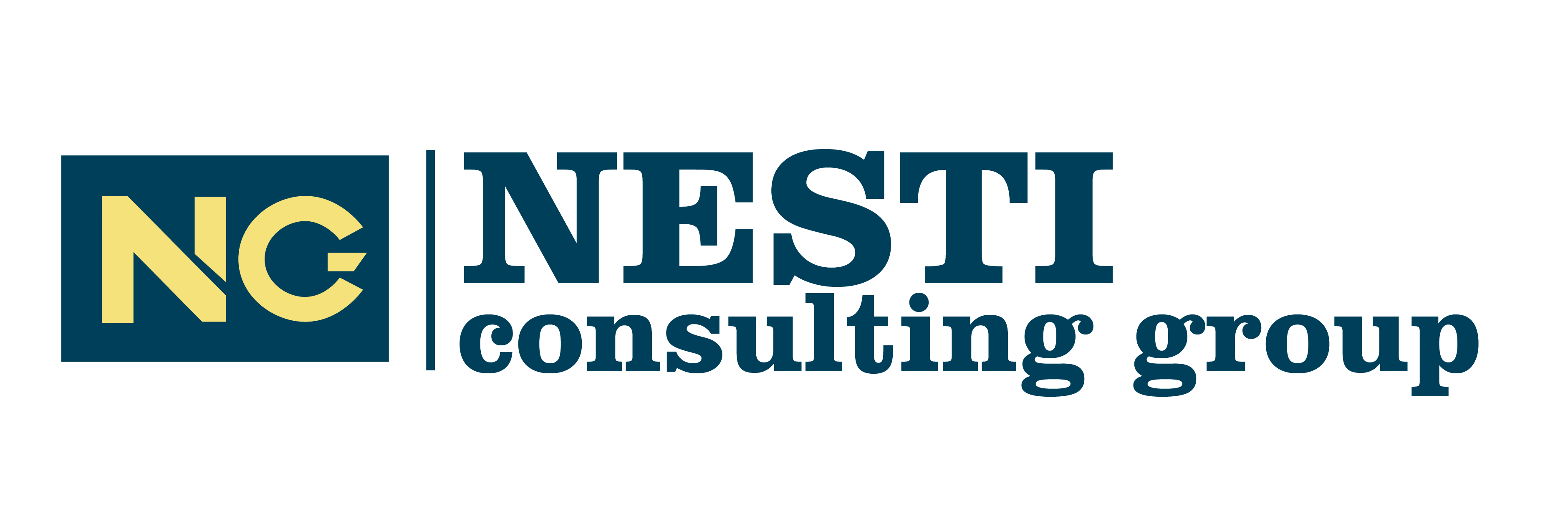
I can tell at least why your b/w logo works better; the contrast. When you start using those colors they don’t have a lot of contrast so the logo turns out bland. Try playing around with one of the colors’ saturation and try to keep it two colors maximum. You also used one capital letter in ‘Consulting group’, it’s nicer to keep consistency here. Also try to evenly align your text. Taking the last logo for example, there is almost no space between NESTI and consulting group. It’s easier to read when you keep more space between those. This contributes as to why your first logo looks good and the rest not so much ![]()
Here’s what I wrapped up as an example since I had PS opened anyway. Sorry about the font, it’s nothing like yours but this was what I had selected atm. By all means anyone feel free to correct me or add anything. The grayscale image shows what’s wrong with the contrast of your colors !
image removed
Sorry, @LandOfFace I had to remove your designs as doing someone’s work for them is against forum rules.
Do not take work posted for critique and redo it. If your critique is difficult to explain in words, a supporting sketch or example to clarify your words is acceptable.
Hello @LandOfFae, and thanks a lot for the feedback. It’s kind of surprising how much of a difference the colors make. Thanks for the insight and advice.
Does the company consult for any specific industry?
I think serif typeface communicates well, but I’d be carful with the thinner strokes. It may give the perception of feeble/weakness. You may want to look at a serif family with thicker strokes–or custom make it, there are only 5 letters to contend with. If you haven’t looked into colour/colour meanings especially within industries, look for some articles on strong colours to use [for what colours work best] with consulting groups.
I don’t think it needs an icon. The name is short enough that it should be able to stand and be recognized on its own.
Also, other than the subtle reasons as to why the colour isn’t working. You’re calling ‘group’ out by distinguishing it apart from ‘Nesti’ and ‘consulting’. ‘Group’ is probably the least important word in the wordmark. If you were to colour ‘Nesti’ in red, and ‘consulting group’ in blue, it would work better (again do some research on colours and their meaning in regards to industries).
Just understand if you’re trying to drive meaning out of the colours, you’ll loose that meaning when it’s printed or displayed in black.
@Sparrow. I hadn’t had the time to work on it but will get back to it today. It seems financial management consultants shy away from shades of red, so I’ll let that go and also apply some of your advice to see how things work out.
Thanks.
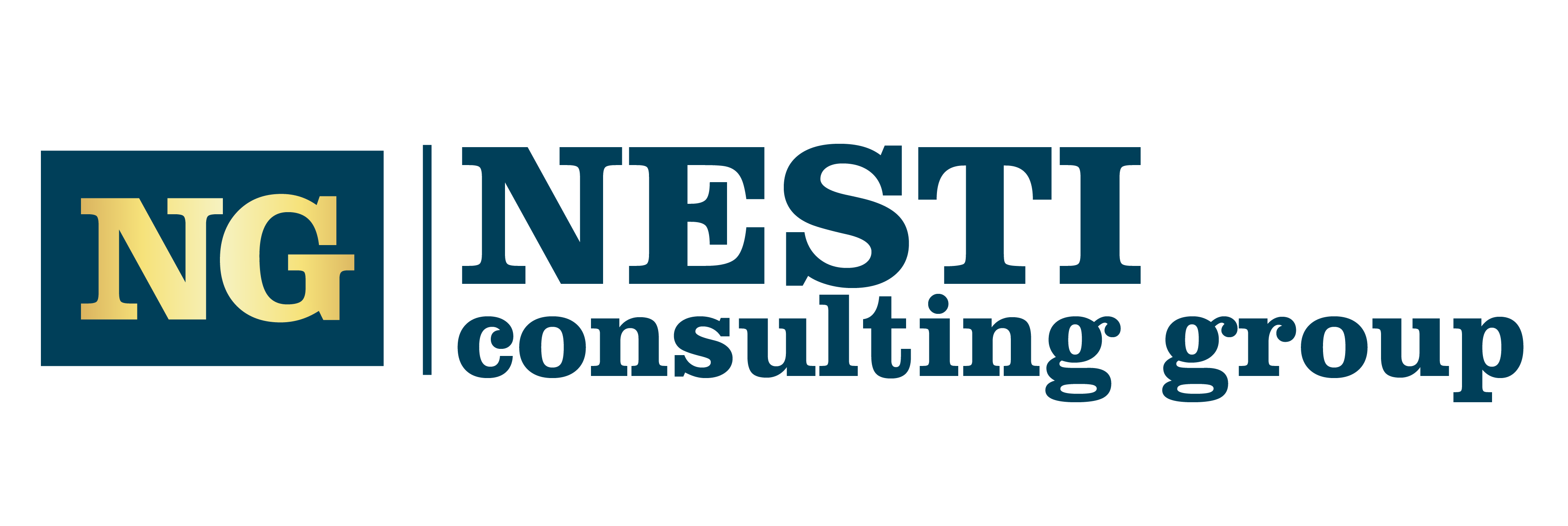
@LandOfFae and @Sparrow, thanks again for all the help. It was short but extremely efficient. I feel like with your advice I’m a lot closer to something I can actually be proud of and I also learned quite a lot. As for the icon, it seems the company really wants one to reuse later for other purposes. And they like blue and gold as colors. I’ll keep tweaking little things to see if these logos can be any better.
But then again, all that’s only my opinion. What do you guys think of the new versions?


1 Like
Heya no problem, with pleasure! I find it really difficult myself to judge something I’ve been staring at for hours.
Great improvements! My personal favorites are 2, 3 and 5.
The 2nd I like because of the color combination. Though the gradient is a daring choice. Love the purple/blueish hue though.
The 3rd is fairly easy on the eyes and very clear and professional looking. Alignment is very tight. The symbol of the G is not entirely working in my opinion. It’s supposed to be an ON switch right? Perhaps you can extend the stripe of the G so that it is more recognizeable as the letter G. I’m also wondering whether the NG could have a different color from the full name. Either play around with some color of the stripe on the G or an entire color change. Somehow I feel like this logo is very strong but it needs more emphasis on which part of the logo is most important for the viewer.
The 5th; My only comment is that I don’t think the serif and sans serif fonts are fitting together and that the alignment could be executed better. I’d choose either completely different fonts (fe: futuristic and sans serif or serif and edited serif symbol) But the latter comment about the alignment could be very well a personal opinion. Otherwise very clear and nice colors.
Those are my thoughts. Looking nice! ![]()
I’d say going the route you are, the second is your best bet. I’d probably get rid of the gradient, they don’t typically print well–so depending on the promotional or collateral products/stationary they are going on, it may look like poor quality.
I think you now have too little contrast in the line weight of the “NESTI” type, but you’re close.
The other “NC” logo looks like “NG” or a sideways power button, I’d veer from that iteration. Why is it “NC” and not “NCG”? Also, I’d probably make the container for the logo a square, rather than a rectangle, and shrink the “NC” more to give it some breathing room.
I’m not a fan of either of those blues, but that’s purely my eyes and brain. something close to this #458ccb maybe. It’s a little more of a “trusting” blue.
Hey @LandOfFae and @Sparrow. Thanks again. He also liked the second. But he insisted on the G used in the 1st. I tried to extend the horizontal a bit. He says the gradient is also not an issue and he can use that.
Be sure your lockup is done with Pantone spot colors, with appropriately selected CMYK and hex equivalents available.
While you can use the gradient as a bling option, I wouldn’t make it your primary for reasons mentioned. I favor the stronger gold of the 4th logodown, but maybe a step lighter so you get the contrast against the blue. Don’t go too washed out.
Be VERY careful if you go with the blue on the 2nd one down. That approaches a non-printable blue called Reflex Blue. All of the blues in on that “bright” side of dark blue are unachievable in CMYK, and just about any other print process out there besides spot ink printing.
Yes, I can imagine financial advisors wanting to avoid red ink at all costs! LOL.
@PrintDriver thanks. I’ll do that and also try and modify the gold a bit. I’ll check with them to be certain if all this can even work out with the equipment at their disposal.