Hello everyone this is my first post in this awessom forum , i’m a begginer in graphic design i would like to hear your opinion about this logo.
Did you design this in Photoshop?
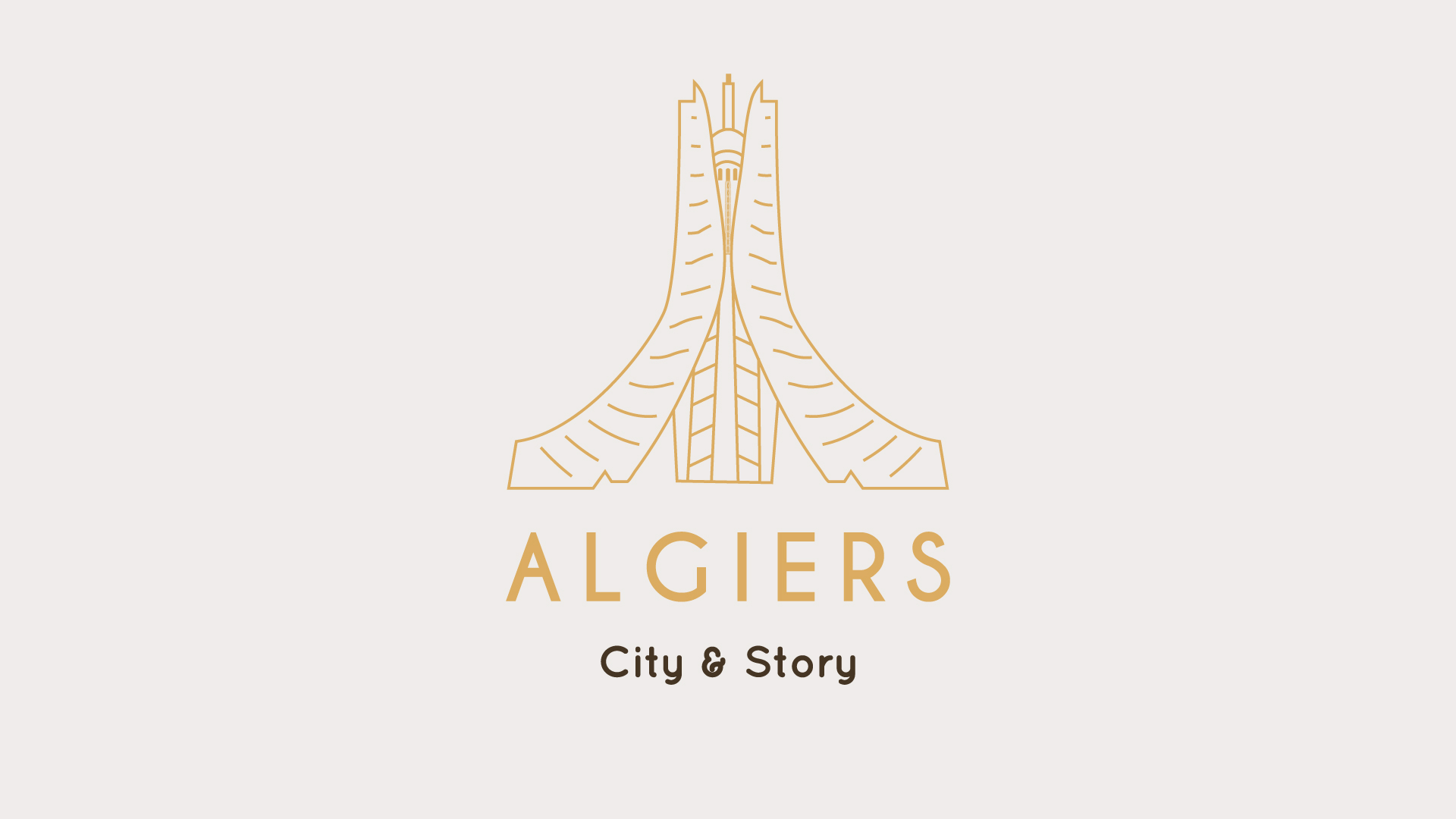
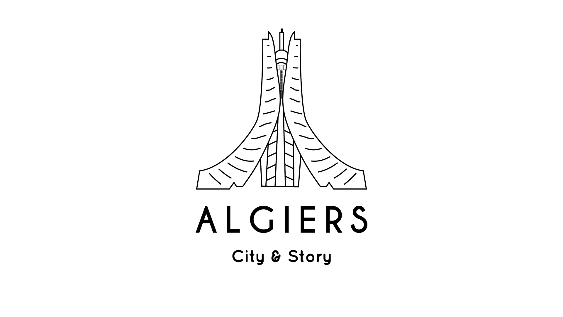
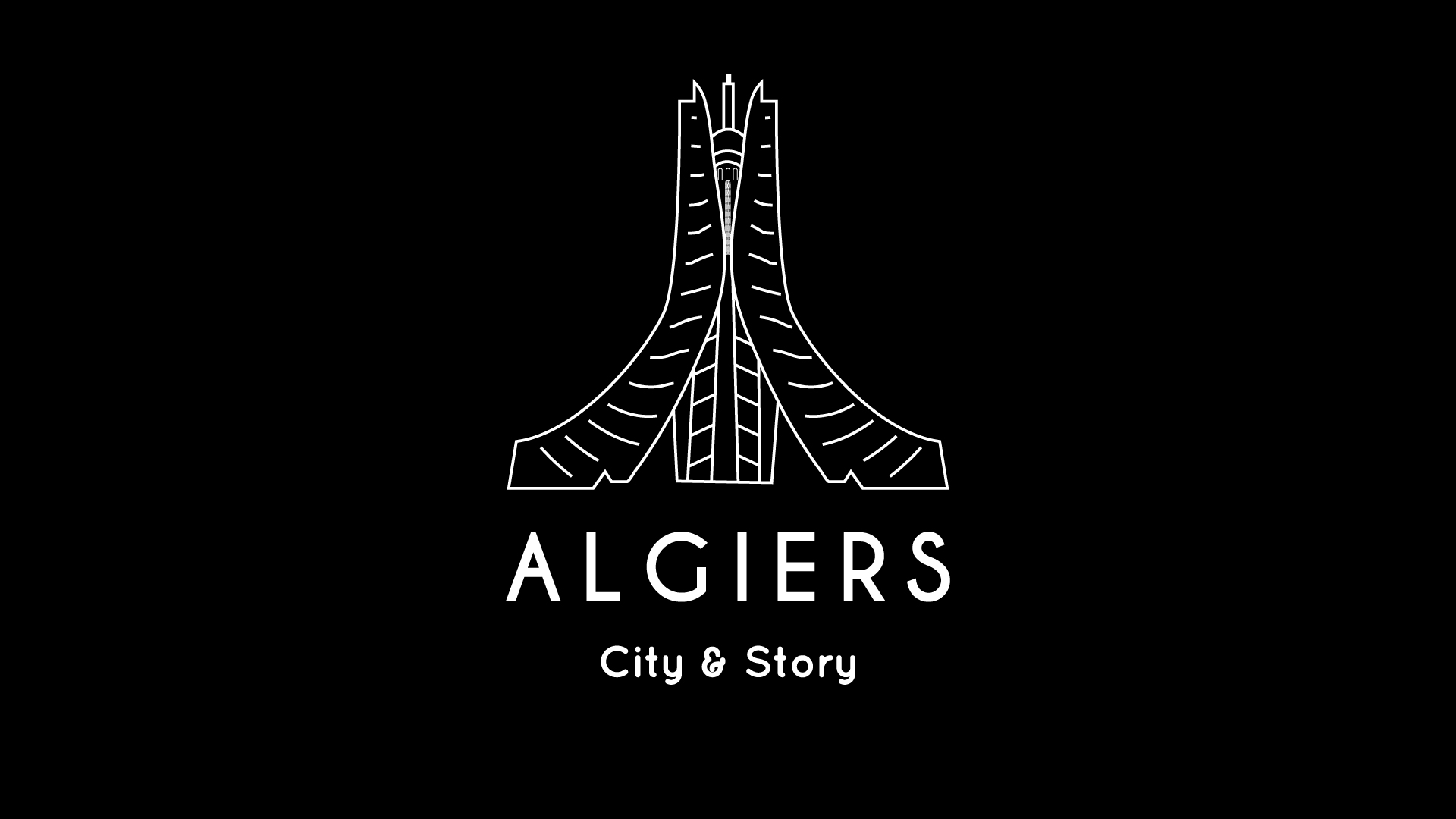
Your thin lines are breaking down.
Your outer stepped lines are not equally or logrithmically spaced.
Those thin lines are raggedly drawn.
Some elements are so small and finely lined that they are not showing up at preview size. They will be lost on smaller printed pieces. You can see the logo is already filling in when done as white on black.
Besides. Stroked objects all with the same stroke width are (yawn) boring.
Give it some life.
The typeface, I could take it or leave it.
1 Like
Thank’s for your replay and time sir! i actually use illustrator doing this logo i will take your remark in consideration.
A clean logo
I like the Font that you wrote ‘’ Algiers’’ with… But as PrintDriver said, in the small size, it really disappears
city story font is not OK take some capital letters
make the center part taller than side parts
I’d vary the line thickness in there some, maybe add a few areas with shades (opacities). Hard to tell by the pic but if that is architectural I’d def throw in some shading. Maybe cross hatch in this style. I like the colors in the first but neither of the back and whites as is (mainly because all the lines are same width).
“City & Story” font is totally wrong.
Same design in different style and colors very nice touch. And I like here first one and third one, excellent work.