Logo concept for an architectural office based in Scandinavia. The name ‘Vága’ means ‘to dare, to venture’ in Old Norse. The design draws inspiration from Scandinavian runes and a simple, abstract form. This is the first sketch, and I’m wondering if this idea has potential. I would greatly appreciate your thoughts and feedback
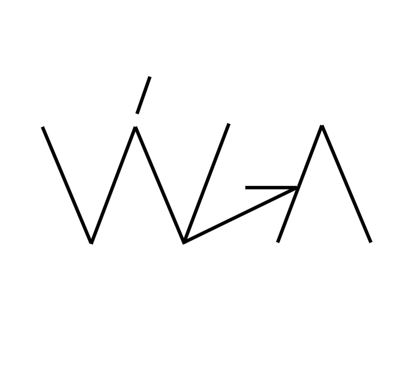
It doesn’t quite read as “Vága” it looks more like “W—>^” to me.
It kind of reminds me of the Sony Vaio logo in terms of abstraction. While the Vaio logo wasn’t immediately legible either, the explanation behind it told a clear story that made sense, helping people connect with the design.
With your logo, I’m not seeing any story or meaning. It just feels like a collection of straight lines without a clear sense of purpose.
Logos should solve problems, communicate the brand’s identity, and convey meaning. They should tell a story, resonate with the target audience, and ultimately make a lasting impression.
1 Like
I’ll let you try to find an LED tape small enough to backlight that on a building…Or worse, an office wall.
I don’t even think I could laser cut that in acrylic without it warping. Certainly not without breaking it in handling. Water jet probably can’t cut it out of metal either.
What’s the tolerance, out of curiosity?
For what? For LED tape we usually use 3/8" but can get lower power Light Wire stuff for indoor use. Probably can’t do a channel letter for it though.
For the laser, depends on the thickness of the acrylic. You have to account for heat buildup in the thicker material. For a wall logo, most people want 1/2" thick so the letters can be studded to prevent sheer.
We could probably do about 3/8 wide without it warping. But, those contact points would snap if you just breath on them, let alone getting it out of the machine, through the paint department (assuming it’s painted,) getting it to the install site and installing it…
Same with the water jet, depends on the thickness, only there is less support under the sheet to let the blast go thru, so skinny stuff tends to bend. You don’t want tabs everywhere. Gotta account for the coning too. Same with laser, the thicker the material, the wider the cone gets as it goes through and you end up with a tapered edge.
1 Like
A logo with lines that thin is a problem, but I’m assuming this is a digital sketch instead of a finished logo. Assuming it’s a sketch, a pencil and paper work better (at least for me) in the idea stages.
While a logo based on runes is conceptually interesting, it should make logical sense. For example, rune-like letters might be more appropriate if the architectural firm had a niche business designing Scandinavian buildings that relied on traditional construction methods and materials. Perhaps the Old Norse connection with the name justifies a rune theme, but it seems like a bit of a stretch that few will understand without explaining it to them.
In addition, a logo spelling out a business’s name ought to be readable, but this logo is anything but readable. If you hadn’t mentioned the name, I never would have seen VÁGA. Even then, I had trouble deciphering the letters.
2 Likes
My first thought was that a stick figure blew up. Then I saw some abstract lines making a W. Only after reading your post and knowing it is supposed to read “vaga” do I see the “vaga.” I’d say this is a swing and a miss — which is 100% fine and even encouraged at the sketch and brainstorm phase.
1 Like