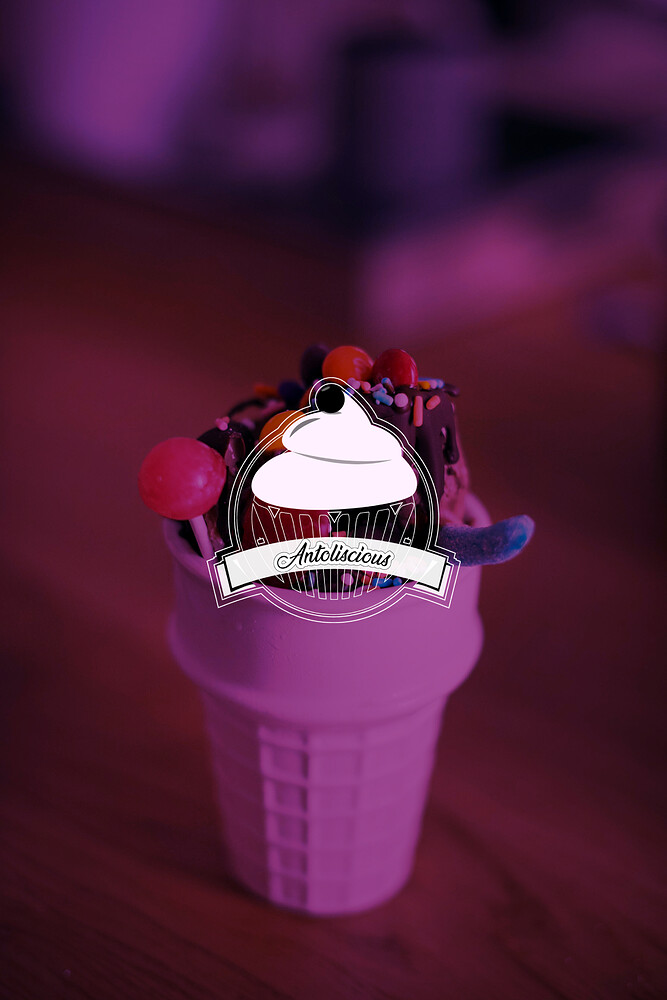
Standard line of advice across the board for most people posting logos here:
Far too complex.
Too many thin lines - nightmare at small sizes for print production
Transparency - will be issues - think if being embroidered or another application on different substrates
Gradients - a big no no
Too many details
I’m seeing the logo on a black background. Not sur if it’s the forum or the logo itself?
You can get the same cupcake case effect with a continuous line and wavy edges at the bottom and top - for example.
Transparency that subtle will be an issue in print, never mind embroidery.
If that’s a cherry on top I’d prefer to see a stem.
Remember that readability is key to communication (which is a primary goal of graphic design.) You have received some good advice here, especially about avoiding lines that are too thin. For certain, make sure that the business name is larger for overall readability. By the way, I do like the type font you chose!
Looking cool logos
Why have you placed a cupcake over an ice cream cone? Why have you used all those thin lines that will cause huge printing problems? Why have you surrounded everything with multiple lines? What is that big dot sitting atop the cupcake — a cherry, maybe? Cherries have stems and cherries are larger. Maybe it’s a blueberry, but it’s a guess.
The cupcake is an interesting starting point, but this is a logo, yet you’ve approached it more like a full-blown illustration. Simplify the cupcake — don’t keep adding lines in the hope of somehow making up for things that are wrong with it. One good rule of thumb when designing anything — especially logos — is that simpler is better. Subtraction is usually better than addition. It’s a rare situation when you can add stuff to work your way out of a design problem.
Why do you think they’re cool looking or “looking cool”?
Everyone above you went into detail explaining why this logo isn’t working. The hairlines are too thin and too numerous, which not only causes aesthetic problems — they’ll cause major printing problems. The round dot is confusing. The various transparencies are superfluous and gratuitous in addition to adding another level of printing problems.
Despite all that (and more), you make a one-line statement about it being cool looking. Again, I’d like to know what you like about it and why everyone else is wrong about this not working as it currently is
its mostly for social media, he wanted to attract attention with the logo and he wanted a creamy, sugary vibe.
OK, that’s good to know because that changes the nature of the problem.
Even so, when the logo is reduced down on a computer screen or a mobile phone, those thin lines will become nearly invisible. The logo is so complex that it becomes difficult make out when reproduced small.
My statement about simplicity still applies, whether for print or social media. You’ve got a good idea, but you’re trying to improve it through the addition of extra elements rather than through the subtraction of what’s not needed. Figure out what really works about the cupcake. Find the essence of what’s good about it and try to refine that idea without decorating it up with lots of details.
yeah i know, if the client asked for a minimal logo, simplicity would work but this is a detailed logo, thats why you have the extras and its for social media, so it has to sit pretty. And when scaled large or small it would pass for an icon, the black and white is only for a transparency, if there was need to put the logo on a picture or something
Unfortunately, despite all that, it’s not yet working for all the reasons everyone — including me — has already stated. You already know it’s not working or you wouldn’t be here asking for advice. You’re on the right track with the idea, but you’ve detoured off from that track and gotten a bit lost by trying to decorate your way out of the problem.
Maybe the client didn’t ask for a minimal logo, but I’m certain that client didn’t ask for a logo that’s so complicated that it won’t work? There are ways to make that cupcake logo work while accomplishing the objectives of it having a creamy and sugary vibe. This is not the same as counterproductively over-complicating the design with a bunch of hairlines and barely discernible transparencies to the point of it interfering with both legibility, reproducibility and aesthetics.
That said, I’ve run into plenty of clients whose great ideas work in their heads but not in real life. If you’ve run into one of those, you have my sympathies. I’m dealing with one of those clients this morning.
So, receipts, invoices, signage, delivery vehicles, embroidered chef’s whites, print ads, and the shop where those pastry cases are will all have a different logo? Odd strategy. Can we see that one?
- You missed the mark - it’s not minimal
- Simplicity is what they asked for - and you’ve done a detailed logo - why???
- What extras?
- What’s that got to do with it?
- It’s not
- It doesn’t work at small sizes
- Any logo should be able to be placed on a background or an image - any logo.
they are just starting out and the brief sent to be was for social media alone
I don’t understand the reference for social media - you think this makes a difference designing a logo?
The basics have to be there - the simplicity, construction, understanding
Any of those logos work on social media.
Amazingly - yours doesn’t.
Ah, so it’s not odd strategy, it’s no strategy. Still though, selling them a brand design that will cause costly production problems and perpetrate an interruption in recognition continuity as the business grows (that’s the objective, no?), is irresponsible on the part of the design practitioner. Just sayin’.
okay, how do you know i didnt make all this arguements with the client? as a designer you should know not all clients give you briefs that make you happy, they make changes we dont like but accept, plus the budget didnt go all out for things, so i had to cut on some things and i told him about future packaging, he said he just wanted it on his instagram page, the logo with the monoline wasnt for the client actually.
So what’s the point in asking us if you already know the brief didn’t make you happy. No mention of that at all.
I ask again - why did you put it up here for critique?
Just wondering - if the client is happy, and you’re happy despite having to take a budget cut for some reason, and designing a logo you’re not happy with.
What was the point?
dude, ease up, i put my work up to know if there are mistakes i could look out for later and i learnt about looking out for opacity when printing. But the rest thats been pointed out i been known them all
Seems like the logo is done - you got a few pointers.
Best of luck.


