My clients are a couple of cancer researchers who need to draw investors. The drugs they are developing have kind of a “key” molecule. I showed them some options and they ended up loving one very much. My challenge now is about color. Of the options I’ve shown them (all below) they have zeroed in on the one, among many, that I feel is now not so good. Please sound off on which of these, if any, work or don’t, and what you might do to “fix” them. Thanks!
Any of these is probably a 4-color logo rather than any kind of spot color solution.
And I’m not particularly a fan of any kind of gradient in any initial logo lockup.
Why is “for” italicized? Really not digging that loooong tagline.
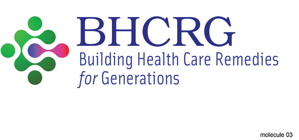
Molecule 03 has too many colors.
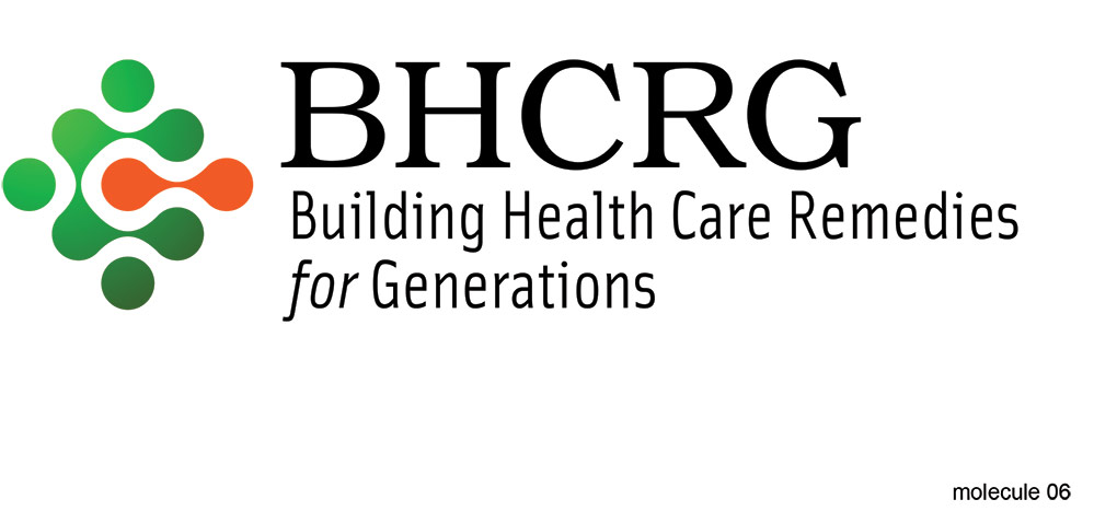
Molecule 06 has the orange-green shimmers.
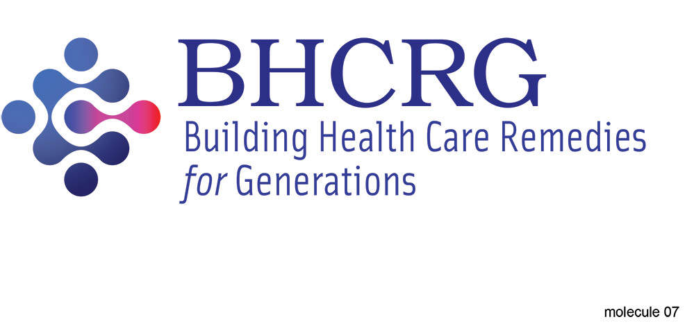
My eye finds Molecule 07 the most pleasing of the lot.
Thanks very much and your points are well-taken. FYI, initial comps were in black-only, and we will have a spot color solution as well. What we have here would be the “fully realized” version for larger and/or 4c and/or online presentations. Thanks again!
I like them, but I guess I’ve seen too many liquid dot logos.
As for which color scheme is best, it’s sort of a toss-up, but I probably like the first one best. I might be inclined to use a neutral dark gray type, however.
I’m not sure the pairing of the serif face you’ve used complements the sans serif, but given the awkward, unmemorable and unpronounceable sequence of letters that form the name and the long ungainly tagline, I’m at a loss to make better suggestions. I’m wondering why the word for is italicized, though. I see no reason for it.
You’re too kind. This is simply not sound strategy.
When the name is a tagline, and the tagline is the name (and it’s a gerund to boot!), whatever brand-marking/logo strategy comes next is already hopelessly hamstrung. 5 initials? If the tagline-name is going to be there anyway, it would be smarter to pare that down to 3 initials, even random, meaningless ones.
The drippydots are fine . . . nice even, but the rest of it is a tactical mistake that you as a designer can’t save.
PD, Thanks for bringing up the Italicized ‘For’. I read that line over, and over, trying to make that work. It doesn’t work.
Maybe simply “Health Care for Generations”
Since that’s one long acronym, and one even longer tagline, Maybe you can modify the acronym portion of the logo to be less direct and more abstract, thus justifying the tagline as it is (less italicized ‘for’)
Pre-press and reproduction:
Simple lose the gradients in the graphic. Personally I like the blue and magenta variation in V3. Just make sure the blue is modified so that it’s not, what appears to be, a reflex blue like color. Unless you plan to convince the client to offset print ALL their collateral. Which, will not happen. Soon, complaints of a purple logo will flow in, printers are being blamed, printers are blaming you, everyone is miserable.
100% Cyan - 50% Magenta (play it safe), and some 25% (maybe more) Black should do it. Consistent printing (mostly) all around.
Plus version 3 has two color print capability with ease. And if you have Process Magenta as one of those two spot colors, you may even avoid (or receive a discount) on your second PMS match.
Over all, I like this design, I like the serif typeface selection. I normally wouldn’t be a fan of that sans-serif typeface selection, but… it just works (in this case).
I like it!
B, oh, it’s Pronounceable, and don’t you think otherwise.
(bhhe-ccc-rrrghh)
Uttered quickly, think, behchurg.
I like the 3rd logo design.
Would you consider different font for “Building…”?