Help please! I created a clean logo in illustrator that has a ring over it (just a simple stroke). When I save this logo as a jpeg or as a png (or a gif) - the thinnest piece of the ring gets pixelated and my client is going insane. (as am I). Any tricks to saving so this doesn’t happen?? Thank you in advance!!
You could try saving it as an SVG. Arguably the thinnest piece of the ring is pixelating, then you could try thickening it up a bit. Logos need to work at all sizes, or have a separate version for small sizes.
Thank you for your response! An SVG 100% saves it perfectly - but I can’t upload an SVG to linked in to showcase their logo or their header and it 's looking pretty poor. Interesting idea about thickening the stroke - I will try that now. Thanks!
Thickening it up is not going to change the pixelation, in terms of resolution, but you will get a bit more meat on it and thus more density, if the size you are reducing it too currently means the antialiasing reduces that part of the logo to a couple of transparent pixels thick.
Any other tips? Not working yet - I really appreciate you trying though!
Show us an example - what size is supposed to be - what is it for (web/print/ms office??)
Mentioning the exact problem is not possible without seeing the logo and knowing the size you’re making the logo.
However, the problem is likely the line being too thin to hold up at whatever pixel density you’re using. In other words, there aren’t enough pixels available to keep the line looking sharp and well-defined.
There’s not much you can do about that other than make the logo larger, increase the thickness of the line or increase the resolution so that the line contains more pixels.

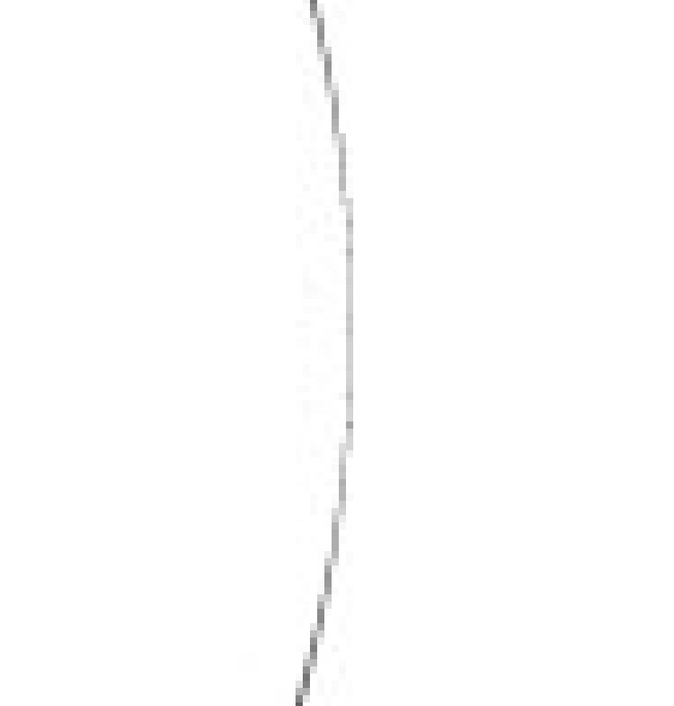
Here is the logo - I am trying to get it into linked in both as the profile pic as well as incorporated into the header. I cannot for the life of me get that ring to not pixelate. I have enlarged, tried to thicken the stroke, saved as every format…etc. LInkedin will only accept png, jpg, or gif.

There will always be problems with that thin line for exactly the reasons I mentioned previously. In those instances where there aren’t enough pixels to define the line, there will be issues.
The screen capture below shows the problem. The line is so thin that it’s only one pixel wide, and even then, the line is antialiased into white and has become grey as part of the rendering algorithm’s effort to maintain legibility. The resolution really becomes a problem where the curve requires that the bulk of the line shift from one pixel column to another, creating a stepped effect.
You’ve run headfirst into the limitations of the medium. At a given resolution, there are only so many pixels to work with. When you have a line too thin to be properly defined by the pixel density, you end up with exactly the problem you’re describing.
It’s best to avoid these problems by not creating situations where they can occur. In other words, don’t make logos with details so fine that they cause problems.
Yes. Go to your original Illustrator file and check your document resolution. I am guessing that it is set at 72 dpi (very low resolution). Change document resolution to at least 300 dpi or larger (full vector can handle up to 2400 dpi) and then try your export again.
I would love to see if this idea worked (changing the dpi to 300)
The original poster said the logo was for LinkedIn — in other words, a website. There’s no such thing as dpi (or more accurately ppi) on a website where sizes are relative to pixels.
1 Like
Ahhh, my bad. I didn’t see that. Just-B is right. Looks like you will need to thicken up the thin line.
I think the best execution, while changing the logo just a bit, but would be to embrace the line getting thinner and remove it all together. It’s the effect they’re all but going for and seeing as it’s going a pixel wide at full size, logically it would completely disappear at any smaller size. I’d experiment with thickening it up if there was a drop shadow or something to further reinforce that right hand edge of the circle but since there’s not it seems like they want the circle to bleed out.
If you make it a half moon shape that ended somewhere around the middle of the green leg of the arrow it might possible work.