Logo Poll

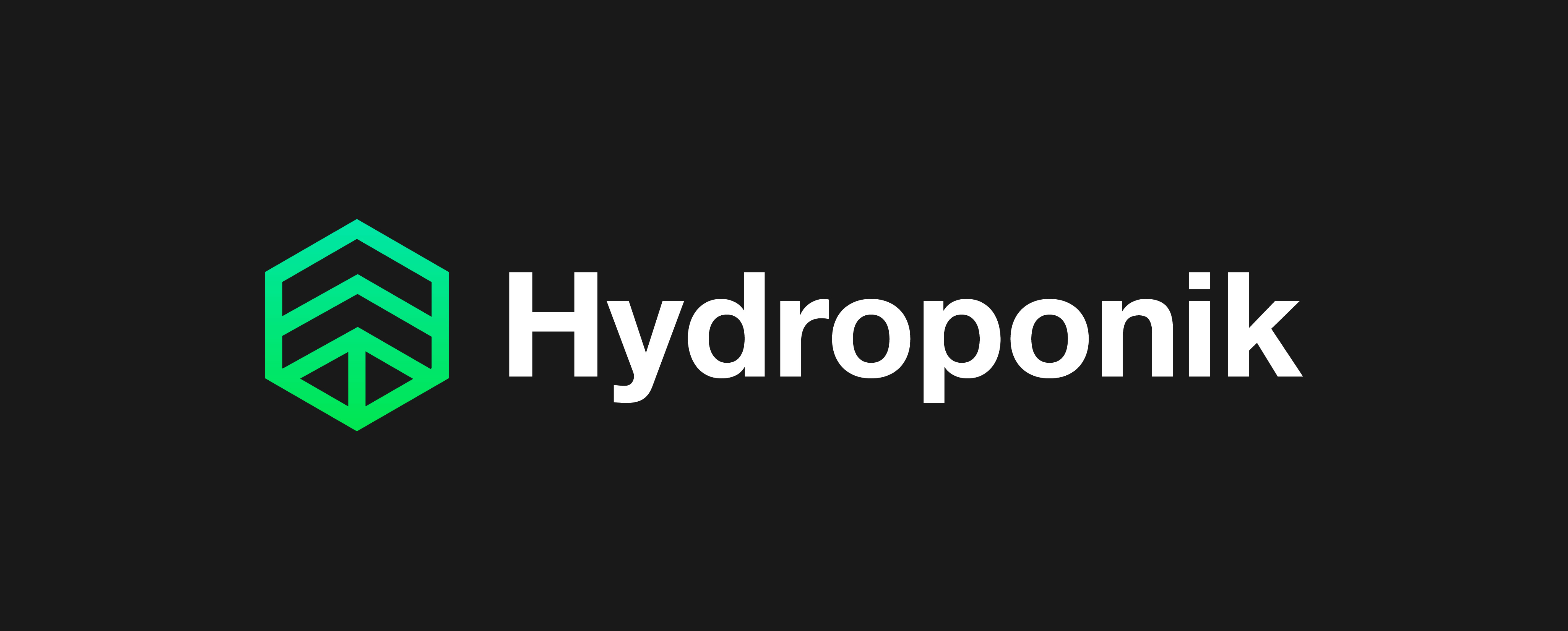
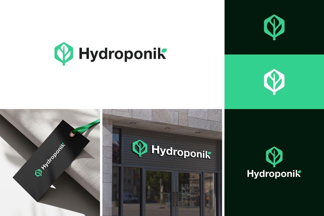
I am making a logo for a hydroponic business, retailing indoor growing equipment supplies such as nutrients, pest control, grow lights, grow tents, pumps, heaters, ventilation etc.

The business will be called Hydroponik (with a ‘k’)

Attached are 3 Logos ideas. All shown with dark and light backgrounds, and also Mono.

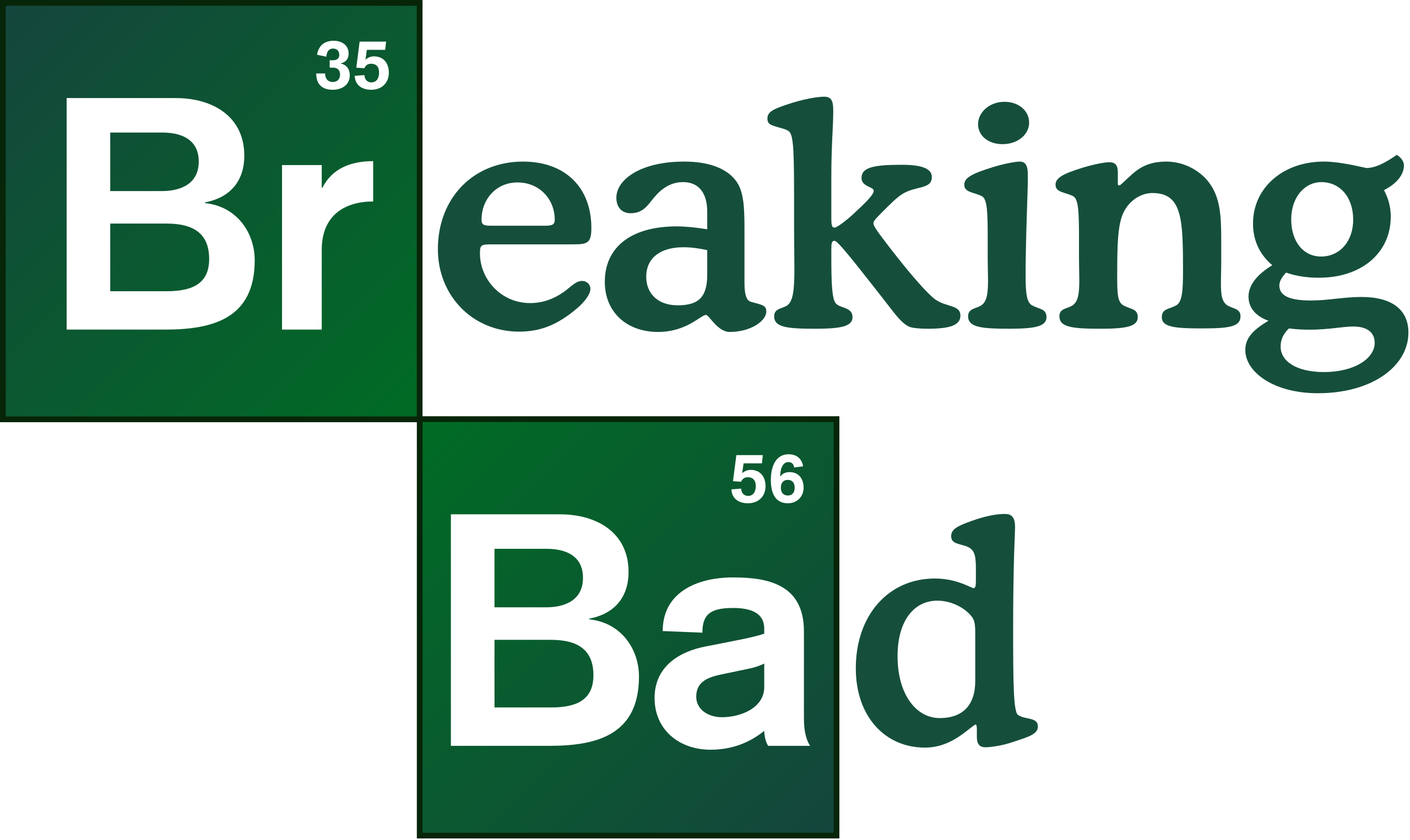
I would like to go with the scientific theme, so my idea for the icon was a periodic chart style (hence the uppercase ‘H’ and lower case ‘p’, and number 1)

(The chemical element symbol for Hydrogen is number 1 on the periodic chart and is usually shown in green, and as it starts with the word ‘Hydro’ it kind of all ties together nicely)

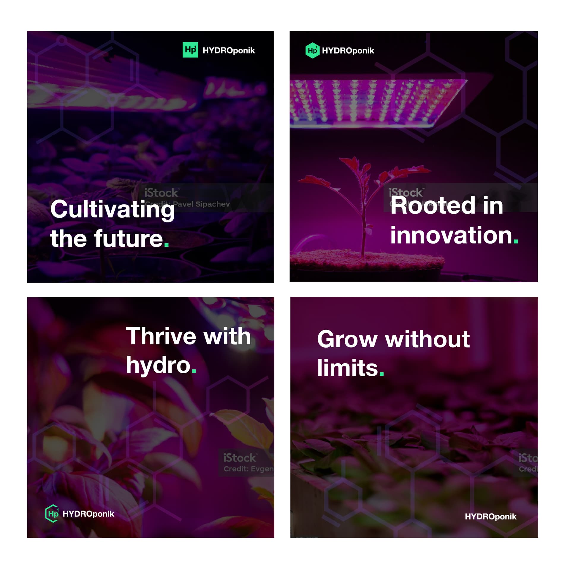
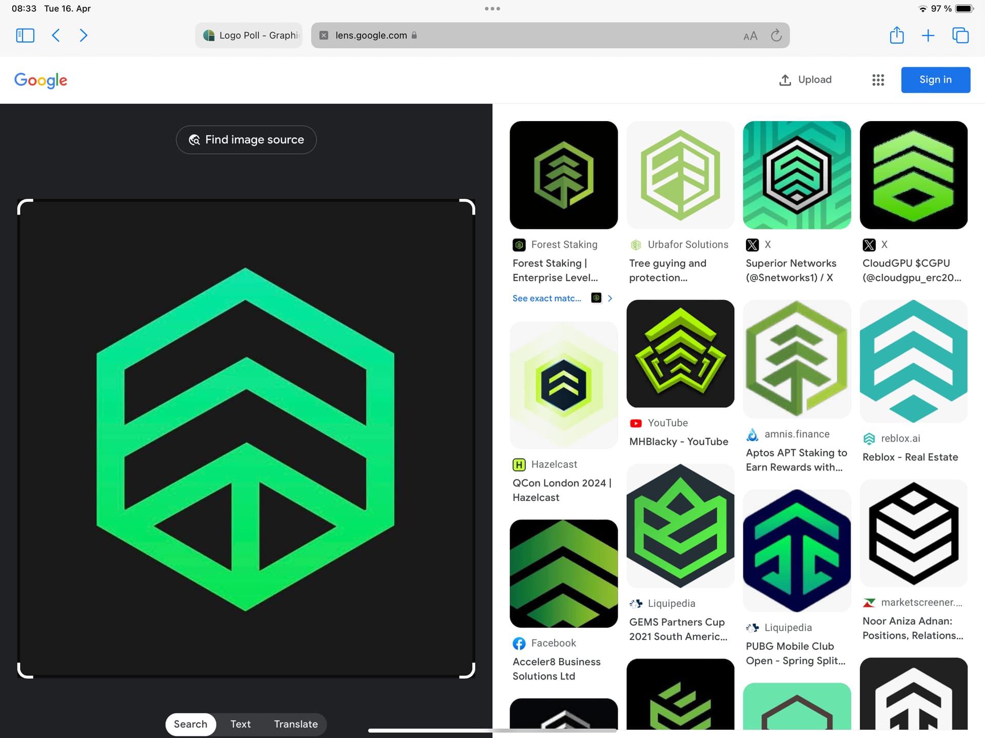
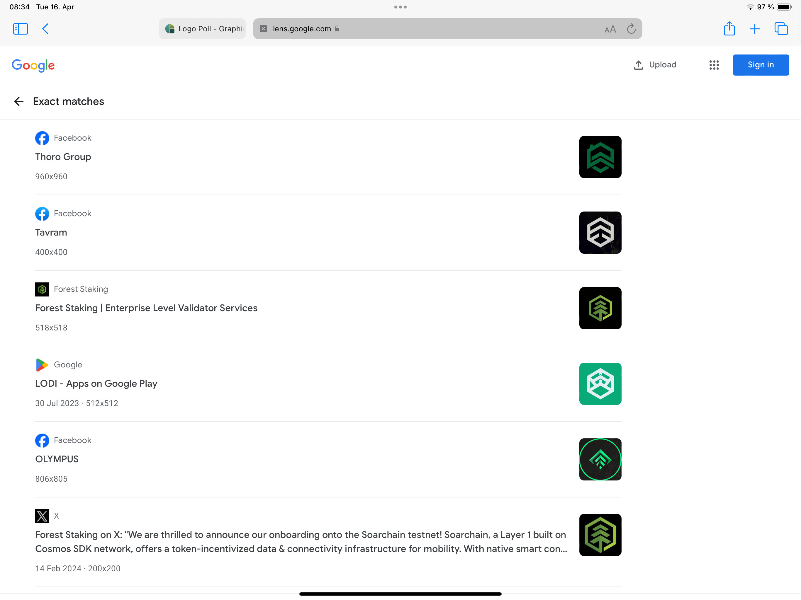
Also attached are some ideas for graphics to be used on printed material such as flyers, letter heads and also social media posts etc which involve the hexagon shape chemical compound graphics. This is not meant to be part of the logo but will be a part of the overall brand identity.

With this in mind, which logo do you all think works best? 1, 2 or 3

1 Like

It doesn’t make any sense. All the logos are the same.

H is periodic element hydrogen

Hydro is typically related to water.

Having the number on it is confusing and makes no sense.

1 Like

@Smurf2 3 logos are uploaded. One in a square, one in a hexagon, and one in a cutout hexagon.

Hydroponics is related to water… it means to grow plants in water.

The number was to nod to the style of a periodic table element… like the Breaking Bad logo (attached)

1 Like

Yeh but br and ba are periodic symbols and the numbers match the table.

Yours doesn’t match. It makes no sense.

I know you used different geometric shapes but they’re not different enough to be different.

It’s the same logo, not 3 options.

Sorry its just not enough of a change.

And the numbering makes no sense.

@Smurf2 Ok then. I get you. What do you think to just logo 1 (in the square) but without the number 1? So it will just say ‘Hp’

In Breaking Bad , a chemist and chemistry played pivotal roles. Does your client want to stress the role that science and chemistry (nutrient solutions) play in hydroponics? If so, I like the idea. The periodic table reference might be less appropriate if your client is primarily a hardware retailer with little concern for the science behind what they sell.

Luckily, most of their customers are probably aware of the science involved and will understand the periodic table reference. The square, the color, the typeface, and the upper and lower case make it pretty obvious to anyone who’s ever taken a chemistry class.

If it were me, I’d drop the atomic number. Yes, it always appears in the periodic table, but the table also includes the element’s atomic weight, which you’ve omitted. In addition, the atomic number usually occurs in the upper left instead of the right. Positioning it on the right makes it appear more as a superscript. All this considered, I’d drop the 1.

I like the hexagon’s look, but it implies carbon and organic chemistry. The reference is appropriate for plants grown in a hydroponic solution, but the hexagon loses the periodic table associations, so I’d lose the 1 since it no longer makes any sense.

Despite my comments, I like the idea (if it’s appropriate for the client).

pH level would be appropriate.

The hexagon makes more sense for hydroponics as hydroponics doesn’t focus on 1 element, but takes many elements from air and water and other sources.

A bit of research shows hexagons would be more appropriate but still very cliche.

But when I research hydroponics logos I don’t find that shape, so unless it’s scientific based it’s not appropriate.

Most go for leaves, water drops etc.

It might be unique but is it appropriate?

What is the assignment?

What is the unique selling point of the client/product?

Ok I’ve took a new approach.

Replaced the ‘Hp1’ icon with one that represents a tree / plant and signifies growing by the up arrow

Does this work better with the hexagon shape chemical comppund branding?

Plus added a slight gradient to the colour.

Also made a change to the way the text is stylised to keep it simpler from ‘HYDROponik’ to ‘Hydroponik’

Still keeping the ‘k’ spelling as that’s what makes the brand name unique

Any thoughts on this are appreciated

1 Like

I quite like this. Have you searched to see if you can find a similar logo in use?

I’m not sure the gradient is needed, but it could easily be left out and printed solid as needed. I like the mention of science, which helps support the organic molecule overlay. The upward arrow in the tree logo is great. I even like the green period after *The science of a greener life."

However, the green color lies outside the CMYK gamut, but it works well for RGB uses. I suppose a duller green would suffice for CMYK purposes

1 Like

https://lens.google.com/search?ep=gsbubb&hl=en-AT&re=df&p=AbrfA8qayzm3n-5Aj7ABMre4nrQrTrM7Z4Iz7qJmVxeCJgwZ8TuAyfM-PO61pmBfPYTQM4eWhSoX9rvYZ2aDxLjO_DouBFFqmx6xC4GzLZSTjN29u9t585AIsdhX9NJS0e2xfdV0l2JPAv0x2lI96_CUBk_fs3Plh-LzMqEf716t3rkkg7eKt-bu3Hf05UHA6Yl7cZEpC6QaAd8nKQ%3D%3D#lns=W251bGwsbnVsbCxudWxsLG51bGwsbnVsbCxudWxsLG51bGwsIkVrY0tKRGxrWkdFeU5XWmtMVEJtTkdJdE5ESmhZUzA0TWpReUxUZzRPVEprWWpGa01URmxaUklmTkRSYVpITkRObGx0WlRCV1RVbG5SM0JuU1V4dVVEQTBaRzVzV2pkb1p3PT0iXQ==


2 Likes

I too really like this. I also wasn’t bothered with your first versions, the criticism of the periodic chart just seemed a little too narrowly focused. That said, I think this version is better. I really like the word all the same cap treatment, and the symbol is both precise, had the nice nod to organic chemistry with the use of the hexagon and the little tree element is surprisingly effective. It also appears from the other posts, that even though similar - I mean, these days… what isn’t similar to something - it appears to be unique. Love the color palette.

1 Like

Sorry, if you’re going to enter a market that is scientific by any measure then you can’t skimp on factual design elements.

It still annoys me that ponic is spelled incorrectly.

If I saw it as a brand I would say it’s weak, not researched, not accurate, and professionals would laugh it out of the room.

If I presented something like that, and I’m actually currently actively engaged in pharma work, I wouldnt get very far.

You have no idea how fickle the industry can be.

The hydroponic is a very niche market and people who do this work are academic.

This brand logo is not by any means in that wheelhouse, and the target audience is a huge miss here, especially on the first round.

The 2nd round is a complete rip off, not thought out, just another stolen idea.

Very disappointing.

I can’t do anything about the name this is what the client has chosen. It was originally going to be Hydroponix which would have been better but the domain, and company name is already taken.

Hence why now days a lot of companies have to be creative with business names and use deliberate mis-spellings for branding purposes. It is a popular marketing tactic that is now widely seen.

Fiverr.com, Froot Loops, Lyft, Tumblr.

Also you see many hydroponic products and shop names deliberately stylise the word ‘Grow’ as ‘Gro’.

I’ve just put ‘Hydropnic Shop’ in google images and seen a shop called ‘Gro Wize’

The ‘scientific’ nature of it all is a branding gimmick more than anything… it’s not like proper serious style laboratory style science.

Take ‘Shogun Nutrients’ for example… you have pictures of Chinese warriors and sumo wrestlers on their products.

Or ‘Advanced Nutrients’ that have a pictures of a gorillas, mermaids, skulls, and all sorts of weird stuff

If it was a pharmaceutical brand, then I agree this would probably not be suitable and instead would have to be super professional.

Let’s be honest, most customers of hydroponic shops are growing you know what… I really don’t think the spelling of ‘Hydroponik’ is going to offend them.

You say the logo is a ‘rip off’ but most hydroponic shop logos are pretty much all the same, basically a leaf, or tear drop of some kind… I personally thought the arrow one was a little more creative but still in keeping with a leaf design and still minimalistic and simple.

Anyway… see attached new design. My thought process behind this was the leaf on the ‘K’ emphasises the mis-spelling as to not cover it up like it is a mistake, and also incorporates the typography into the new icon.

What are everyones thoughts?

2 Likes

I like how this has evolved. The rounded edges soften the geometric shape nicely, and you’ve created some really interesting negative space with the leaf/tree inside. The leaf on the ‘k’ is a great touch that prevents the type from being too cold and clinical and creates a nice rhythm that leads your eye through the design.

1 Like

Well the previous issue of the misspelling is gone by the simple.fact your tried a scientific notation that didn’t work on top of a mispelled scientific word that didn’t work.

All that is gone now.

When you first mentioned hydrponics, I thought you were referring to commercial vegetable farming. Small-time home growers of smokeable forbs is another matter. I agree, the k at the end seems fine considering the target audience.

I really like it.

Is it weird that I think the main green leaf logo/icon and the little leaf on the “k” distract from each other?

I sort of feel like one makes the other superfluous.

I like the whole thing in general though.

Normally I don’t like it at all when there is an independent symbol and an additional visual element is integrated into the font.
But here it forms a pleasant visual bracket and doesn’t bother me because it’s placed at the very end. For the same reason, I don’t confuse it with an h.