That is my first post on the forum. First of all, I am doing it for fun, but maybe I will be able to create visual identification for my company.
Brief:
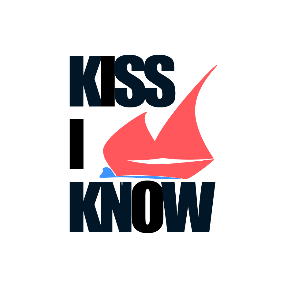
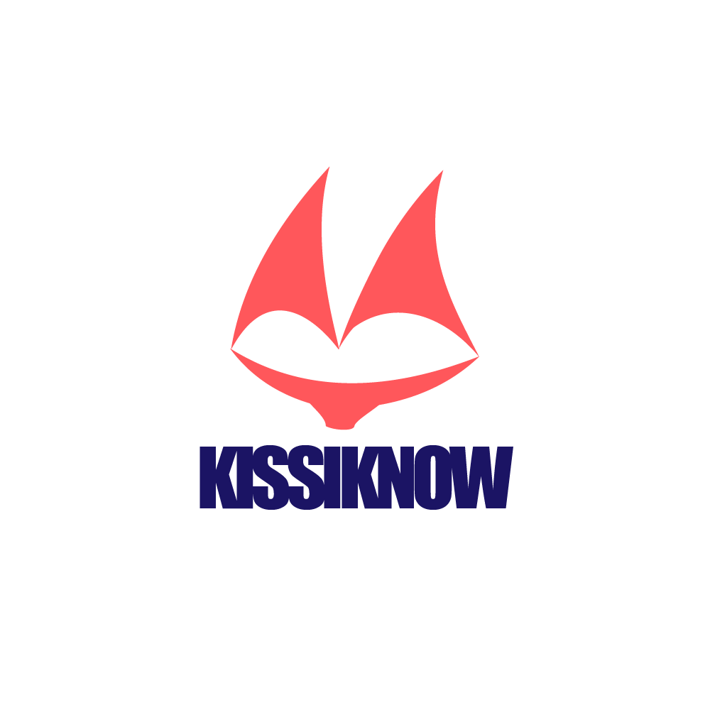
Company name: KissIKnow
It may sound weird but I know it means nothing. But as you pronounce it’s similar as name of one lake (Kisajno) in Poland where the company exist.
We are organizing the event on the boats, so I wanted to some how connect the name of the company with what we do. Whats more, music, all around.
So that’s the first draft, tell me what do you think about it:
So the logo is a combination of lips and sail boats, right? I guess that mostly works, but morphing two things together can produce some strange shapes that seem a bit forced. Yours might be wading into that territory. Another thing: why are the vowels a slightly darker color than the rest of the letters?
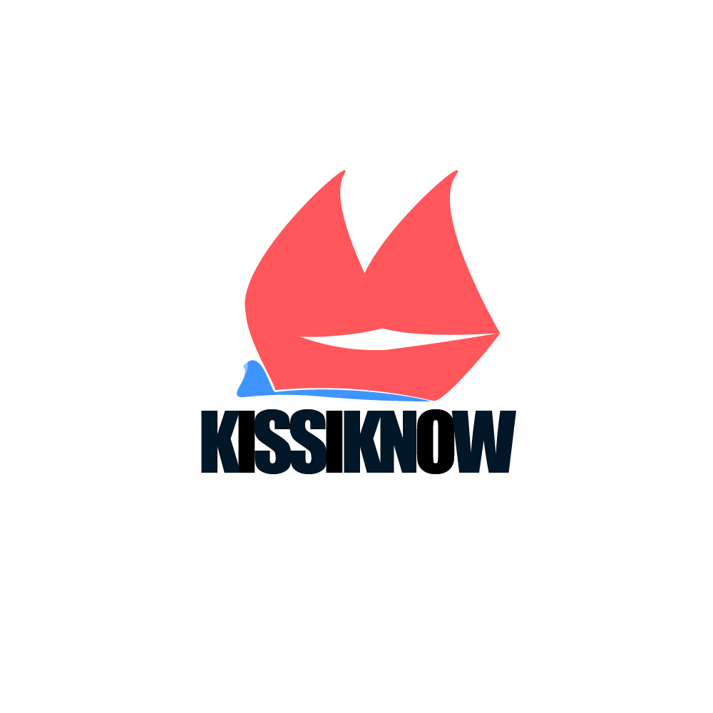
Yes, its the combination of lips and sail boats.
Yeah I didn’t check the colors, that’s true, I will repair it.
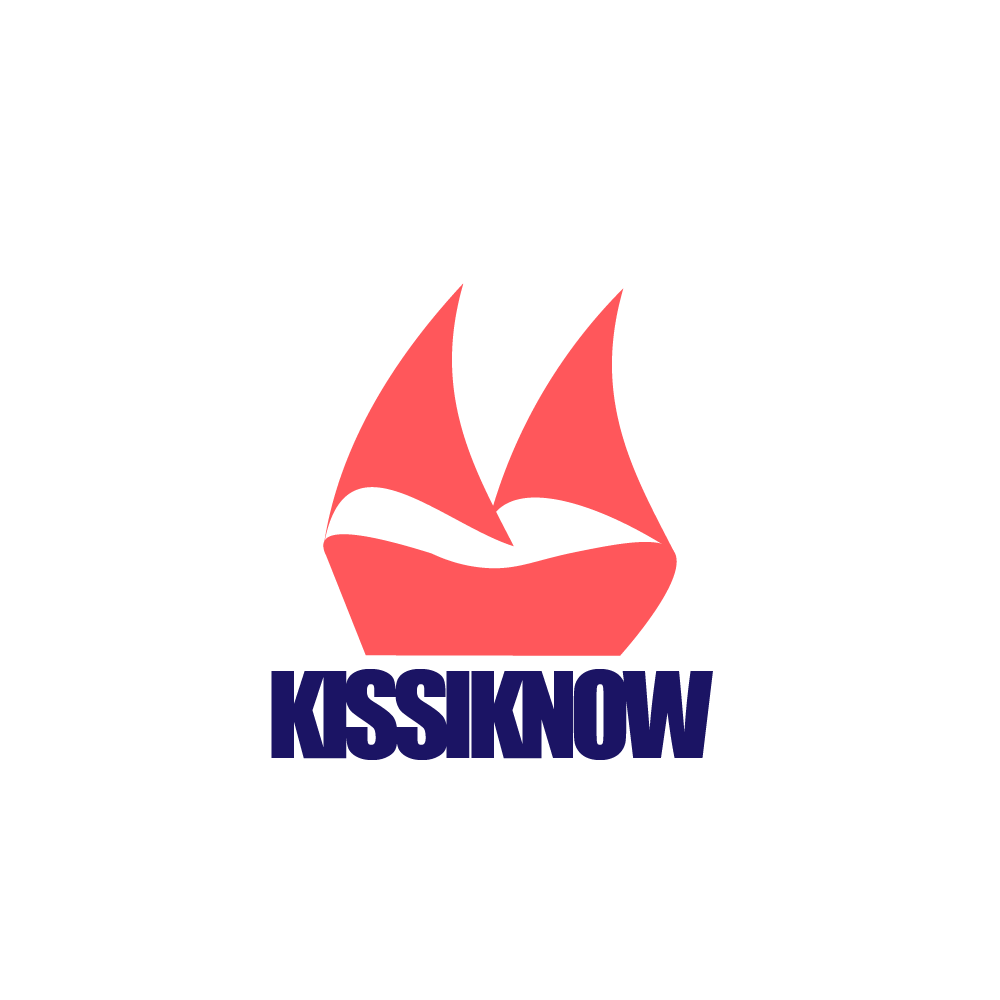
About the shapes Do you think I should simplify it? I will try and come back.
I don’t know if that shapes gonna work better or not, but I think its a little bit easier, maybe got far away from lips, but I think its still sth what is coming on your mind when you are looking at it.