I came across this AI logo review tool - looks interesting!
Has anyone tried dropping in some well known logos to see what it says?
(I can’t. Blocked by my server for some reason.)
I’m curious to see what it says for well-known logos too, but it says in the terms and conditions that one is not allowed to upload copyrighted content, so it would most likely be a violation to upload one.
Logos aren’t copyrighted. They’re trademarked…
Oh, thanks for clarifying!
Yeah, but if a “logo review” site doesn’t know the difference, it isn’t worth the time or effort.
1 Like
I was going to give it a shot .. but you have to create an account. ![]()
Hmm, I hear that, but I don’t know if that’s the case here - but, for sure, I didn’t know the difference and I appreciate that you clarified.
@PrintDriver @RedKittieKat and anyone else wondering, someone actually did upload a well-known logo - the Youtube logomark - check out the review.
2 Likes
In my opinion, this tool is not beneficial yet. On the contrary, I’m afraid it is misleading. Furthermore, I strongly believe that, in order to review a logo, one must understand the company, which this AI cannot do yet.
I have got a free account which offers two reviews per month. Which two logos should I upload?
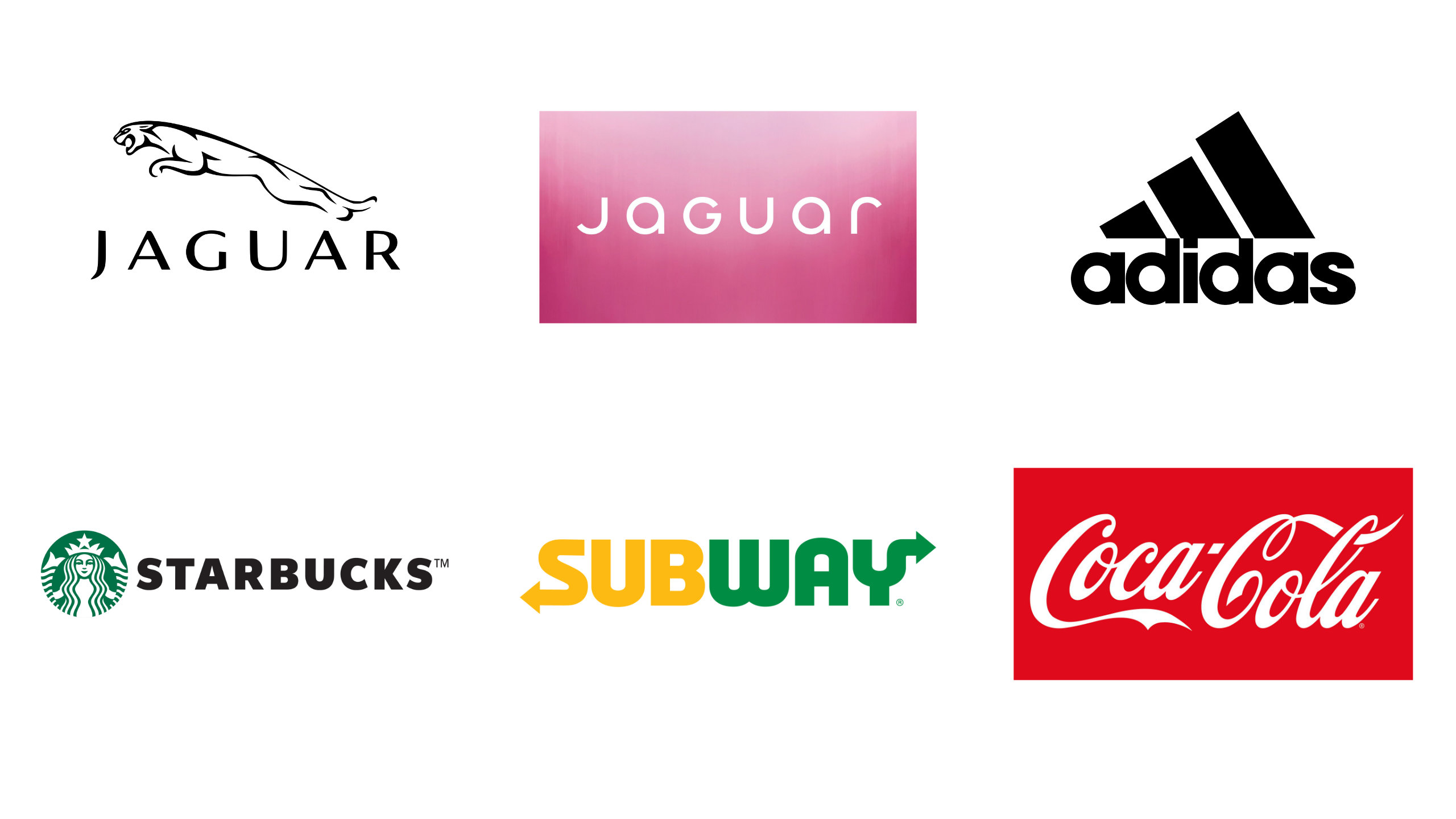
WHICH 2 OF THESE 6 LOGOS SHOULD I UPLOAD?
- Coke
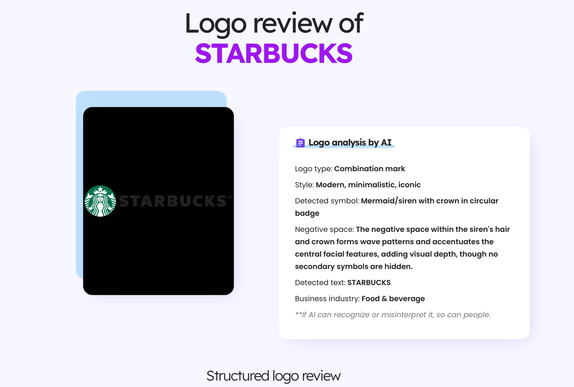
- Starbucks
- Adidas
- Subway
- Jaguar (black)
- Jaguar (white (on pink))
0
voters
1 Like
You have a good point! I think this tool is good for reviewing certain things that don’t rely on knowing the full background of a company, like legibility and scalability, but should definitely not be the sole source used for feedback cause a deeper understanding is definitely necessary for certain areas of feedback.
I created an account using a temporary email and a fake name. It gives you two logo “critiques” before asking you to subscribe to get more.
I ran a couple of good logos through it. The feedback was interesting but uninspired. It apparently goes through a list of do’s and don’ts, and then mentions them. However, it overlooks the nuances that distinguish an average logo from a great one. And it obviously has no knowledge of the client or any creative brief that might have led to the design.
It’s difficult to say much more with only two shots at it. I have no intention of subscribing to learn more.
3 Likes
Interesting, thanks for the insight - from the public reviews, I kind of realized that the critiques are those basic dos and don’ts - not ideal for thorough feedback, but could be useful as a start just to get quick feedback on things like scalability, legibility, balance, ect. when doing the initial construction of logo options. It’s probably more useful for beginners to get perspective on these things cause experienced designers already have an eye for it.
Maybe, but it also risks giving those beginners the impression that following the rules is the key to good design, when, in reality, the dynamic circumstances surrounding a logo’s creation require interpreting the rules in various ways or abandoning them altogether.
In my university design classes, these concepts were taught together, not sequentially, which is the best way to do it (in my opinion). Sometimes, when concepts are taught sequentially, bad habits are formed that are difficult to discard when subsequently learning more advanced approaches that are more nuanced and contradictory to the basics.
For example, the Starbucks logo is highly recognizable from a great distance because it’s so common, well-known, and easily stands apart from other signs. The logo is spectacularly effective at doing its job of letting people know that a Starbucks lies down the road, even though the mermaid design completely ignores the “rules” regarding simplicity and scalability.
1 Like
Thanks for sharing this perspective and example with the Starbucks logo, didn’t think about it that way - so maybe this tool isn’t really that helpful, even for beginners. I guess I won’t be using this tool…
To clarify, I think the tool would be more effective if it provided pros and cons, while emphasizing that there’s more to logo design than analyzing its adherence to various rules of thumb.
However, the tool may still be valuable in bringing to attention something the designer didn’t notice or didn’t consider. When used that way, the logo review tool might be helpful, as long as the designer keeps in mind that the tool’s suggestions and observations are only things to contemplate along with all the other design considerations that are unique to that job, which the AI tool can’t possibly know about.
1 Like
Those results are interesting. It recognized them, which makes me wonder if those logos were part of the AI’s training.
1 Like
There’s something your all missing. Human emotion for one thing. Think about it. If you go to starbucks the logo can look great but if you have a bad time time in and time out then your going to associate that emotion with the logo. Can you script emotion? Can you write a program to identify human emotions with color and font style. No. nope.
2 Likes
Interesting point, that’s why brand identity cannot be the end all that drives a brand - it’s only a piece of a greater whole that makes a brand what it is, there’s so much more to it. One of my design teachers wrote an article about this - and he used Starbucks as an example to illustrate his point as well!
1 Like