Thanks had a quick look through and a few things jumped out.
No pantone colour references
And the letter spacing in CORNERSTONE Is all over the place, it’s not even spacing, especially the start of the word.
Thanks had a quick look through and a few things jumped out.
No pantone colour references
And the letter spacing in CORNERSTONE Is all over the place, it’s not even spacing, especially the start of the word.
can you explain in brief what you want to say about letter spacing all over the place? I couldn’t understand
Visually it lookes uneven, there’s a small gap between the C and O and a large gap between O and R the N and E are almost touching, yet the E has a larger gap between the R etc
This makes it unbalanced and looks less professional. I’d adjust the spacing between each letter (kerning) and then the overall spacing of the word (tracking) to make it consistent.
You could try using optical kerning and/or manual adjustments.
And you should test logo at different sizes to ensure it looks balanced - look at it upside down
You’ve got inconsistent use of small caps (The first letter of a word that is all caps is slightly larger than the rest of the letters).
-slide 8: the B and P in BRAND PERSONA
-slide 25: the first letters in “HI, I’M THE PRIMARY HEADING” and “I’M SUBHEADING”
-slide 26: The P in PATTERN
Several years ago, when I was working for an ad agency, we typically handled larger-budget projects. On those jobs, we normally spent considerable time and the client’s money on the sales pitches and presentations, which always included lots of artwork.
We also had smaller clients with tighter budgets. One of those clients was the owner of a small business start-up that needed a logo, stationery, and some basic advice on promotions.
Our workload was low that week, so we put extra effort into this person’s modest needs. The next week, when we made our initial presentation, he was impressed with the work we had put into the presentation materials.
However, he immediately followed up by saying his budget was small and that it looked like we had spent the entire thing on the presentation instead of the work he had hired us to do. He was a little bit upset.
Are you sure you haven’t done the same thing? How big is your client’s budget?
it’s not a real project, it is fake brief. I made this big brand presentation because I have seen many professional designers on social media to use brand guidelines presentation. So this time I also tried to make one. And also yes I spent a lot of time in making this but I think it is also necessary to show our work.
thanks for your brief explaination, I will definitely keep this mind in my next works.
Thank you for your comment, but i haven’t done it, it just happened automatically.
Is this good way to present our work, for a self learning designer, can this help to make good portfolio on behance and other platforms like these? I want to know these unspoken answers from you guys, please help.
I know a designer she sends 4 initial options of logo designs of 10 pages presentation each. and then send sends 1 final logo chosen in almost 30-40 pages presentation. but her clients are big budget clients, So I thought as a beginner I should work like a professional designer
It’s not just logo presentation though is it?
For a logo presentation you’d show previous logo, competitors logo, research.
Then show 3 logo options.
What you’ve done here is more like a brand book, spring typography, colors application etc.
Normally you’d nail down the logo before going half cocked on the branding.
now I got it, you are trying to say that I should solidify my design work and structure of the logo design process before roaming in the presentations and all this.
Professional designers must be aware of the budget limitations of a project and work within those parameters. For example, they can’t put 40 hours of work into a project that only warrants 20 hours of work.
This is especially true when working for oneself or working at an advertising agency, where time is often tracked in 15-minute increments and billed to the client. If the client’s budget is XXX and you put XXXX amount of time into the project, you’ve lost money instead of making a profit.
By the way, your design skills from an aesthetic point of view are very good. You obviously have talent that can be developed. Remember, though, that graphic design is also a business that depends on making money.
Your branding presentation is good. It’s good to understand the difference between logo presentations and full branding showcase.
thank you for your guidance and the compliment you gave below I will work hard on developing my skills and practical world knowledge of the design, ![]()
![]()
![]()
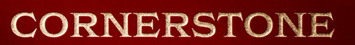
As Smurf initially said, Kerning bad and no Pantone callouts in the brand guide.
I’m guessing it’s a coincidence that you used Pantone’s Color of the year (though a slightly darker version.)
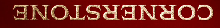
As to the wordmark, I seem to be the only one who doesn’t see kerning as the problem. Instead, I see word color density as the issue. In other words, the C & O and the T & O contain more negative space than the more complex letters with less negative space, which throws off the word color consistency.
I can’t think of a way to adequately describe this without an example. The top wordmark is the original. The bottom one is where I’ve reshaped a few of the letters and spaced the denser letters bit more loosely to add more negative space between them. It’s not perfect and could use a little judicious kerning, but you get the idea.
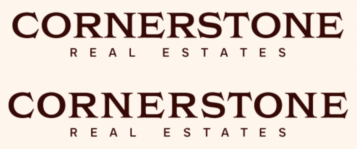
A bigger problem is the difference between the logo paired with the words. Cornerstone is one word and is the business name. A name shouldn’t be broken in two just to make it fit. In addition, the size difference between the logo mark and the name appears too large. Maybe it’s a regional thing, but I’ve never seen the words REAL ESTATE spelled as REAL ESTATES.
Very simple fix looks better
yeah, its a coincidence. but I want to ask is it that much necessary to give pantone colors even after providing Hex code, RGB values and CMYK color codes?
Thank you for the info that a business name should be kept whole. I dont really know if " real estates" is called correct or not before.
I’ve always put Pantone selection first, especially when it comes to colour accuracy and reproduction across various mediums and substrates, and especially for print production.
RBG, HEX, CMYK and NOT based on standardised systems - unlike Pantone which is a premixed ink system. You techincally should have a Pantone book and pick the colours from there rather than relying on your monitor. As the colour swatch you have in the book would match what printers have and they can closely match to that.
This ensures the exact same colour appears across different materials, and where it comes to very wonky coated vs unsaturated, the colours could vary immensly, so a printer knowing what Colour it is by a printed swatch they have in front of them knowing it matches what you selected.
CMYK printing relies on mixing four inks (Cyan, Magenta, Yellow, and Black), which can lead to slight colour variations due to differences in printers, paper types, and ink batches.
Pantone colours are premixed and printed as solid ink (Just 1 Ink not 4 like CMYK), which should guarantee a repeatable colour every time.
I’ve had it before where an old boss split a batch of FSDUs between printers for costs and even though the same artwork file, the FSDUs by different printers yielded different colours because there was no Pantone referene, only CMYK.
Vibrant oranges, deep blues etc, are difficult to reproduce accurately using CMYK. Pantone offers a much wider range (gamut) that go beyond what CMYK can achieve.
Providing Pantone eliminates ambiguity. Different monitors display differently in RGB or Hex, and even CMYK values can shift depending on calibration.
Hex & RGB are fine for digital use (websites, social media, apps).
CMYK is acceptable for general printing where perfect matching isn’t essential (flyers, brochures, magazines).
If the project involves high-quality branding, packaging, or any situation where color must be 100% consistent, Pantone should always be the primary reference.
Again another example - we sent our company sign to a printers and it had 7 pantone colours, 2 of which were similar shade of Pantone, however, the company producing the sign converted to CMYK (probably as it was a 3D backlit sign) and when we received it the 2 purples were the same colour.
It was an immediate do-over for the sign company as we gave them a Pantone file and a CMYK file for reference.
However, they failed to match.