I’m designing a brand identy for a Mexican restaurant called fresco Mexico. I drew out ten different logo concept. I wanted to get some feedback.
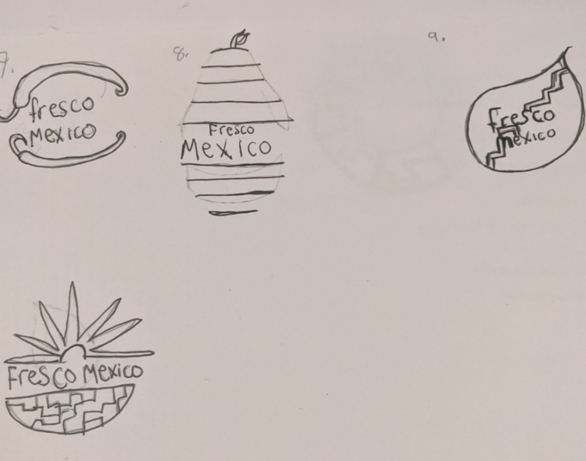
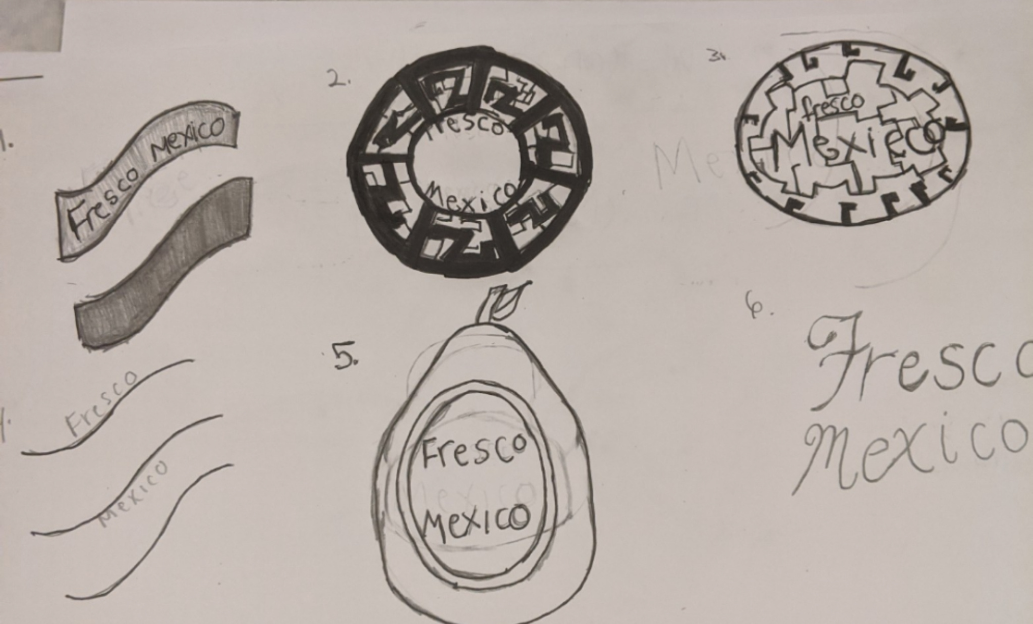
7, 9, 1 and 2 have potential for me. Pick your favorite one and then make a few iteration (changes till you love it)
Congrats on sketching out ideas. Ten is a good start. If you feel stuck, take a break. Watch some TV, cook, take a walk, whatever. I’ve found I often have ideas at random times of the day. Keep a little sketch book nearby and keep going. Don’t erase things, When I sketch things, I might finish sketching an idea out and realize it doesn’t work and just draw a little x near it and write “no” or some other quick note like “too much” or “unbalanced” or sometimes I’ll sketch something and it’s not right, but something about it is on the right track and I might jot down a note such as “interesting” or “pattern”, etc.
1 Like
I try to do fifty, but for now I did ten, but so far I like #1
In sketching usually the first ten or twenty are the cliche and obvious options. They come easier because they were “top of mind”. Once you get past those, then you get more creative and start thinking about it and coming up with solutions. Rarely any designer goes with their first sketch.
2 Likes
I chose #1 , but I plan on doing variations of #1
And here’s your problem. You’re rushing things. Your first attempt at this logo looked like you just grabbed some elements and threw them together quickly without giving it any real thought. You took our advice and set out to do sketches, which is great; but you petered out after only 10, and it feels like you’re rushing just to have something to toss online. And now you’re saying you’re going to go with #1.
You’ve got to slow down. Logo design isn’t a race. A solid, well-designed logo should last years and years – so don’t try to hammer something out over night. The last logo I worked on, I spent three weeks sketching out ideas. It wasn’t three weeks solid, granted, I’d work on it, set it aside, come back and work some more. Treat your school assignments like a real-world work assignment and don’t try to crank through it in less than a day.
What I see in your sketches is similar to what I see in your initial attempt. The graphic overwhelmed the type. Aside from #6, you have the same thing going on here. Spend some time studying other quick-serve restaurant identities paying particularly close attention to the Mexican segment. Do any of them allow the graphics to overwhelm the type? No. Okay, maybe Taco Bell; but when you spend over half a century establishing your name, you get to break some rules here and there.
Take each one of your sketches and push them. Come up with 10 variations on each one. That would give you 100 options. Take #7 for example. What if there was only one pepper? On top? On bottom? What if the pepper was on bottom but arced the other way? What if the pepper was the crossbar on the F?
You have to figure out what the real goal is with this project . . . to do something quickly that you can post to a forum or to create a solid piece for your budding portfolio.
1 Like
To be honest, I do throw a bunch of elements together at first just to see what I can come up with, and build up off of that. But, yes my problem is that I do tend to rush things. Ironically, I told my self even before starting those sketches that I wouldn’t do. I do want to put out quality work to be able to put something in a portfolio because the University I’m going to requires a portfolio review. Which is highly competitive. But, I will take your advice on coming up with more variations on a concept. I appreciate your help because in my design classes I often did the bare minimum and still pass. But I definitely get what you mean if I truly want a solid piece of work. Back to the drawing board I go ( no pun intended)
I think part my issue is that I focus too much on being aesthetically appealing, and not taking into an account that the logo also has to be functional to the brand. I’m going to work on that with the next 30 or 40 logos.
I’m with Craig, leaning towards 10. With a simplified version of the “Aztec-Like” brick base.
If it weren’t for the Chili’s restaurant franchise logo looking very much like #1 , I wouldn’t be apposed to it.
you should take into account that a logo/brand doesn’t necessarily have to represent the company, rather it should be suggestive of what they do (eg. provide fresh, healthy, mexican cuisine). For instance look at McDonalds. Though the “M” is representative of Mcdonalds, the shape of the M and colors are more suggestive of a happy, inviting place(the curves of the M and the color yellow) that satisfies your hunger and is on the go (the red of the logo) which makes the logo much better then any other “M”. It literally says “come here when your hungry and want to be happy”
I find for me when coming up with ideas loosening my parameters helps me create more creative branding idea. Your sketches all say “Mexican food” but doesn’t invite a the audience to accept the brand as something for them. The brand could go on any random Mexican place look fine but thats not what you want. When making new iterations I would look to create a brand story first and then apply that story to your logo.
1 Like
I uploaded all 45 logo concepts on th same fourm I wanted to get your feedback and others on them before move on