I’m designing a logo for an attorney, and we’ve been talking past each other due to differences in terminology. He intends to register the logo as a trademark with the US Patent and Trademark Office (USPTO), so he used the USPTO definitions of design mark and word mark. However, I was using the common and informal definitions that designers typically use.
I needed to look up the USPTO definitions. When trademarking a logo with USPTO, there are two very different trademarks: design marks and word marks. A design mark is what most designers would call a logo, even when that logo consists of nothing but words. However, a designer might consider a logo consisting of words as a word mark.
For example, the following made-up logo might be a word mark to a designer, but it’s a design mark to the USPTO.
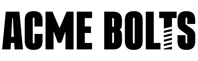
To the USPTO, the logo above is a design mark because it’s the customized design that’s being registered, not the name of the company. The USPTO considers a word mark to be a generic typeface that’s registered to protect the name whenever it’s written out in any typeface, either in lowercase or uppercase and in any color.
For example, the following could be used to register a word mark since the font is generic.

In other words, a design mark is a unique logo, but a word mark is the company’s name when spelled out. For example, Coca-Cola is a registered trademarked name, whether used in headlines or body copy. However, the Coca-Cola logo is a registered trademarked design.
There’s more…
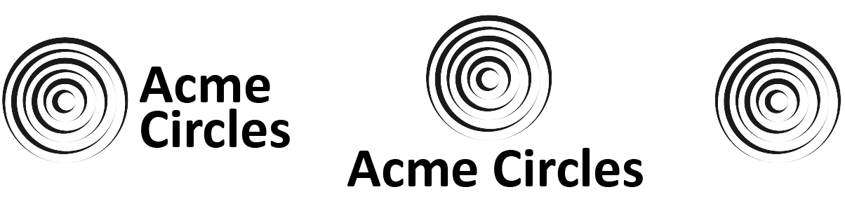
The following is an example of a logo used in three separate ways. The USPTO considers each a separate design mark, requiring separate trademarks.
I’m guessing a way around this might be to register only the symbol as the design mark, and then register the words in generic type as a word mark. However, this would entail placing a separate ® on both the logo and the words. I’m not sure about this, though.
I’m not an attorney, so don’t consider what I’ve written as fact. I’m just pointing out some things pertinent to trademarking logo designs that I doubt many designers consider — especially crowdsourcing pseudo-designers. It’s probably best to let a trademark attorney handle a trademark registration.
However, when designing logos for clients — long before attorneys get involved — it’s a good idea to know the regulations surrounding trademarks and design the logos accordingly. Outside the U.S., the rules probably differ, but are no less important to understand.