Hello. These are for a class im taking t my college. I wanted to post here because I think I would receive better feedback. These are just black and white logos, no symbols.(for now) The word Jiggity is for an online music store/forum. I would like opinions on how I can make the logo feel more like the word jiggity
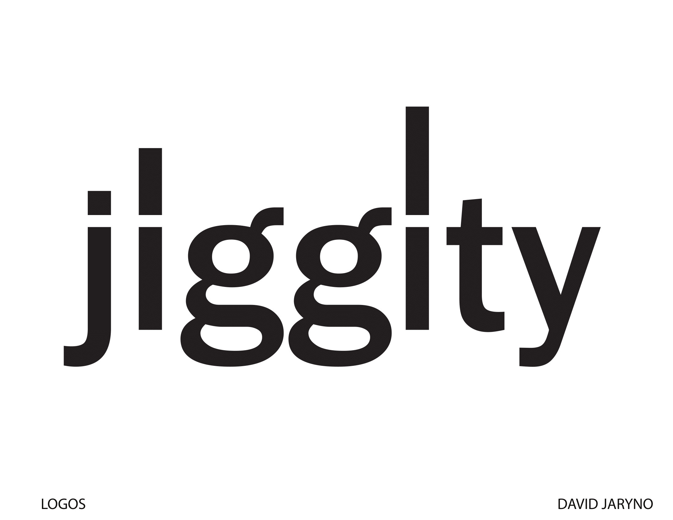
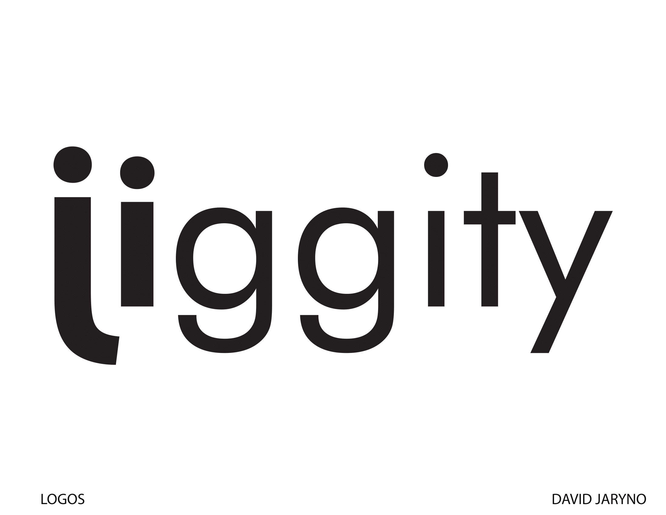
1 – Needs more work. Concentrate on the weight of the letters and the space between the letters.
2 – Amazon has this type of treatment locked up. Ditch this one.
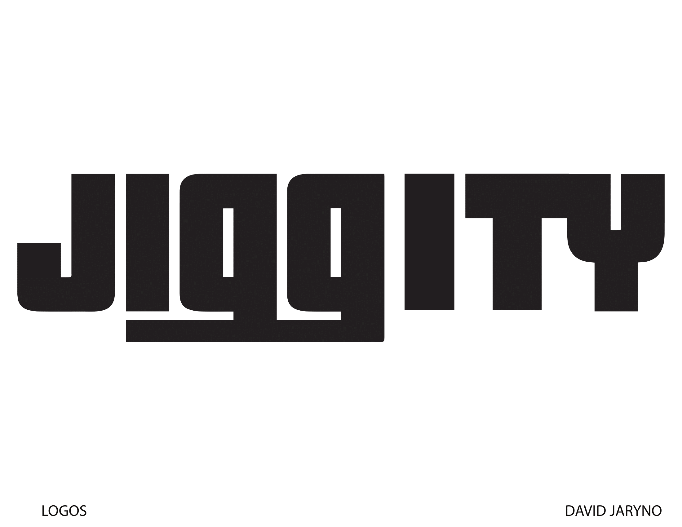
3 – Interesting, but needs more work. Again, pay attention to the space between the letters. This looks a bit like JIGG I TY.
4 – This does nothing for me.
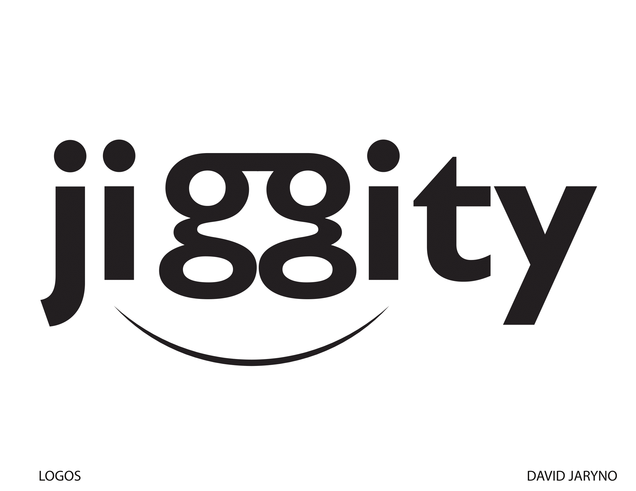
5 – Maybe if I got the concept you’re going for, but, right now, it comes across like you just extended the dots on the lower case i’s.
6 – I think you need to have a really good reason for flipping letters. This isn’t it.
Do you have pencil sketches to share instead. Do not just jump to the computer.
Sketch First yes, Sketch … step away form the computer.
Yeah, but I moved a bunch of other student work to the student section yesterday, so I’m sort of needing to move yours too. I haven’t noticed the forum category making a whole lot of difference to the number of responses a post gets.
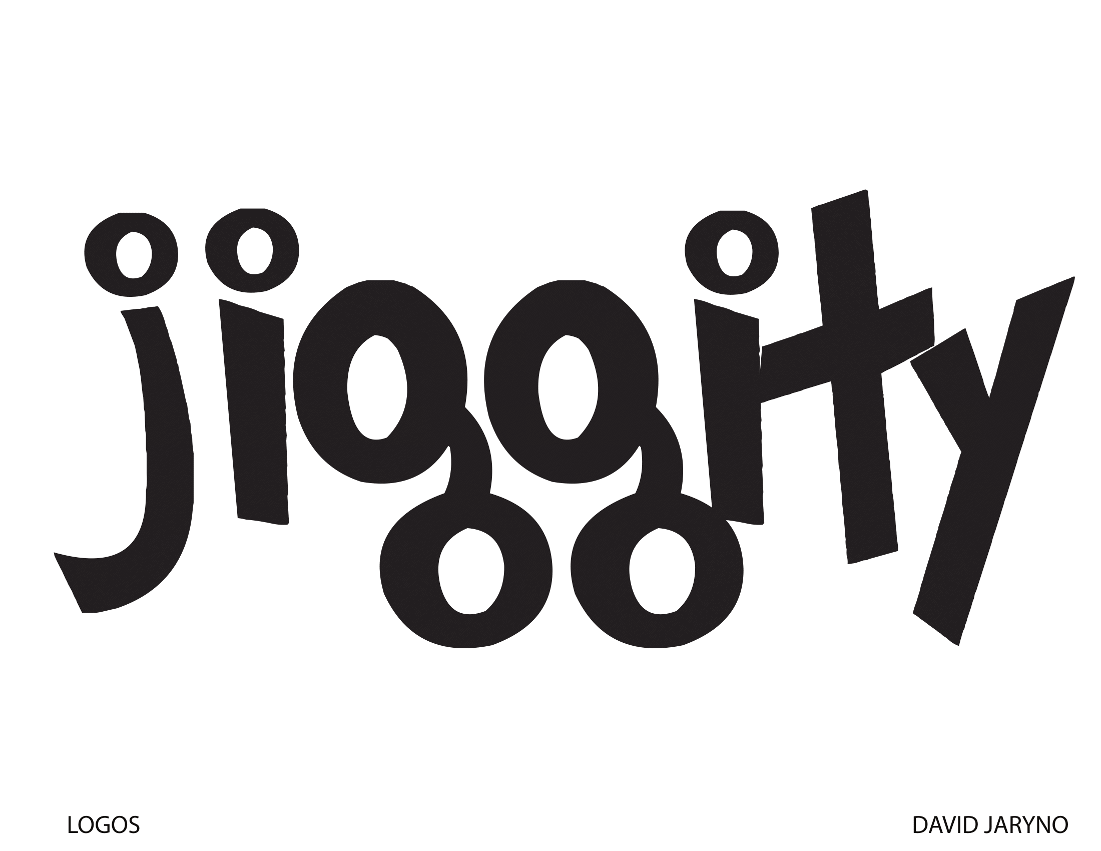
As for your work, I’m not quite sure what “jiggity” means, but to me, your first example is the jiggitiest of all. However, the rendering of the glyphs is a bit crude. If it were me, I’d clean them up in Illustrator. I’d also alter the shapes of one of the g’s to make it a little different from the other one — same with the i’s and the dots over the i’s and j.
I like the first one alot!!! just needs more tweeking to the shapes of the letters. it reminds me of the Yahoo logo. It has alot of personality. Go for it!