I’m working on this logo for a client and they love it. I think there’s potential but right now it feels off. And I can’t really put my finger on it. Well I know it has to do with harmonising the W but I don’t really know where to start.
What does a ropey-looking W have to do with the meaning of the word swipe? I don’t understand the concept, so I’m hesitant to offer suggestions on how to fix it.
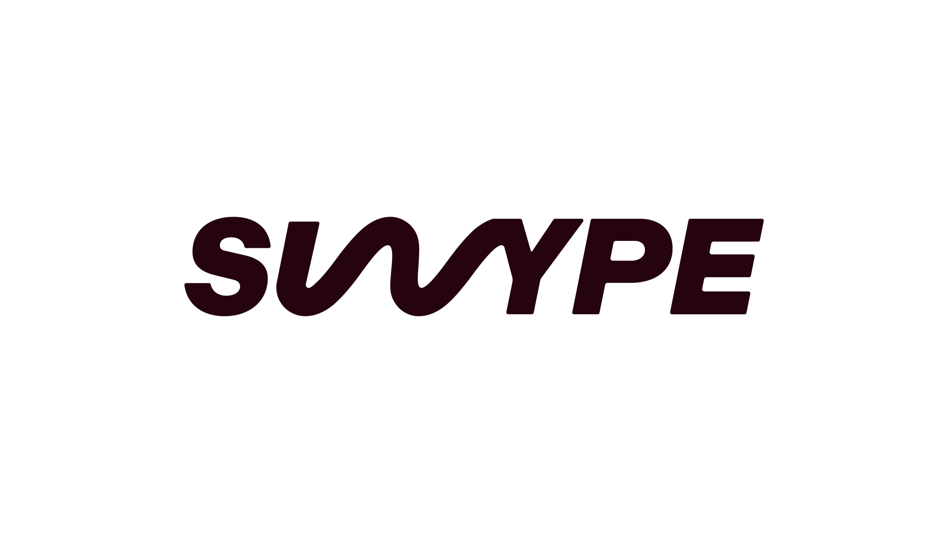
Svvype ? What it is about ? Speed ? Soap ? Etc … and I think you need to define what it is the kind of message that you want to give. Also, Just-B speaks about the concept which I don’t see too.
I found something on Wikipedia : Swype smartphones and tablets originally developed by Swype founded in 2002, where the user enters words by sliding a finger or stylus from the first letter of a word to its last letter, lifting only between words!
I actually don’t fully agree with the “SVVYPE” take I can read it as SWYPE straight away. We’re pretty good at reading word shapes, even when letters are slightly unexpected. So for me it’s not a straight legibility issue.
That said, I do think something feels slightly unresolved and I think it’s more about cohesion than spelling.
The W feels like it’s coming from a different place stylistically. The rest of the letters feel structured and controlled, while the W is more expressive and fluid. That contrast isn’t necessarily wrong, but it doesn’t quite feel intentional yet more like two ideas sitting beside each other.
On the naming side, I agree there’s potential in the misspelling. A name like this can be playful or smart, but usually there’s a visible reason behind it. If it’s “Swype” instead of “Swipe,” what’s the story? Speed? Motion? A gesture? If that idea was clearer in the form, it could turn from “slightly off” into “clever and deliberate.”
It’s close. I wouldn’t bin it. I’d just push one direction with more conviction so it feels like a decision rather than a compromise.
Need to know what this company is selling. The wavy ‘W’ suggests to me a sound wave which might be appropriate for some kind of musical instrument manufacturer.
I saw “swype” right away without reading your description. You have a kernel of an idea here, but it needs work. The w doesn’t mesh well with the rest of the type, and the w / y ligature looks awkward.