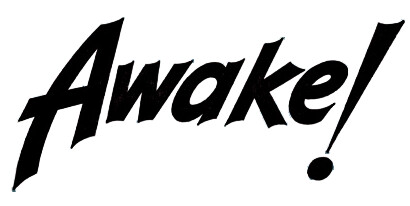
Hoping to find a font who’s numbers will go nicely with this logo, I need to add years to banners for it and would like to find numbers that go with it. Looking mostly at the slight curve in places like the top line of the A and other similar places. The overall curve isn’t as important since the curved ones I found didn’t “feel” right. Most I found were either a bit too ornate or a bit too whimsical for the job, so I’m asking the Experts!
You could try Danger Girl Regular, if you are just looking for numbers. The logo is hand-drawn from what I could find.
1 Like
Thanks! Will give it a look.
The logo is from the 1920s so it’s definitely hand drawn. That’s why I just asked for something that kinda looks like it would work and be similar.
I kept finding things similar, but the differences clashed rather starkly. I may have to finally learn to use Fontlab Studio! Never was any good at vector art - I’m a left handed dyslexic and those beerier contraptions are something I never “got a handle on”
I have version 4 on an old laptop. No idea where it is or if it still works, but it’s there! This is why I archive my old ‘puters; Old Software still works perfectly well on old hardware and will only “age out” when the hardware dies and cannot be replaced (even backed up installers + serials on external drives).
Gonna have to tweak my first font! I only ever used it to trace bitmaps and make “special” characters for “certain” clients. Finally gonna put it to it’s intended purpose 
1 Like
Well, this was interesting.
Anyone ever hear of https://www.mixfont.com/ ?
I showed it the logo and it designed a font based on it.
Their license says we can share the fonts it makes (even sell them) so it was an interesting free alternative (could not find that old laptop!).
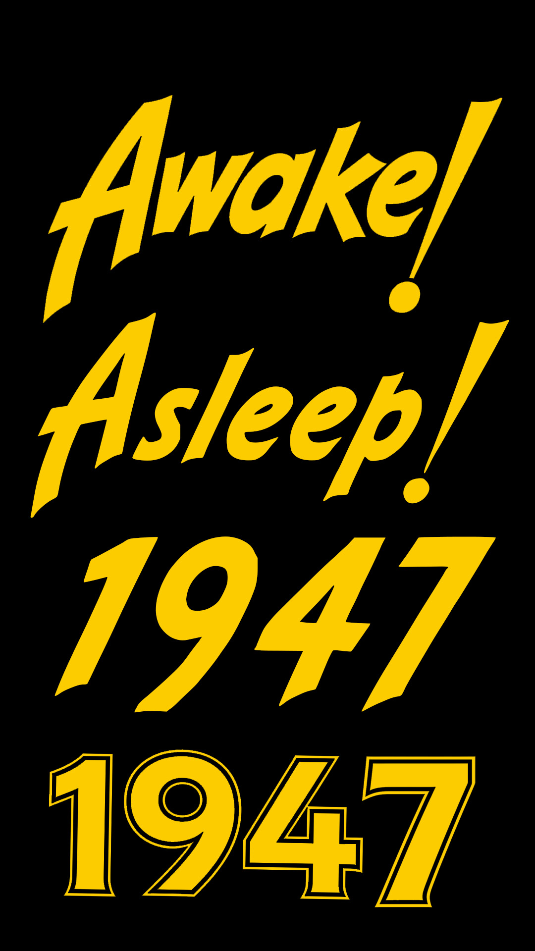
Here’s a pic with the original logo, a word from the font the website created, a date from the mixfont creation and and my first effort at getting something similar from asking ai to create numerals zero through nine in a similar style as the logo (in that order). I cut and pasted the images to make a year. The font is easier.
So… what do people think of this mixfont site? Is there good reason to avoid it? That sort of thing usually has drawbacks. Fortunately I am working with the owners of this logo, so I’ll offer them the font if they want it, but I can see this sort of thing being … questionable?
I’d be very careful about offering anything like that on a commercial basis. Like anything AI-generated, it is very unlikely to be copyright-able. AI for client work is a very dark and murky swamp to be swimming in.
Agreed! As I said, the only reason I was comfortable using it for this job is that it’s a very old logo and the copyright holder of the logo is not only aware of what is happening, they are peripherally involved in the project.
I’d never try to sell anything from that place and I only offered the font to the copyright holder (free of course). They, surprisingly, didn’t want it.
I’ll keep the font with the archive of stuff used for this project, but doubt it will ever get used after this is done unless they want more updates.
I am very much against nearly all ai stuff, but am in a desperate financial situation and needed to get this part of the job moving. I must admit, it did a good job. But I’m very vocal around here about my anti-ai stance because it is so bad for the environment that it may literally kill people soon, and how horrible I feel on these rare occasions when I need to resort to it. One or two other times so far, and I feel like a hypocrite when I do it… but I lost my job as a Chemist, can’t find work in my field, plus the woman I love needs medical treatment and, as I said after I first used it, I guess I really would kill for her!
I’d be interested to see how it fairs in terms of technical (and visual) integrity. I am cynical that it will get anywhere close to achieving the optical compensations required in pretty much every aspect of designing a coherent type family. Still, as AI gets more sophisticated, who knows…
It did a surprisingly good job, but only because I had low expectations.
The image with yellow text above shows the Awake! logo from a scan and a typed out Asleep! logo from the font, just to show what it did. I did have to manually adjust some spacing (leading/kerning) and baseline stuff (the numbers varied widely on baseline and had to be rotated in some cases so they look right) (the 1947 with no outline is from the font and the whole reason for the effort - I didn’t need any letters or special characters, but I needed 0 through 9 in a close style and I think the numbers look, if not work (without manual tweaks), just fine.
Bottom line is that it did acceptable work and everyone involved thinks the numbers work as intended.
What would you be interested in seeing? A character map? The actual font? I’ll sell it to you for 87 Million dollars! 
Or you can have a free copy if you want to just see the output on your own system. I wasn’t told not to share it by the copyright holder (I can ask though), but he knows early issues are public domain now (but I have no idea how derivative works of public domain items work if there are later issues with the same logo that are not public domain!). I would say if you want it for that we can call it “for evaluation purposes” and include no commercial use stuffs.
Depending on the job at hand, like yours, an AI-generated font might be an acceptable solution. It might even serve as a starting point for refinement.
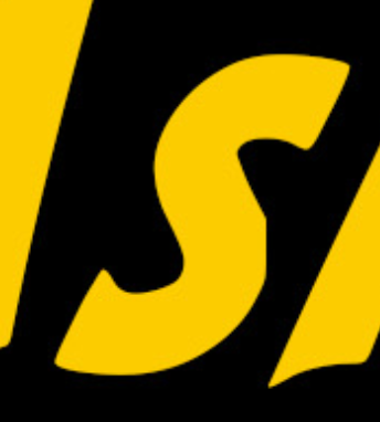
However, current AI models still don’t create professional-quality typography, even though they’re getting better at it all the time. For example, here’s the “s” from “Asleep,” with some awfully crude outlines and clunky curves. I don’t want to dismiss it, though, since the generated font produced what you needed.
Absolutely right! And I hope ai never gets good enough to do it all. Since I only needed the numbers the additional characters were a bonus, so naturally I got a little silly playing with it.
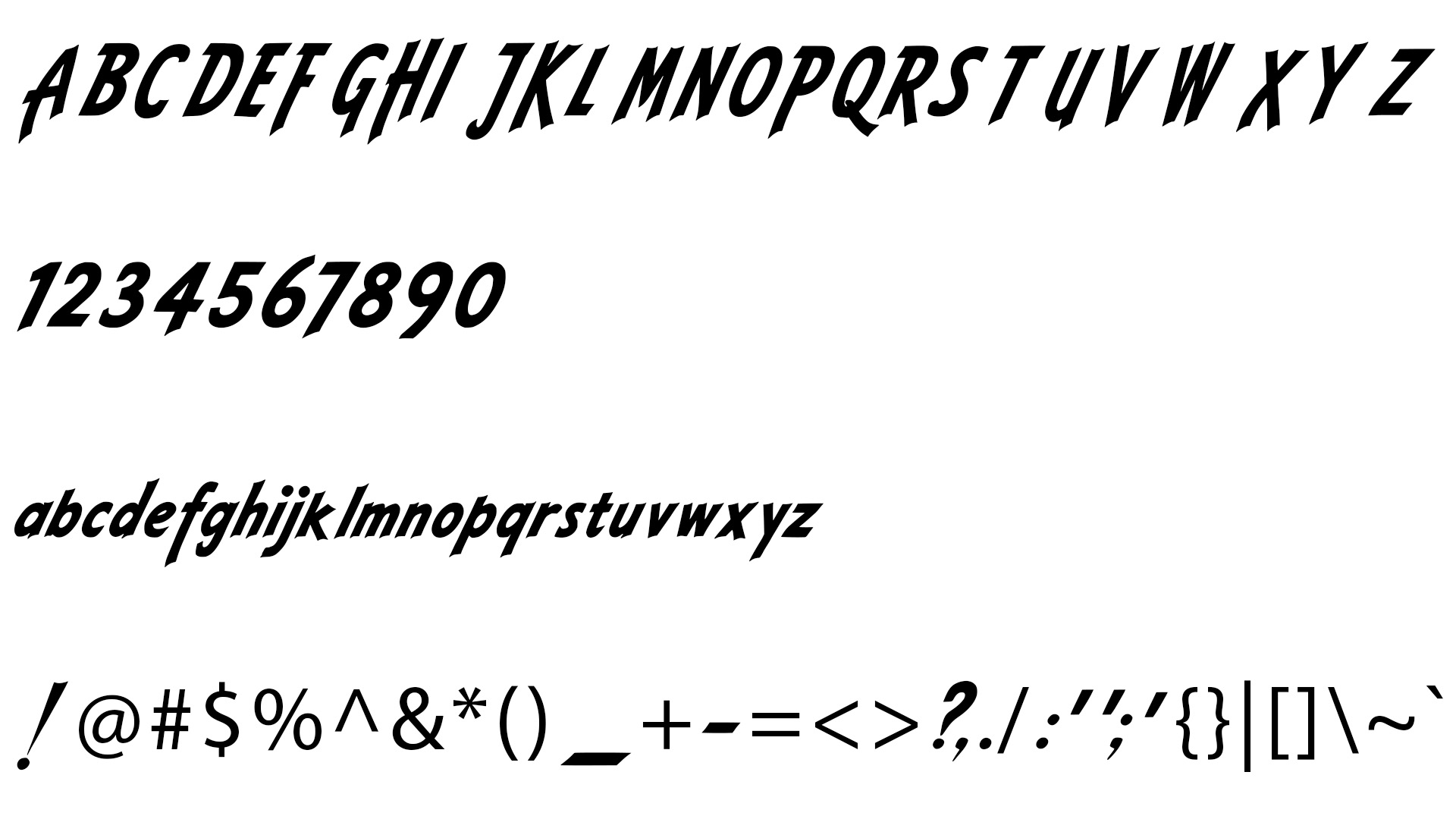
Since @sprout was curious, this may show what it did. The erratic placing and alignment of glyphs is clear from this image. I just opened my good old Photoshop CS6 and typed out every character. I actually was surprised it wasn’t quick and easy to find a tool that would export every character in a font like this or in the character map format seen in font generators. That may be something for one of our coders to think about. Sounds like it could be useful, but don’t expect me to buy one if you make it! I’m broke.
Also looks like many special characters were not created and it used some default font for them.
Anyway… The entire font:
1 Like