I have a conceptual question and I didn’t know where to turn. I found this forum and figured you folks might have some ideas.
I’m looking for a way to represent the concept of “explanation” in a diagram. I teach argumentation theory, and one of the ways we represent arguments is through argument maps. These maps are typically blocks of text with arrow pointing to another block of text. The arrow is what represents the reasoning relationship where one claim “leads to” the next claim. So an arrow is perfectly appropriate.
However, what I need is a way to represent when one claim explains another. An arrow doesn’t quite seem right. I was thinking of playing with shapes, that might lead to something. For example, if one shape (which would be the evidence) where to fit inside another (the hypothesis) that might be a way to represent the hypothesis’ explanation of the data.
But… If you folks have any ideas, I’d love to hear them!
Oh, that’s an interesting concept. To make sure I’ve got it right, you’re trying to visually explain the “If X, then Y” argument, right? I like these kind of thought experiments, so if I’m coming out of left field, set me straight and I’d be happy to try again.
But if that’s the case, then you could use basic geometric shapes - the “All squares are rectangles, so if the data is a square, it is also a rectangle; and if the data is a triangle, it is not”. Other options could be things like animals or plants - a chicken is a bird, a cat is not - but those are more complicated on basically every level, so probably not the best for a teaching tool.
Well, that’s super close, but not quite it. Instead of an “If x, then y” argument, it’s an argument where the conclusion is reached because it explains some evidence we are presented with. For example, if you go to turn on your car and nothing happens (the key turns in the ignition but the car doesn’t start), you might infer that your battery was dead. So the evidence is “Nothing happens when I turn the key” and the conclusion is “The battery is dead”. [The battery being dead would explain why nothing happens when I turn the key.]
Ah, okay, I think I have a better grasp on the idea now. You’re looking to visually signify the relationship of am explanation as to why a certain set of data is how it is. Using the algebraic bits again, in a “y=mx+b” equation, the value for Y is given, and the “mx+b” equation is one posited explanation for that value.
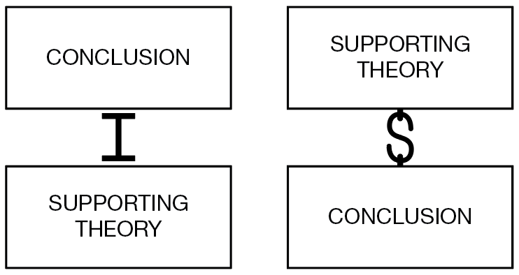
I like HotButton’s suggestion of the I-Beams - they’re reminiscent of columns, so they get across the supportive nature of the relationship, and they’re also easy to scale and transform, so you could set up a myriad of flowchart branches without distorting the imagery, so it’d be easy to showcase multiple relationships together - for instance, my car not turning on when I turn the key could be a dead batter, or a busted starter, or maybe I’m using the wrong key - the provided evidence supports all of those explanations. If you wanted to show a more tenuous relationship, wavy lines like the tilde (~) do a good job of conveying that concept, and in that case the S-hooks are probably better.
If you were really committed to doing something fancier, I think that’d be much more context dependent, and harder to convey multiple explanations or relationships if you needed or wanted to down the line. For instance, for the car example again you could maybe work with keys and keyholes, but that wouldn’t be as clear what the relationship was, and it wouldn’t work the same on an example that had nothing to do with keys. If you wanted that much detail, you’d probably want to get a full-bore illustration, instead of embellishing a chart.