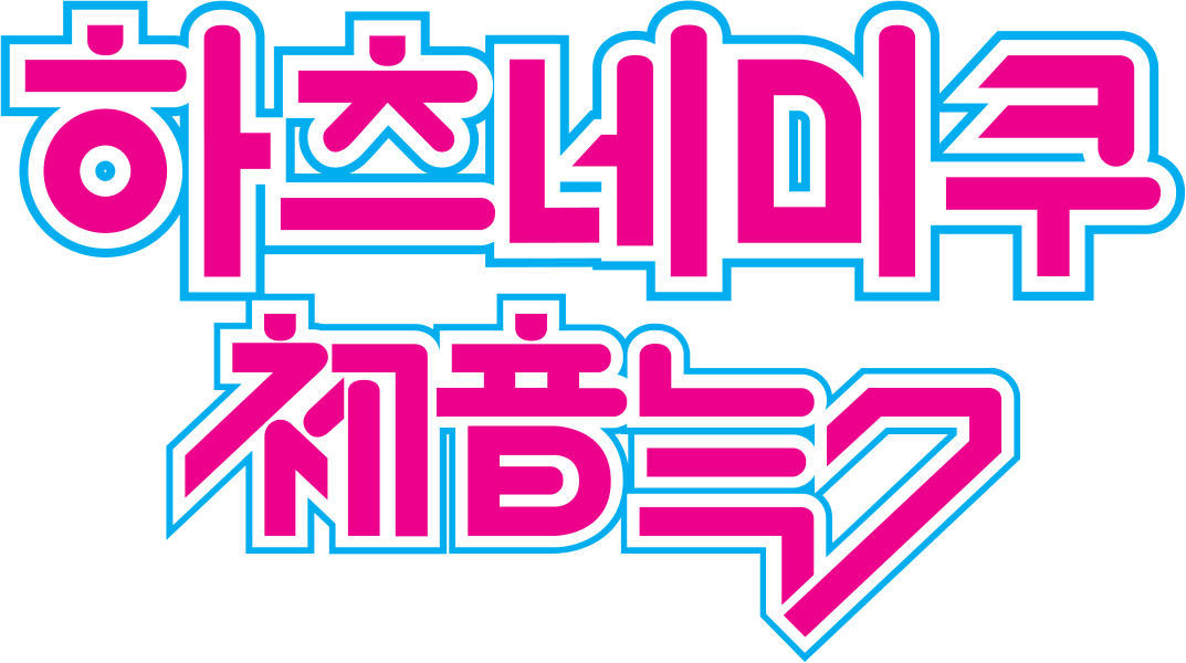
Hey I made this Korean Hatsune Miku logo and would like feedback on how to improve it. Your feed back is appreciated. The original Japanese logo is at the bottom
I am fairly certain the majority of GDF members are not familiar with either Korean or Japanese language, let alone both, even if provided with brief and/or background information.
To me they’re just groups of shapes. Sorry.
As Eriskay mentioned, I have no idea about either language ![]()
As for similarities. Your colors and styling look the same. Your stroke is a bit thicker than theirs and your kerning is also a bit wider than theirs. The kerning could be a symbol issue though. I would have no idea about that though.
That’s about all I can say about it.
Stylistically, the top one matches the bottom one, if that’s of any help. However, as has already been said, I don’t have a clue what either says or if your Korean characters would match the normal written conventions of Korean.
yeah, I know a majority of GDF doesn’t speak Korean. Like you said I’m more looking for advice on whether the style matches. Also thanks for the compliment
This topic was automatically closed 365 days after the last reply. New replies are no longer allowed.