Hello everyone, this is my first ever post on this forum. I’ve been working on this logo for about a week and some. I would really appreciate some external feedback. Especially on the typeface. my name last name is pretty long which also makes this even more difficult for me. Let me know your thoughts, thank you!
I like it, and I like the typeface you’ve chosen. It has a nice, warm quality to it that, I think, works well.
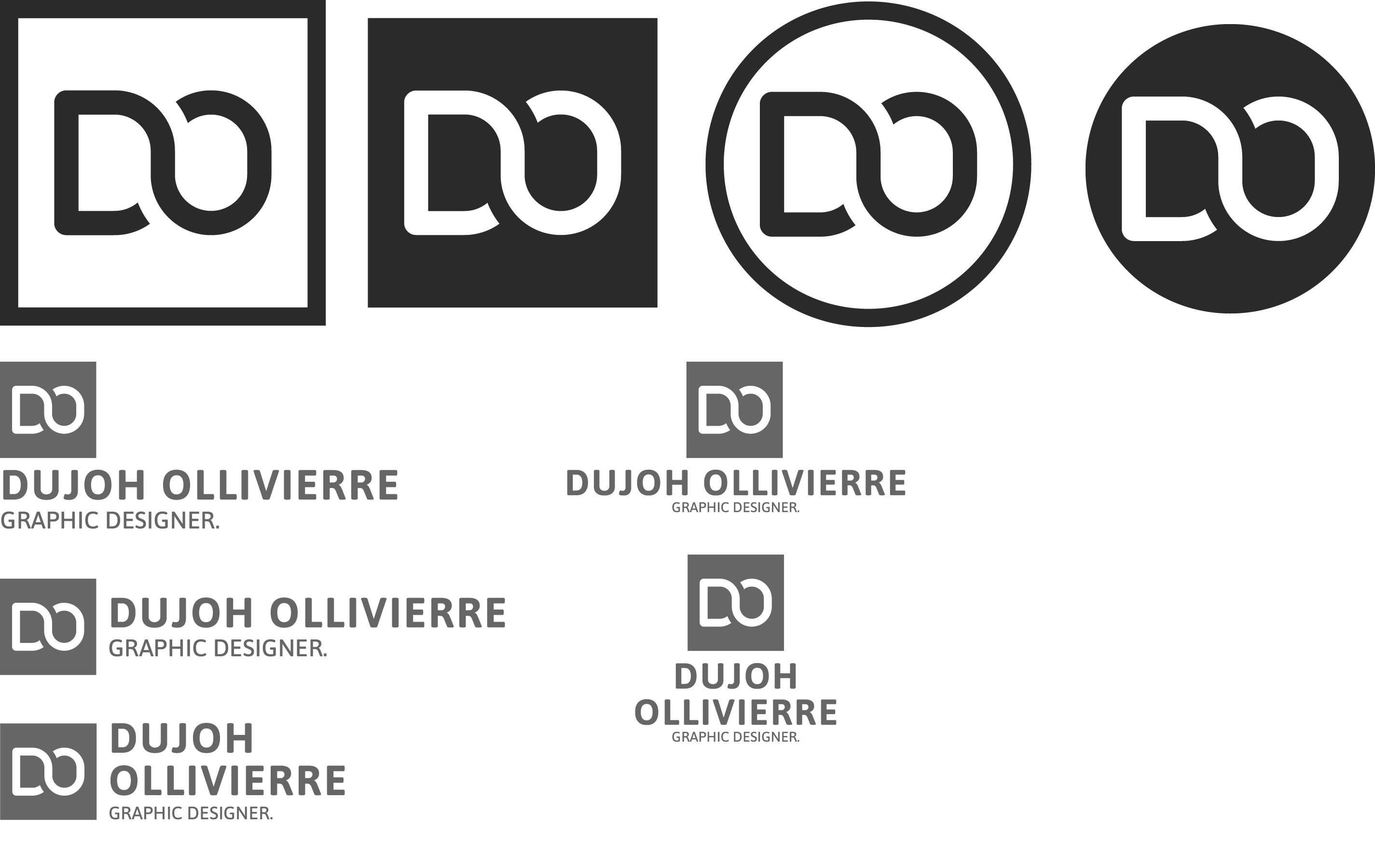
I have mixed feelings on the different logos on the top row, but I’m inclined to like the two solid black ones better than the outlines.
As for the compositions with your long name, I think they work nicely with a professional corporate look (if that’s what you’re intending). The length of your name doesn’t bother me at all. My least favorite is the last one where you’ve placed your name on two lines and centered it.
I see no purpose in the period after graphic designer, however. It’s not a sentence, so the period is not needed and is out of place.
Even though I like the logo, my mind does have a slight tendency to see the D and the O as the numeral 2 tipped on its side. That just might be me, though. If you tipped the logo upside down, however, it still reads perfectly as a D and an O, but the numeral 2 illusion is gone.
@Just-B Thank you so much for the feedback, its confirmed a few of my own thoughts as well, especially the phantom number 2. In terms of aesthetic and emotional attributes, I’m very happy to hear that it exudes a sort of warm quality. Professionalism is also important, but I don’t want to seem distant or cold.
Could you elaborate further on the variations of logos on the top row.
If the letters D and O are visually present first, then I can live with the numeral five. It doesn’t feel as obvious as the previous version with the numeral two.
The Lettermark logo is fine. The position of the text can be adjusted. For example, the Logo and the text are too close to each other. Give it some space between them. Always let the Logo breath when using it alongside text. It is good that the logo is versatile. You have 3 best options : the last two from the left bottom side, and the one from the top right side.
The best option as the main Logo layout is the one from the bottom left side. This will works efficiently across different media and layouts, due to the alignment.