Currently a senior in a conflict studies program, but have done a fair amount of graphic design before (by no means a professional) - mostly logos and infographics. For our research capstone we’re creating magazines, rather than traditional papers. Working on creating my cover, which I’m trying to use a passport theme for - since I’m researching secession. Have created two designs so far, one is way off from what I like and the other is satisfying enough for me but could be better.
Would greatly appreciate any feedback on these, as well as any inspiration that could be useful.
Thanks a bunch!
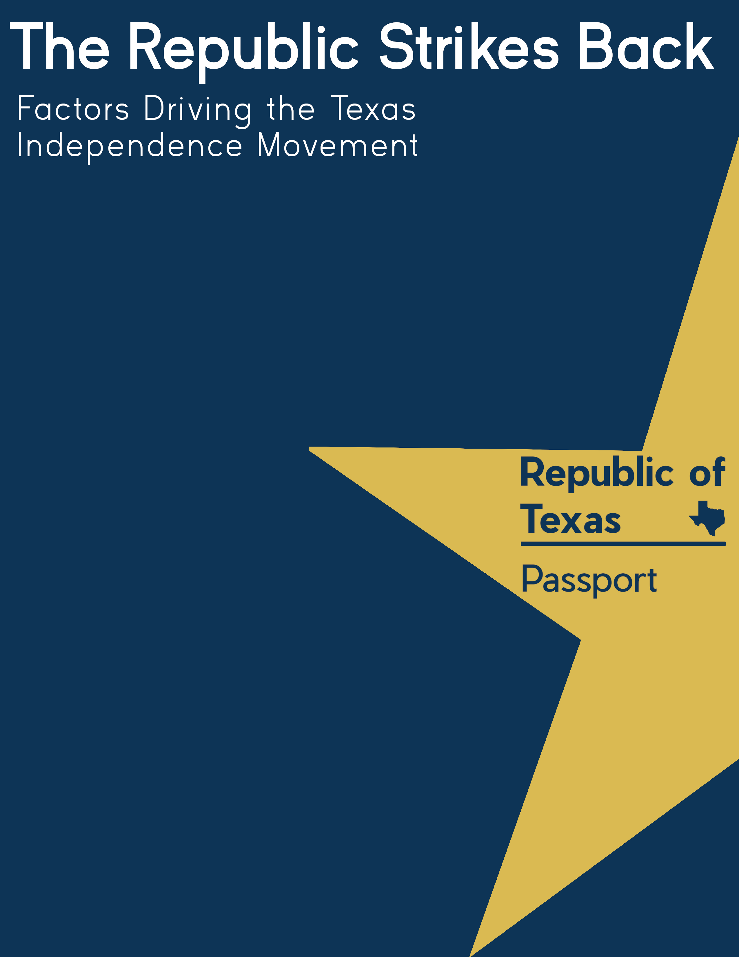
For this first one, the blank space at the bottom is where my info (paper title, name, etc) go - but sanitized it.
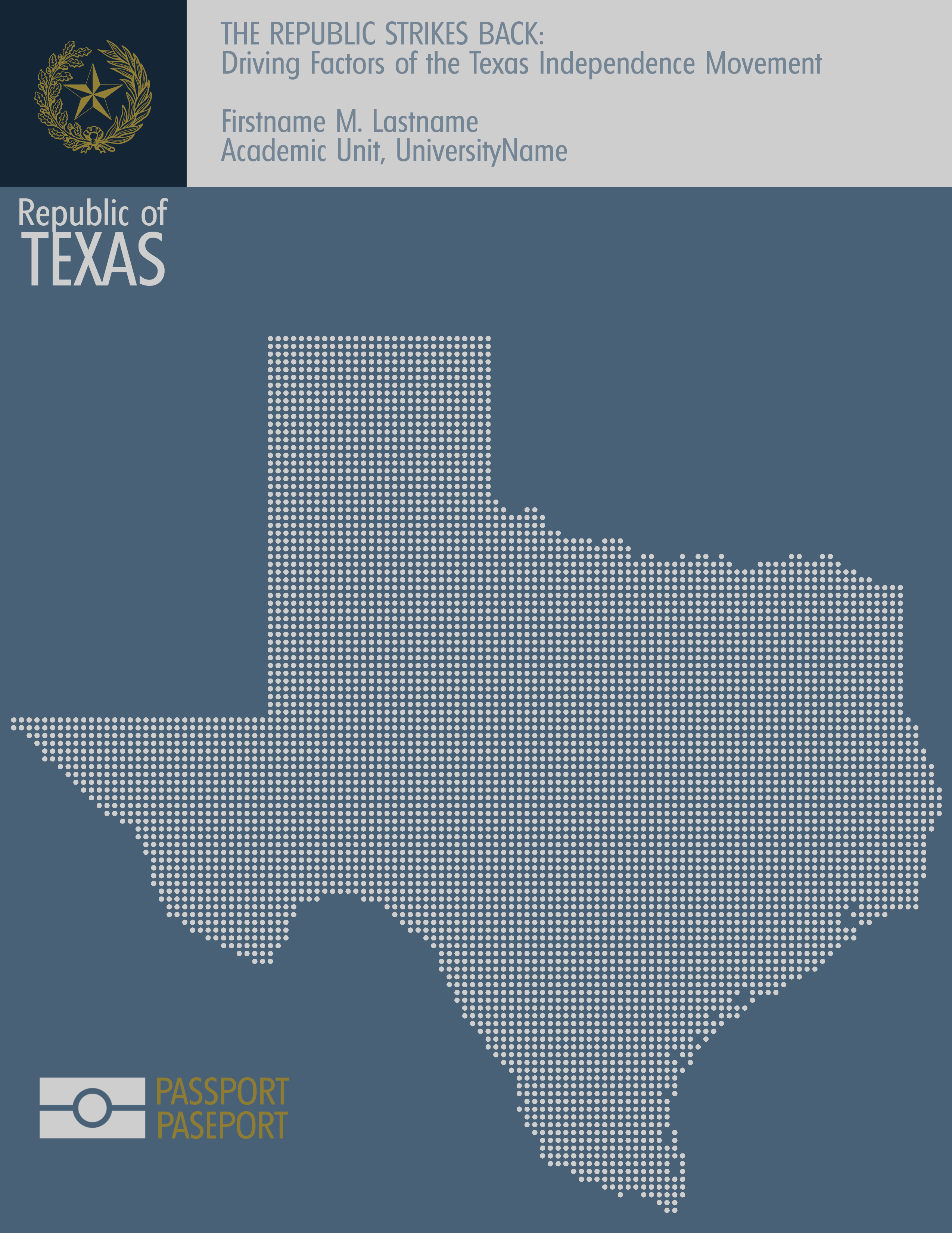
The second is better than the first, in that the type inside the star on the first is all wrong. It creates some really jarring tension. The second is better, but looks more like an internal governmental communiqué than it does a magazine.
If it is supposed to emulate a magazine cover, I’m afraid neither work. Look at other magazine covers. Whatever the subject (unless fringe publications), They usually all follow a similar format. Prominent masthead. Strong, engaging headline (sometimes they are provocative, which your ‘The Republic Strikes Back’ is – along with the Texan passport idea, it makes me want to read more) referencing the main story. Strong, supporting image or illustration. Smaller call-out text / flashes / boxes with snippets of other things you will find inside, to draw you in.
If you were to make this into a successfully convincing magazine, using a similar theme (which, by the way, I think could work really well), then my suggestion would be to do it photographically. Ideally, you would shoot a pic of a passport in a setting with other objects that support your editorial bent. Comp out the existing passport cover details and replace in a realistic, convincing way with your Texas design. This is unlikely to be an option, I’d imagine, so the next best thing would be to find a good stock shot of a passport in an appropriate setting and do the same comping job on it. Naturally, this is going to require more than basic photoshop skills. For it to be successful, it has to be seamless and convincingly executed.
Look at other magazine covers to see how they use type to highlight articles and salient points. Your idea is great. You just need to execute it with a much higher level of polish.
Good luck. Look forward to seeing the next incarnation.
I agree with Sprout, the second one is better than the first.
In addition, pull the artwork elements and type away from the edges. If something bleeds off the edge, that’s fine, but don’t have it scooting up close to the edge in a way that looks claustrophobic. Things like this need space to breathe.
Similarly, there are practical considerations regarding when magazines pages are trimmed. These trims (cutting the pages to size) can be off one way or the other by about 3mm or an eighth of an inch, which can really cause problems if essential elements, like type, get cut off or noticeably shifted from their ideal positions. Instead, move things in a bit so that these trim irregularities won’t be noticeable.
Thanks for the input, the first one is definitely way off - but thought it should at least be put up for some input.
Maybe calling it a magazine is a bit inaccurate, its technically a digital zine - so from what I understand there’s a bit more artistic liberty there than a standard magazine cover. But Sprout, your idea of shooting a pic of a passport with other objects would be a good one. I think what I’ll go for is to have design the passport, have a run produced (with a couple blank pages to write thank you notes and give out), create a poster format that combines the passport and the title (similar to design 2) for social media and the like, and create a more magazine like cover featuring the passport with a tray of barbecue & other items.
And thanks for the tips on pulling away from the edges, Just-B. First thing that strikes me as needing to be re-sized a bit is the Texas dot map. Will definitely have to be conscious of trimming, and I’ve run into that issue before (@ the map on my wall). For the passport, since those are a weird size I’m assuming it will have to be printed on a larger piece of paper and trimmed - but either way need to be conscious of trimming and will coordinate with the print shop.
Not sure if feedback is still needed here, but instead of trying to make the cover look like a fictional Texan passport, I would rather make it a more normal looking magazine cover showing a photo of a Texan passport in the center - maybe with a hand holding it up, or placed onto an immigration counter, or like one of the below pictures. That would make it more identifiable as a passport and convey the topic better.
Feedback is always welcome! That route is the plan now, going with a traditional magazine cover. The passport (working on a design for it still) will be sitting next to a platter of barbecue for the cover, at least that’s the idea for now.
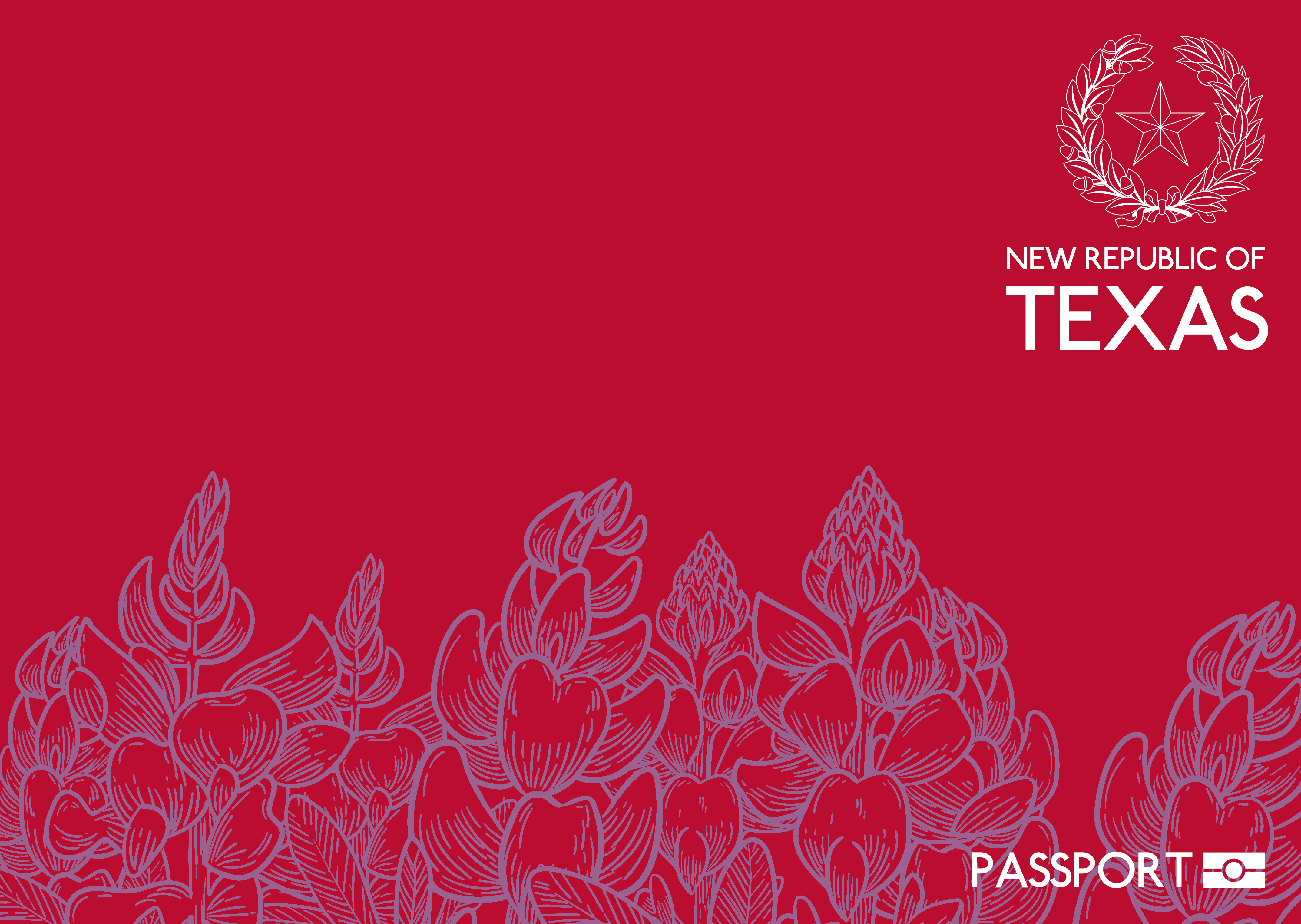
After moving on from the idea for a while, here is the passport design that I think I’m going with (image is the front and back cover combined). Will get this produced, and then take some photos to create a cover for the zine.
If you’re going after a magazine look, it doesn’t look like one. It looks more like the cover of a booklet or a report.
A magazine needs a clear mast or nameplate. This doesn’t have one, unless the name of it is New Republic of Texas, but that doesn’t really make sense. It also says PASSPORT, but there’s no obvious clue as to what that means since it’s obviously not a passport. A magazine (or a report or a booklet) always contains a title or teasers as to what’s inside. Your cover contains no information about what this magazine/booklet/report is about other than it might have something to do with Texas.
It’s nice, clean and simple, but if I saw it on a magazine rack, in a library or sitting on somebody’s bookshelf, I’d have no idea what’s inside it.
Moving past that confusion, what are the purple plants? Are they a clue about what’s inside? Are they a native Texas plant? What relevance do they have? The purple and red really clash with each other. They’re analogous colors of almost the same value, which causes them to visually vibrate (for lack of a better term).
You’ve made the seal, the words beneath it and the passport logo flush right. There’s nothing wrong with doing that, but they’re close enough to the same width that they look centered, except the seal, which is pushed off to the side. Yeah, I know that if I measure the edges, they’re flush right, but my brain keeps thinking that the seal needs to be centered above the words — possibly because the seal itself is vertically symmetrical.
Aesthetics aside, and back to what I think is most important, there’s no words or visual clues on the cover of this mystery publication that tells me what it is.
A major component of graphic design is targeting. In a broad sense, effective design targets an audience, but on the way to that, there are many sub-targets. “Magazine cover” is a sub-target. To hit it, you must aim at the audience members’ recognition impulse, and that means it has to look like (the common preconceived notion of) a magazine cover. This might feel like an unwanted constraint to we who would prefer setting trends rather than following, but recognizing these constraints and working well within them is the recipe for successful targeting. After all, if you set out to design pants, you can’t design a hat and expect people to wear it on their arse.
So, if the sub-target here was “magazine cover,” you’ve missed it, and so too will the audience.