Looking for feedback on Logo Rebrand

Hi, I’m looking for a Designer to answer the questions below for each of my Vegemite Rebrand Logo Designs for an Assessment. a) What does the logo represent to you?

b) Is it legible? Is it easy to read and understand?
c) What is the core product/service undertaken by the business?
d) What do you think about the company when you see this?
e) Does it stand out and catch your eye?
f) Does it feel genuine?
g) Are there any technical, legal or budgetary issues that need to be considered?

Honestly, I think it is a step backwards.

The existing branding is not going to win any design awards, but it is one of those things, like Marmite is in the UK, that are cultural icons and if you mess around with them too much, you make people positively angry, or at very least leave them with a real sense of unease that their world is a little out of balance. You‘d be playing with people’s childhood memories, their sense of, nostalgia and history. We all hold on to our halcyon, ‘hide-and-seek-in-the-woods’ childhoods with a fight to the death. Products like Vegemite are usually part of all those nostalgia trips. You’d be playing with fire.

This is one of those branding jobs that would require vast amounts of consultation and market testing. In the end, the outcome would likely be a tweak or a tidy up of the original and end up costing tens, if not hundreds, of thousands, and have everybody up in arms, saying, ‘I could have done that for a tenth of the cost’, without the vaguest understanding of what’s involved.

So, the question has to be; why are you wanting to rebrand it? If it ain’t broke… and all that. There has to be a very good reason to want to mess around with such a cultural signifier. People don’t like it. If there is a change in company direction, ingredients, a need to respond to a changing market demographic, because of a drop in sales, etc, then perhaps – but only perhaps. A lot of that would be done with targeted advertising and marketing strategies. Messing around with such strong brands has to be a last resort.

On a practical level, using cultural clichés, like kangaroos on products that are already cultural icons is a big no-no. Just comes across as trite and patronising. The colour choice also misses the mark, to my mind. Looks fresh and citrusy. Not really the right feel for this product. And the strapline. Again, all too cliché – unless this is something historic and existing, they have used for years.

Sorry, a bit of a slating, I’m afraid, but better to have honest criticism that feint praise.

Ok, thanks for all that! Doesn’t help me with finishing the assessment though!

I need to rebrand it because its an assessment that I have to rebrand the Vegemite logo??!!

THE DESIGN BRIEF

To design a NEW UPDATED logo for VEGEMITE

VEGEMITE has reviewed it’s branding and identity through an independent consulting company and as a result of the findings has decided to rebrand the logo and some secondary associated elements, letterhead, business card and email signature.

The design must be simple, elegant, clean and minimal to reflect the VEGEMITE marketing ethos : ”simple, colourful, iconic”
Maximum of two colours other than the use of black and white.

Then, in that case, it depends entirely what your college is expecting of you.

Personally, I’d still treat it with a lighter touch and not deviate so far from what exists, for all the reasons I have outlined. Maybe look at modernising, and updating rather than redesigning. Treat it as a more typographical refinement. You don’t always need to reinvent the wheel.

However, as it is not a real world project, the result is going to be what is expected of you from your college course, rather than the approach that would be taken on real life. If you wanted to put any weight on what I have said, then perhaps have a word with your tutor and see what his or her thoughts are. Because it is a fictitious project, they may be wanting to see how you would approach a full redesign, ie, to judge whether you get the ‘tone of voice’ right. That being the case, I still think the citrus colours don’t work well. I think the yellow has to stay, given how recognisable it is.

My comments were not intended to slate it wholesale, ie, I am not trying to crucify you as a designer. It certainly doesn’t look amateur and could be a believable product on a supermarket shelf. My comments were based on the product it is and it’s cultural significance. Personally I am not a huge fan of scripty, jaunty fonts, though I can see why using them to change the tenor of the message and appeal to a different audience, might work, I just feel it comes a little too far away from what the existing brand is and you risk alienating its current market. I’d just dial it back a bit if it were me.

One final thing I’d say you could do to improve the second option, is remove the graduated tint on the circle. Looks a bit too bling. The product is a fairly utilitarian, down-to-earth, dyed-in-the-wool, sort of product, so making it glitzy fights with this.

As I have given you my thoughts on the feel of it visually, perhaps better others wade in with their thoughts too.

Good luck with it and let us know how it all goes. Remember, this is all just my opinion. Feel free to come back and tell me I was completely wrong and that you aced it!
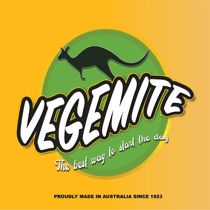
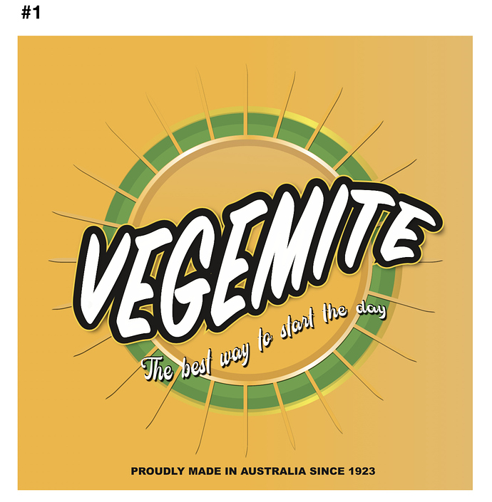
your professor is on a roll.
Student seeking feedback, help please!

Well, you need to be the judge of that; we don’t know your instructor and his or her expectations.

However, Sprout is right. There are certain iconic brands that hold special places in the hearts of those who love them. Changing the visual identity of those brands risks undermining that connection people have with them. Vegemite’s visual branding isn’t great, but despite that, the existing visuals have significant and very valuable brand equity, and is something with which its fans have a strong emotional connection.

Like I said, I don’t know anything about the expectations of your instructor. If he or she wants a total redo, well, that’s what you should do. After all, your instructor is, in essence, your client who will be paying you with a grade.

If I were your instructor, though, I’d be awfully impressed with a student who looked beyond the actual assignment and provided solid marketing rationale as to why the traditional brand should only be modernized and cleaned up rather than redone from scratch.

If this were me and Vegemite was an actual client, I’d have this talk with them about brand identity and brand loyalty — backed up with lots of research — before moving ahead with any request for a ground-up redo.

OK.

It represents Vegemite. I mean, how could it represent anything else since it says Vegemite.

If one already knows what Vegemite is, it’s understandable. For those not knowing, the label (if that’s what this is) provides no clue as to what’s in the bottle. As for readability, the typeface you’ve used for the tagline isn’t the most legible face you could have used.

Again, for those unfamiliar with the product, there’s no indication at all as to what it is.

If I wasn’t already familiar with Vegemite, I wouldn’t know. It has something of a cartoonish look, so I might assume it’s some sort of weird substance to eat (given its placement in the grocery store), but I would be unlikely to purchase it. As for the company behind it, I wouldn’t think anything.

Yes, but there’s no context. Would it stand out on a grocery shelf store next to everything else. Well, maybe. Yellow is a bright color, but there are lots of variables to be considered that aren’t part of your design.

Genuine what? Genuine Vegemite? Not really, and for all the reasons mentioned earlier. The new look is too far removed from the old one.

Not big ones, but a some point, you would need a flat color version minus the tonal gradations.

OK; I let the seemingly arrogant, exclamations in your first response slide, but I am afraid when you used the same ungracious, (now capitalised) tone of voice in your second reply, it does not predispose me to help you any further. A little humility goes a long way. I’m out…

…not quite; Read the brief again. Now I am.

The capitals in the brief is because I copied and pasted this from my assignment - it was in caps lock already. Sorry. As for my caps lock I was making it clear that I near the questions answered because I asked for this at the start and wasn’t get these answers. Sorry. Thats fine if you don’t want to help any further. Thanks for the additional feedback.

Thank you

Hey, do us a favor and screenshot this:
I’m asking the trainer to come on here and explain this exercise to us.
Since s/he is using us for free help on this classwork, maybe s/he should, you know, ask us in person what we think of this assignment…

Sorry for wasting everyones time :slightly_frowning_face: This is my first time using this space, and I’m only a beginner so don’t worry I won’t be putting anymore stupid exercises up.

It’s not a wasting anyone’s time if you get something out of it – even if it is not what you initially wanted to hear.

Many of us around here have been working in the field for more time than we care to admit and I assume are here because, like me, they have reached a point in their career where they want to ‘put something back’. It’s certainly a resource I wish I’d had at your age.

I only got a little piqued because you came back all guns blazing and sounding pissed off because you weren’t getting the help in exactly the way you wanted it given instead of engaging in a dialogue. I am more than happy to do this, but not when I get barked at for doing so. Anyway, let’s draw a line under that.

Do stick around – and never stop asking for help. It’s a good community with lots of very knowledgable people. Even for those of us who are ‘seasoned’ it is always good to get other professionals’ take on things. None of us ever know everything.

You can post anything you like here in the student forum.
Members should check the header before going off. I’m just as guilty of this as the next person.

Anon, we’ve been getting these kind of assessment posts for 3 years now, starting with a bunch of IKEA junk then changing to Vegemite. It’s wearing a little thin that this instructor thinks we can teach their class for them. You should be doing your critiques in class where you can give and take critique in real time, just like you would in a real job. Asking a bunch of strangers some really off the mark questions regarding an assignment we know nothing about is bad form on your instructors part. You are just caught in the middle.

Stick around, read up, give, and take. Learn to roll with criticism without anger (IOW, watch those caplocks) and if you disagree, feel free to argue your point. We like dialogue.

1 Like