Hi All,
I have to submit some designs for a new Vegemite logo as part of an assesment.
I also need to seek feedback from 2 graphic designers based on the questions below. As I dont actually know any I am relying on help from any designers out there that are generous enough to give me some of their precious time to answer the following:
a) What does the logo represent to you?
b) Is it legible? Is it easy to read and understand?
c) What is the core product/service undertaken by the business?
d) What do you think about the company when you see this? (List a range of key adjectives for them to choose from ie innovative, stylish|
e) Does it stand out and catch your eye (you may want to include a visual amongst your competitor logos)
f) Does it feel genuine?
g) Are there any technical, legal or budgetary issues that need to be considered?

Hi All,
I have to submit some designs for a new Vegemite logo as part of an assesment.
I also need to seek feedback from 2 graphic designers based on the questions below. As I dont actually know any I am relying on help from any designers out there that are generous enough to give me some of their precious time to answer the following:
a) What does the logo represent to you?
b) Is it legible? Is it easy to read and understand?
c) What is the core product/service undertaken by the business?
d) What do you think about the company when you see this? (List a range of key adjectives for them to choose from ie innovative, stylish
e) Does it stand out and catch your eye (you may want to include a visual amongst your competitor logos)
f) Does it feel genuine?
g) Are there any technical, legal or budgetary issues that need to be considered?
Topics merged.
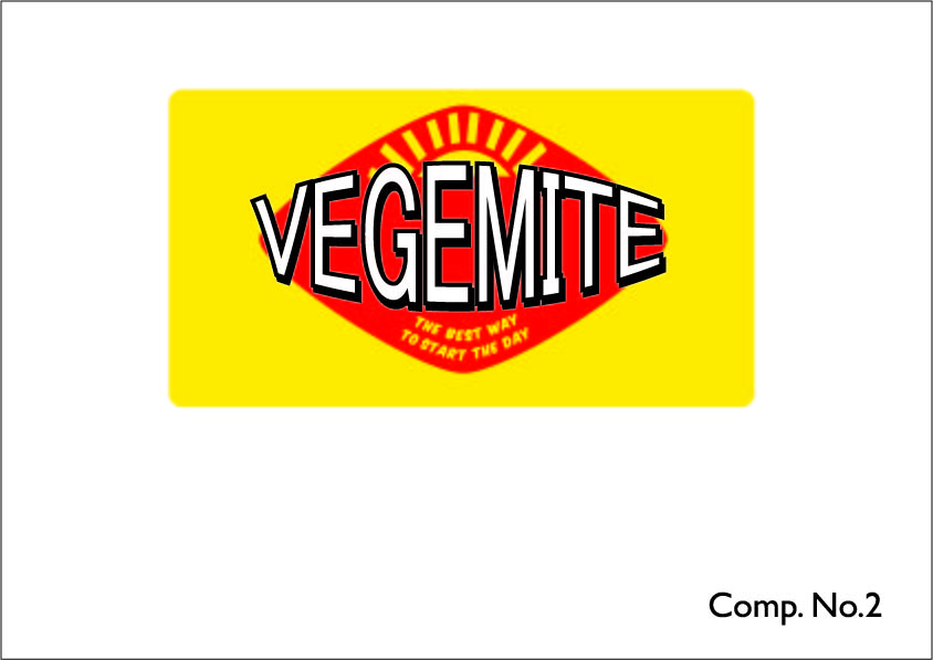
Vegemite
No. If I wasn’t already familiar with the product, I could have never identified the M.
Vegemite, promoted as a breakfast option, it would appear.
Cheap. Discount store brand.
If bright yellow and red is a rare color combination among shelf-neighbors, yes, it will stand out.
Genuinely low-end, perhaps. Consumer-grade.
Consider applications in which the white areas will become transparent; i.e., the color of whatever is underneath. A white under-coat will add cost.

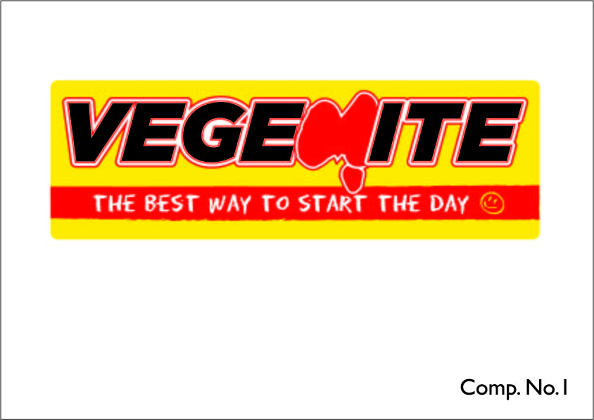
Vegemite
No. The product name is readable despite the asymmetrical warp, but the tagline is far too small.
Vegemite, promoted as a breakfast option, it would appear.
Cheap. Discount store brand.
If bright yellow and red is a rare color combination among shelf-neighbors, yes, it will stand out.
Genuinely low-end, perhaps. Consumer-grade.
Consider applications in which the white areas will become transparent; i.e., the color of whatever is underneath. A white under-coat will add cost.
I’m not from Australia, but I’ve heard of Vegemite. So what does it represent? It represents your idea for a Vegemite label, which seems like a stupid answer, but there’s nothing else it could represent given that it says Vegemite.
Is that M supposed to be a map of Australia. I never would have guessed it excepting that Tasmania is hanging off the bottom. The logo is readable, but the M is weird — both as a letter and a map.
Um, Vegemite. Again, the answer seems obvious given that it says Vegemite?
I don’t know what to think of the company, but here’s what comes to mind regarding the product: cheap, low-quality, discount, unhealthy, unappetizing (Again, though, I’m not from Australia where this yeasty stuff seems to have a special place in people’s diets. In other words, I’m not the target audience, so my adjectives might not match up with those who are the target audience. )
There typically needs to be a reason for a new label, like a new objective that the new label would help accomplish — for example, updating the products image or it being introduced into a new market that isn’t familiar with the product. Not knowing what the redesign’s objectives, all I can do is respond to your question about whether or not it would stand out on a grocery store shelf, but that depends on the other products surrounding it. Yellow, red and black is an aggressive color combination, but a Google search tells me that this is already the colors of the existing Vegemite label. For that matter, yours is mostly just an update. Given that this isn’t a real project and something, instead, for a class, if I were you, I’d probably experiment a bit more and come up with something very different from their existing label.
Genuine what? Genuine Vegemite? I don’t know. Never having seen a bottle of the stuff nor tasted it, I don’t know if it’s genuine or fake. I’m not even quite sure what the question means.
Why are the two labels different shapes? Something like the size and shape of a bottle can’t really be changed on a whim to accommodate the label — at least not without a very good reason. It usually works the other way around.
Thanks for the comments, it means I can now move on to the next stage of this assignment.
Thank you for the comments, it means I can now move on to the next stage of this assignment.
You lucked out that you got two very professional replies. Both of whom pointed out the flaws in your work and the assignment’s line of questioning. I wouldn’t say you are quite ready to proceed to the next stage.
This only means we are going to get a deluge of Vegemite logos now instead of Ikea logos.
Yay.
…Sigh…
Yes we have to tick a box before I can work any further and unfortunately I don’t know of any designers around here to ask, and this was suggested to me by tutors. Next time I will post in the student section.
I also see flaws in the questions we are forced to ask they are always generic and dont always seem relevant. And being made to redesign a logo that is historic and should only ever be tweaked.
Again I am grateful to those who took the time to give me their comments.