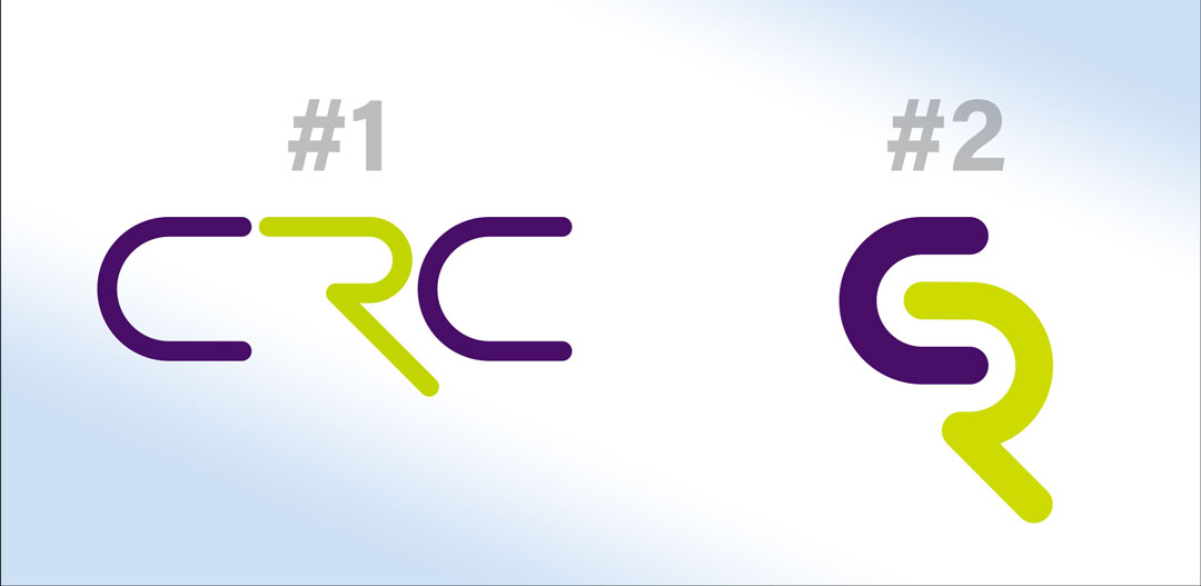
Is it OK to post a question for an A/B choice? I’d love to get basic feedback on which of the two logos below people find more appealing. It’s for my graphic design business rolling out a new emblem for 2023. New cards, literature, website etc. They would be accompanied by a wordmark, and #1 has all three words initialed, and #2 just has the first 2. Thank you!
If both options capture your identity and vision and achieves the best perception of your business in the minds of your target audience, I’d say the second option is more creative and unique. It’s not clear from the two whether you want to capture the three letters, CRC. Therefore, I cannot reject the second option for not fully capturing the three letters.
For me both are good looking but not the solution to your client’s need.
I will look for the memorability of the logo. Whatever it contains shapes, types or complex illustration, the most important property of a logo is its memorability. If a prospect looks at it for few seconds, the logo should get stored in their mind. Not the exact shape or color but largely the idea or concept.
I would also suggest to try and research the emotional attachments of potential customers to client’s product or service. What emotions will drive the end user to buy the product or service? Try to capture that into visual form.
In this case I’m just trying to create a more interesting emblem to go along with my existing brand. What kind of clients? All over the map really. Main street businesses, corporations, tradesmen… I prefer not to specialize. I like the variety.
It’s not for a client, it’s for my graphic design business. I always find that producing a visual that communicates “graphic design” is extremely difficult, because it already is what it is (if that makes sense). But I offer more than design, so maybe it’s a good idea to approach it from another angle!
If I went with the second one, (or either of them really) it would be accompanied by a wordmark with all three words. The first two initials are sort of the “flavor” of the business name, and the third is the more direct descriptor, so there’s a bit of a divide between the first two and the third where I could have the emblem and then just the third word in some cases.
Same reply as the comment above: If I went with the second one, (or either of them really) it would be accompanied by a wordmark with all three words. The first two initials are sort of the “flavor” of the business name, and the third is the more direct descriptor, so there’s a bit of a divide between the first two and the third where I could have the emblem and then just the third word in some cases.
Ahh ok, that seems like quite a broad mandate to design a solution to. The options you’ve provided both look to be kinda futuristic to me, is that what you intended?
I’m curious … you may already have answered this, but what do the letters CRC stand for? Are all letters necessary to communicate who your company is? That might help me understand if the letters CR communicate better than CRC.
The company is Charles River Creative, and either emblem would be accompanied by a wordmark and only very rarely ever be on its own out of any context (like embroidered on a collared shirt). In this case, “charles river” (CR) is sort of the “flavor” of the business name, and “creative” is the more direct descriptor, so there’s some implied line between them which makes me think CR is OK.
Not specifically futuristic, but that’s certainly in my personality. Definitely wanted to do something sleek, somewhat technological, certainly not retro, hoping for some “coolness” factor.
If I were just basing it off of aesthetics, I prefer #2. I like that it’s compact and interlocks. The gap created between the first C and the R of #1 make it look a little unbalanced. However I do think it’s a problem that #2 reads “CR” and not “CRC.” I would consider finding a way to incorporate the second C using the same approach as the #2 design.
Whether you’re building a new brand or refreshing an existing one, evaluating the quality of your logo is an important step. When evaluating logo quality, here are some questions to ask.