Hi Guys,
Just looking for some feedback on my school project . I have been give the task to create s logo for s juice bar and I have used Placeit to create those 3 designs. Would love to hear what you think

Thanks
Hi Guys,
Just looking for some feedback on my school project . I have been give the task to create s logo for s juice bar and I have used Placeit to create those 3 designs. Would love to hear what you think
That sounds like an awesome school project! They’re all really cool designs, although they each are totally different directions and will appeal to different audiences for different reasons.
To determine which direction is the best fit I think you need to ask some more questions about who the customers are - how would you describe them in terms of age, gender, interests and lifestyle?
Too complex.
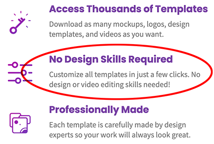
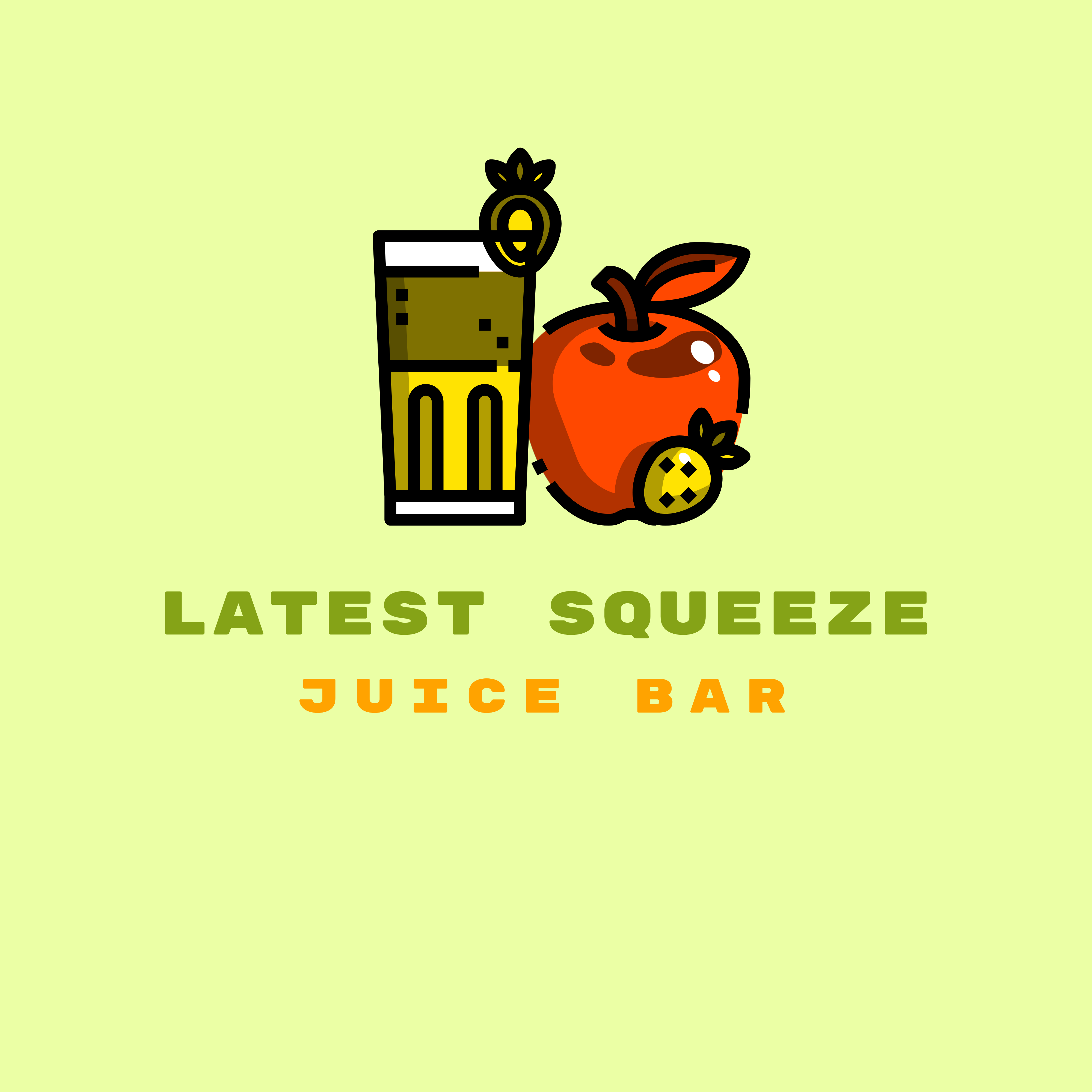
Placeit is a template driven drag and drop piece of junk. Don’t use it to create logos for class or for commercial use. Everything you’ve used in those logos is a pre-created piece of clip art or preselected typeface. On the one with the apple, the “graphic” has been made red, and the “highlights” have been made yellow. That’s why you have a yellow strawberry with yellow leaves.
That is NOT how a logo is made. You cannot trademark it and it is NOT unique.
Just Don’t
If your class even remotely suggested this software, ask for your money back.
I am NOT kidding.
I love it!
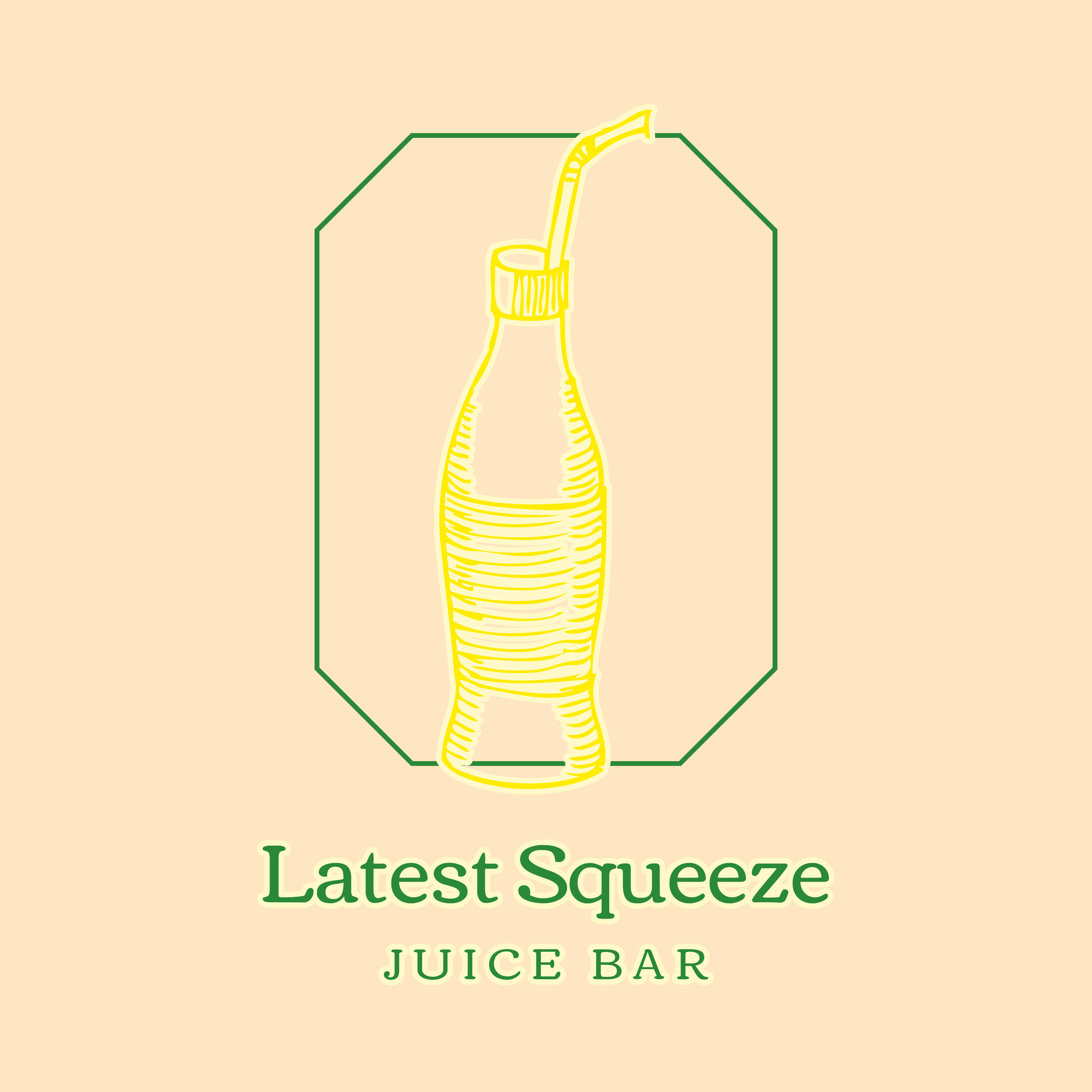
looks like 90s signs, like from movies. I personally like the second option the most! Good job ![]()
totally useless and not design.
Anyone can pick and plop clip art.
That isn’t what a logo is.
But somehow I have the feeling a mod should com along and remove the website name from the OPs post and my post above for the spam it probably is.
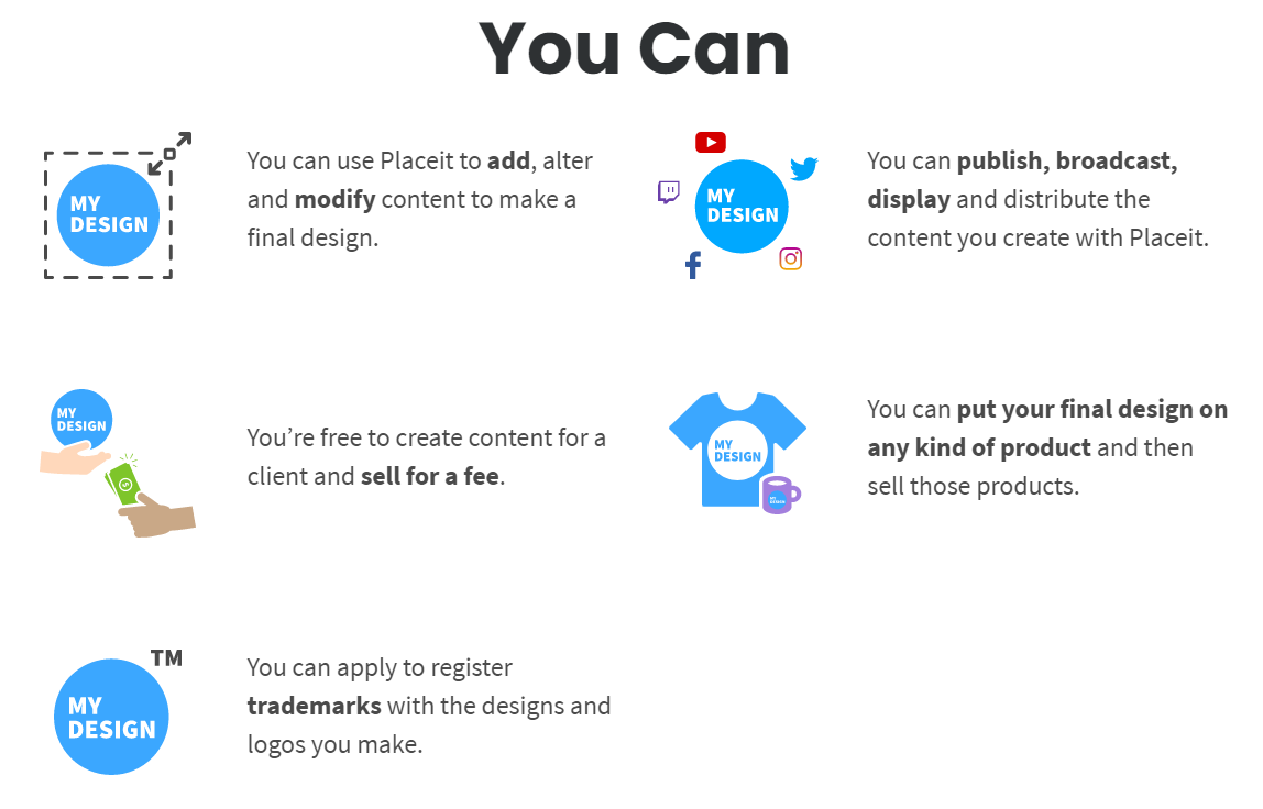
It says you can apply to register trademarks.
It doesn’t say you’ll get that trademark.
And seriously, these designs use the included clipart in the software and its limited color ability. If this is for a class that sort of is rather off the point of the exercise.
You know what.
I give up.
I don’t care anymore.
I’ve been on this forum and others like it for over 20 years - it hasn’t changed.
yeah it has
It’s gotten worse
I think what has changed in recent years is that young designers and, in turn, low-budget clients, are so under-educated about what design actually is, that this becomes the accepted norm and these kids think they are designers because they tell people they are. My hope is that as clients realise it simply doesn’t work at anything other than a most basic level, those charlatans will end up getting weeded out. In the meantime it’s all thoroughly depressing. I don’t remember being that ignorant and trying to find an easy way out. I remember being eager to learn all I could, but not to find some cheating shortcut.
It’s a sad indictment of a society that wants everything immediately without putting any effort in. Social media influencers and over-wealthy celebs who are only famous for being famous. I can’t be bothered with any of it,
Thankfully good design has always needed good clients and they are still around.
I think sites like Placeit are great for people have minimal to no design skills and no budget and just need to put something together for their local bake sale or whatever;
As for cheap clients that don’t value design and are going to use something like this for their business, good luck with that!
I’d never heard of Placeit until now. I just visited and it’s obviously not a tool for professional designers. I’ve circled the important part.
There’s obviously a market for it. The woman who started Canva is a billionaire now. I doubt she gives a flying duck if it causes us day to day issues in RIPs.
Second design looks best. Try making it more cohesive though as the juice glass/mug and the font don’t seem to have anything to do with one another. To solve this, you can try to make it more emblematic to tie them together, or try messing around with the placement. However, you might have issues due to the juice glass being more squareish and the font being more round/curvy