how ca i improve this logo
I moved this to it’s own topic and fixed your upload link as your msg. cut part of it off so it wouldn’t show properly ![]()
I also put this in the Student category. I am going to assume you are still learning.
As for your logo…
There’s a lot to unpack here.
First .. what is the brief? Who, what, where, when .. etc.
Is this for a crowd sourcing site or competition?
1 Like
As my Graphic Design teacher used to say. “Do over.”
the purple has no contrast against the black
The arc for the lettering over the ball is wonky, it in no way follows the ark of the circle
The circle border is off. Could be on purpose, but looks like a mistake
Gradients in logos, especially ones that obscure important elements, no go.
Why clip the circle with the cable.
The roughness of the logo execution sure doesn’t speak to “quality.”
That is a nice rendition of a headphone plug, or is it. Be sure it accurately represents the type of connector your client has in mind. Not just any plug will do.
2 Likes
I agree with PrintDriver—start over and resubmit. Dump the gradients and odd color scheme. Change the fonts (and the whole design for that matter) to better reflect the “Quality” statement. The company name should always draw more attention than secondary lines (such as the “Quality Assured” wording.)
In all fairness, when the teacher said “do over” if you had a really good, convincing argument for why you did something the way you did, you might sometimes get an “Okay, but Do Better.”
I’m not sure there is an argument for any of the choices here. I could be wrong, but it would take a lot of convincing.

Well you see the problem already. At small sizes you can’t read it.

Remove white strokes
Remove gradients
Don’t squash type
Don’t use full colour images (cables at bottom)
Choose better fonts for the Jareeh and the Quality assured
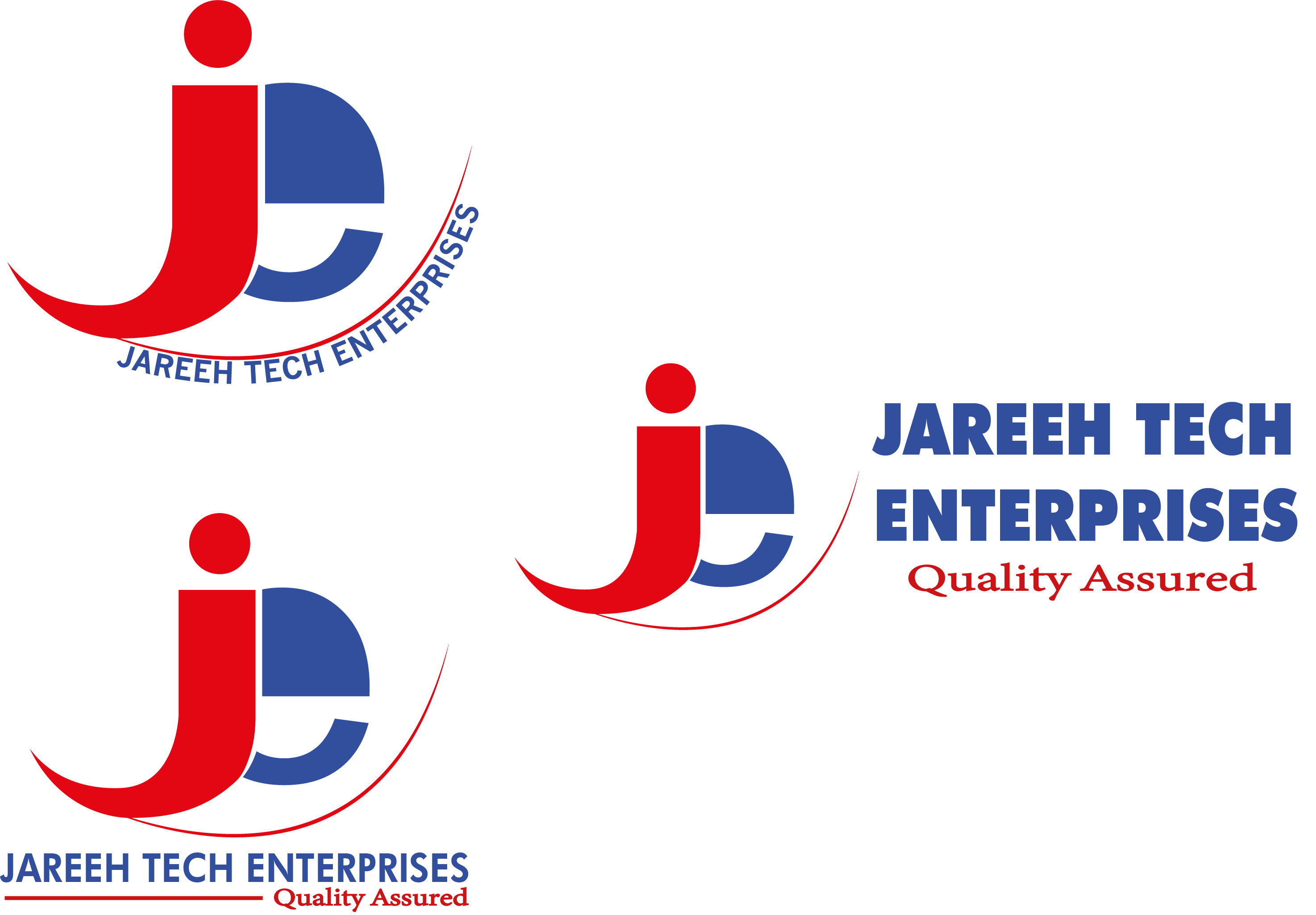
I like the JE symbol - it doesn’t need the gradient circles at the top.
I like the circle it sits in.
The red box - text is not centred
Try
in red box
JAREEH TECH
ENTERPRISES
underneath
Quality Assured
Even bend the JAREEH TECH ENTERPRISES around the circle
@njeru Your posts have been combined to prevent confusion.
The composition is way too busy. Good logos usually focus on one thing or one idea. Good design is more about subtraction than addition. In other words, less is usually more. In a logo, aim for simplicity.
@njeru Please let us know if this is for a crowd sourcing site or competition?
Thank you all for your great comments and critics. Sorry I didn’t share all the details at first.
My logo was intended to be used for a mobile phone and computer accessories shop.
Any more itterations?
How come they have a pretty slickish website and the logo looks like the way it does?
https://jareehtechenterprises.com/
What’s your relationship with the shop?
1 Like
The shop is owned by my cousin. the logo on the website was the first one i did. so we wanted to make better
Have you been able to implement any of the changes mentioned here? How is it looking?