Hi!
I was working on a personal project and looking for some advice from experienced and brilliant designers.
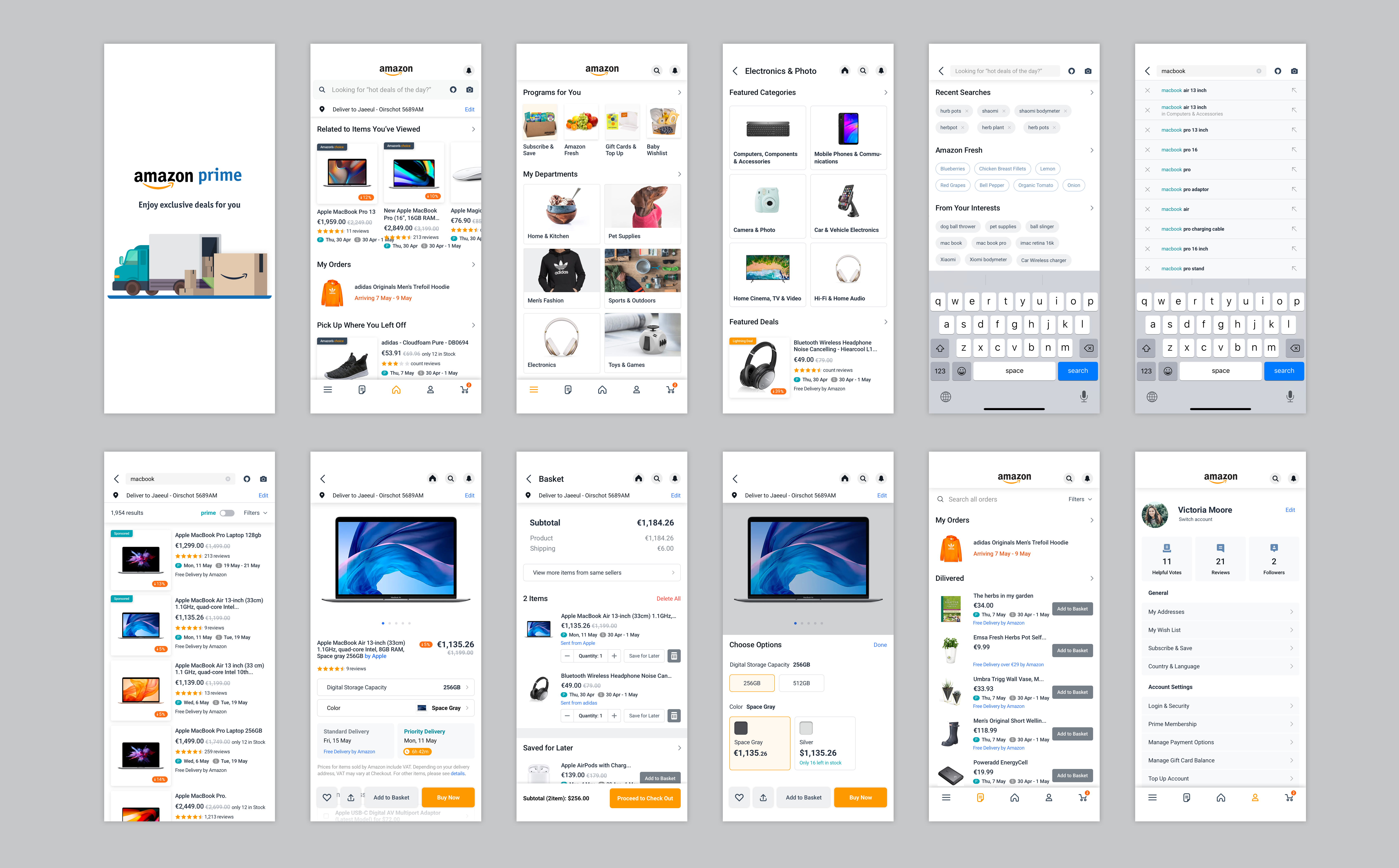
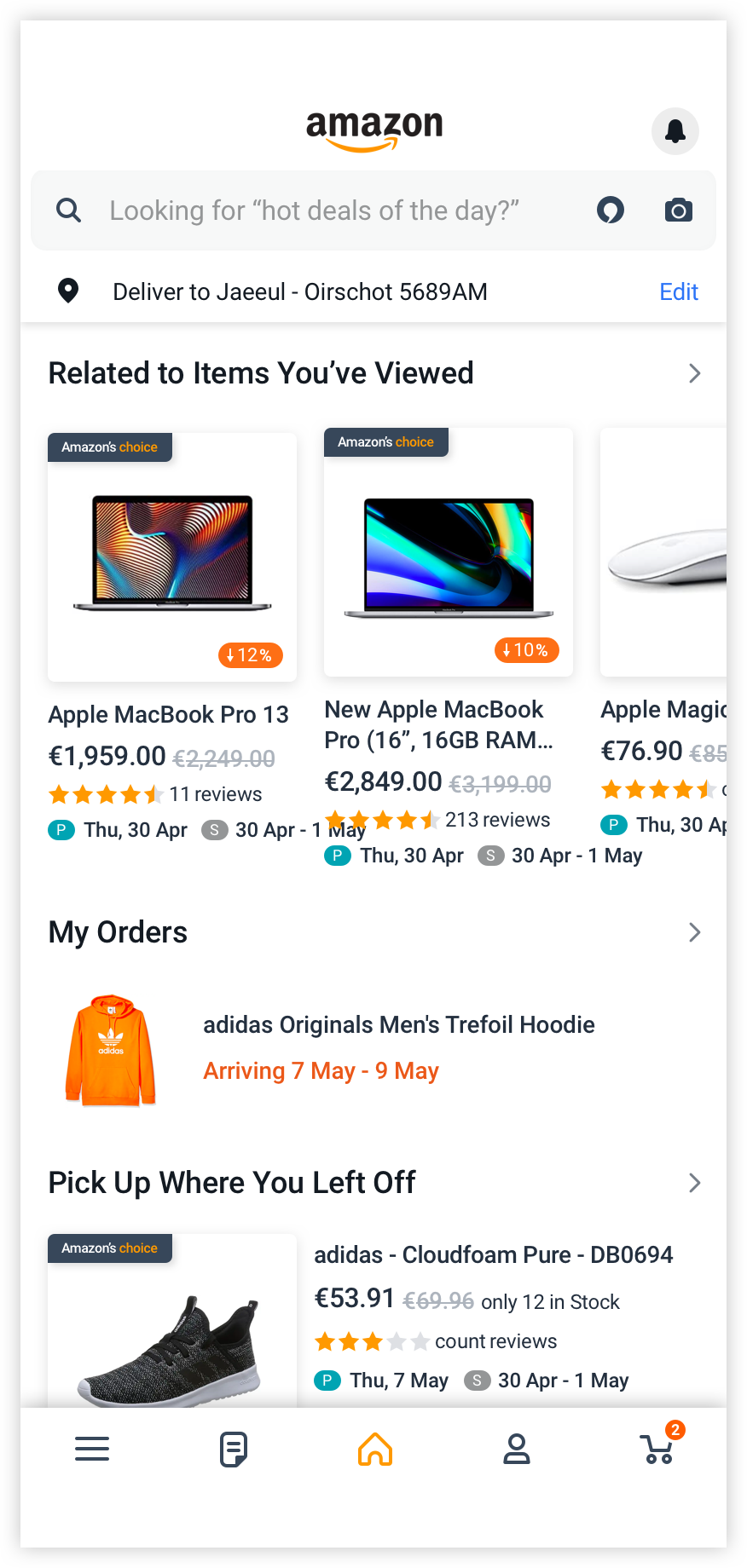
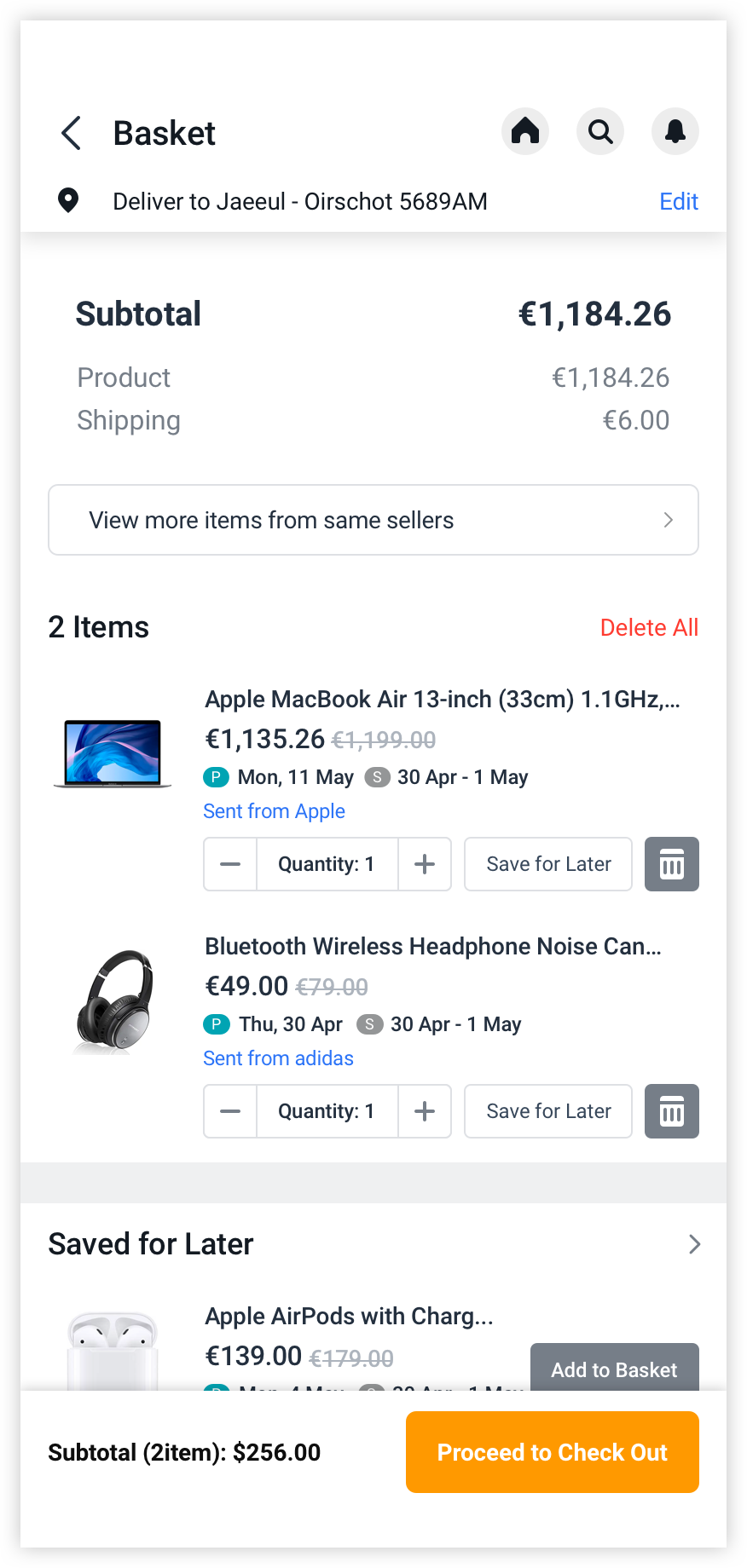
The topic is redesigning the Amazon mobile app, as recently I had many chances to look into the app in detail (as I stay at home all day and only shop on mobile LOL).
I’ve taken an approach to make the designs look realistic, so I brought some real data. So the designs don’t seem simple and fancy as like other concept designs. However, I see that there are rooms for improvement to make the screens neat and organised. But I don’t know how to move forward without helps from experts.
Any comments and feedback would be appreciated!
*The screen size is 414 * 896, iPhone11
I personally don’t know much about UI design. But to me this looks just like a cleaned up version of the original amazon app. I can see how you made the squares rounded which would give a more friendly look and design aesthetic similar to that of IPhone and Apple but to me it looks more like a cheap online shopping app like Wish.
Neatness wise I don’t think its anymore neat then what amazon already has and lots of the things you did to make it neater may be against better user interaction.
For instance, I believe you used a “P” sign to indicate the delivery date, whereas I can see the “Get it by -------” as a easy to understand and psychologically encompassing story that tells me I’m gonna get my product really quickly.
The rearragement of the shopping cart in the top corner is also an issue, at least from my understanding just about every shopping cart thing is in the top right which makes it easy for the user to know where to look to to find their shopping cart.
Amazons top left corner has a menu function that guides you to everywhere you would want to navigate too which makes it easy for the user. You have yours on the bottom left. But since people usually scan in a F motion yours would be a weaker choice.
but then again not a UI guy so what do I know
Thanks for the great comment. I agree that what I did made it not that neater than the original version. But for the navigation, I think bottom tab navigation has some benefits than having a hamburger button – you can get to the menus with fewer steps, and the structure is visible without calling the navigation.
I am still looking for some room for improvement. For your feedback that it looks like a cheaper site, what are some possibilities to make it not look cheap?
I guess cheap is a bad word for it, its nice and clean. But put in some of the design elements that represent Amazon is a better way to put it. They have a brand and probably a brand guide (not too sure about this) so if your gonna redesign something from them it should fit their brand.