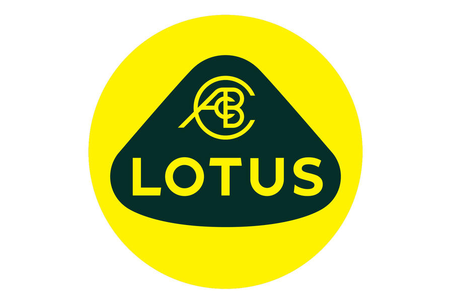
Lotus has unveiled a revised version of its roundel logo as it continues its revamp and revival under new ownership.
1 Like
Simple, flat design. Sans serif type. It’s keeping with the times, so it will probably look dated pretty fast . . . but I like it.
Well, I don’t know how one would go about making a silk purse out of a sow’s ear.
I’ve always wondered about their logo and how a company that makes $100,000-plus automobiles got stuck with it. As for the new one, OK, it’s more contemporary-looking than the others, but it still looks like something that might have been cobbled together by a committee in a backwater Communist block country during the Cold War.
4 Likes
My brain can’t tell whether it’s black or green in the middle because of the neon yellow, but it’s probably dark green. They really need to change their colors…
1 Like
Meh, I see a certain amount of sophistication in it. I think the outer shape is unique.
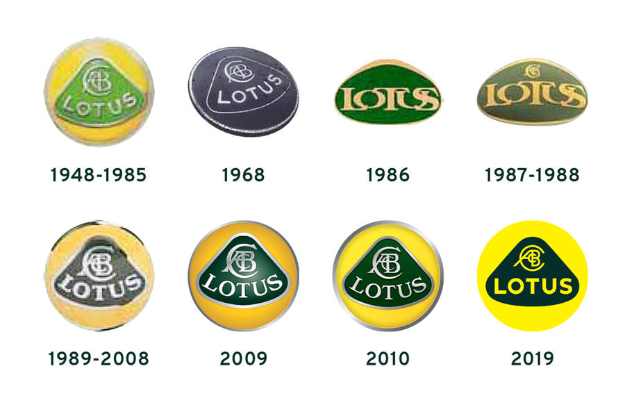
It sure is a good argument for not putting all the initials in the logo, even if they do belong to the founder.
The first two versions (1948-1985 and 1968) are also sans serif but the name is on a curve to fit the inner shape as it is on the latter versions. Having the name straight looks wrong to me.