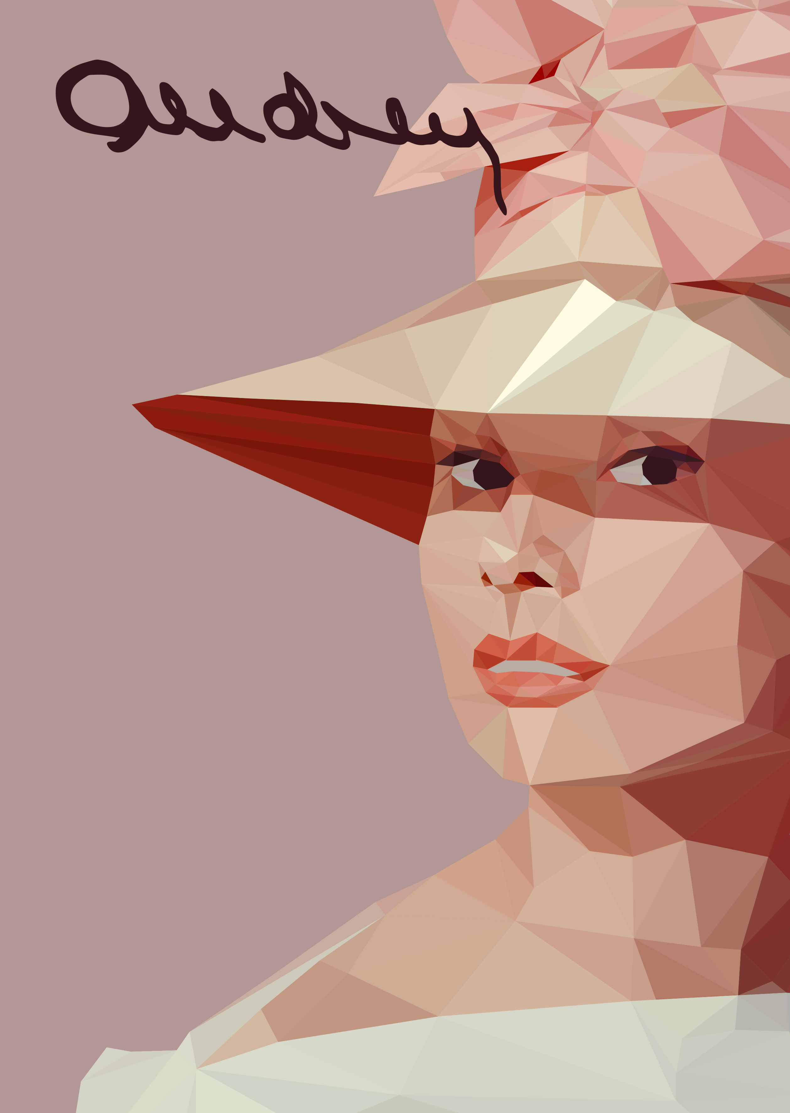
Here’s a design I made recently.
The person in the illustration is Audrey Hepburn and I took her autograph to create the title.
I was going to use this for a portfolio piece like an exhibition poster/ad or bookcover but eventually dropped it.
It’s an experimentation to try something more polished and to learn the technique.
Think it turned out alright. Anything you’d have done differently?
Think it’s worthy as a standalone piece in a portfolio?
Audrey has very characteristic eyes. Your portrait loses that and becomes somewhat more generic.
Too much poly in the hat makes it appear creased or rumpled.
Some weirdity going on in the chin area too.
I hope this trend ends soon. Not a fan of low-poly.
I do like the illustration, but @Eriskay makes some good points. Audrey Hepburn is soft, sensual and from the past. This style of illustration is pointy, tense and modern, which causes a bit of a disconnect between subject and style.
I have reservations about the signature too. It might be based on her signature, but it’s difficult to read. It’s also obviously a vectorized version of her signature, which is distracting. I think you’d be better off with more readable typography that better fits the era and her persona.
All that said, I’m still liking what you’ve done. It’s much better than my less-than-good attempts at this style.
You’re right about the eyes, it does get kind of lost. Also, maybe this isn’t the best way to portray her. Sometimes I pick a subject that I like and start working with it. I’ll have to pay more attention to picking an idea and style and match that subject to it. Part of me is still liking low-poly and I never tried it, that’s why I wanted to see how it’d turn out. I’d been viewing a couple of interviews with her at that moment so the pick seemed kind of obvious. I do know that lowpoly has been overused. Another reason why I thought it wouldn’t be great to take this and put it into my portfolio. The other one was because my other half mentioned it might raise questions to what kind of a book it was for and if it was for an existing client.
To get back at what you said Just-B; I actually tried to choose a font that fitted with the style, it was difficult to find one because when I got an idea in my mind, I find it hard to let go of it. Really have to learn that though. But I suppose this also comes with more experience and making a lot of work, getting better ideas.
In any case thanks for sharing your views. Appreciate it !
I felt it was kind of invigorating for me, even though I already felt some things were off with this picture.
maybe you can enhance the title typography a little bit and the illustration is good though ~
its like a signature / art style looks minimal / abstract. pretty cool! keep it up~