For a project. The article and images are creative commons.
I’m looking for a little feedback on how I can improve my design for a second draft. Any feedback is helpful! Thank you!!
I know you’re a student, but go look at some magazines (even PDFs of magazines.) There’s a lot that needs to be addressed in your layout including:
-
Oddly wide page margins
-
No space after on your paragraphs, the copy just runs together like one looooooooong paragraph.
-
Oddly placed callout quote that has no breathing room and is centered in a way that it creeps into the column next to it.
-
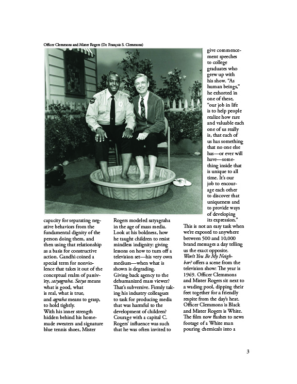
weird text wrap on the photo on page 3
-
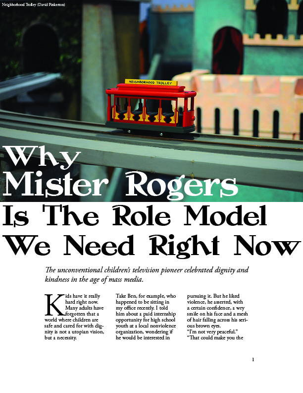
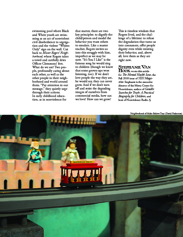
duplicating the trolley photo at the end of the articles, and why on the bottom?
-
Font choices seem odd.
Overall the design lacks personality. Like I said, look at higher-end magazines and really analyze them. See what you like about them and what you don’t. Be inspired, but don’t copy, ha! Also look into grids and how to use them in publication design.
Also, this should be in the Student section. ![]()
1 Like
To add to what CraigB said:
Your main head is dangerously close to the page trim.
Drop cap is extremely awkward. Pull body text maybe 3 pt away.
Indent first line of paragraphs, or create space before/after.
Cutlines look like credit lines.
Where’s the byline?
Author’s name at end credit should just be regular bold face.
End mark should be at the end of the article, not end credit.
Body text does not seem to adhere to the same baseline.
Thank you! I felt like some things were off and you helped me realize what many of those were! I appreciate it!
Thanks! I didn’t even realize there was a student section haha
Thank you for the feedback, especially the specific way to fix the drop cap! I did check the baselines in InDesign and they matched, but I agree, it still feels off. Do you know if there is anything else I can do to try to fix that?
As a former magazine design director…
That’s an unusual typeface you’ve used for headlines. Usually, a magazine will have a standard typeface, and an entire magazine using this one would be interesting. Honestly, though, I’m sort of liking it, but it has an awfully strong personality that would tend to influence everything else in every issue.
Craig’s already mentioned several of the things I noticed, but I’ll still elaborate on them.
As a practical matter, lots of negative space in a magazine is costly in the sense that it takes away the limited space for both editorial copy and advertising. The extra-wide margins on the sides might work for a particular story, but an entire magazine would have difficulty justifying it. Keep in mind that approaching a magazine article as a one-off thing separate from the rest of the magazine is a recipe for an incoherent publication design. Magazines, like most publications, need to be designed as a whole rather than as a collection of separate parts.
The column widths are awfully narrow, which impairs readability. When it comes to publications, the text and what it says, is king. The design needs to support that readability and not impair it.
Your body copy comes across as dense, heavy and a bit less than graceful. I can’t tell what it is, but picking the right face for body copy is, well, important since it forms the guts of the magazine.
The initial drop cap is an opportunity to do something interesting, yet you’ve just sort of jammed it in there with insufficient attention paid to how it fits with the surrounding text.
Paragraph indents are absolutely necessary. There’s no room for not doing this.
Almost every magazine needs running design elements that repeat throughout the magazine to help ties things together. These things include graphic items like stylized rules, page numbers, dates, issue numbers, etc. You’ve included page numbers, but they look like afterthoughts rather than solid participants in the design.
There’s no byline, unless you count the bio at the end of the story (which isn’t normally considered a byline). Bylines are almost always needed at the beginning in a position of some importance. They also provide an additional opportunity for a little bit of visual interest at the beginning of a story.
Your pullout quote is jammed into a space where it doesn’t fit. These kinds of things need to breathe. You should take advantage of them as visually interesting entry points into the story instead of treating them as just generic chunks of larger text.
Photo credits are always a bit awkward and they need to be tucked into the layout next to the photo in ways that are inconspicuous. This typically involves a light-faced typeface that doesn’t sit atop the photo drawing attention to itself. There are many ways to do them, and I’ve typically set them in small, 4- or 5-point light caps running along the side of the photo, but again, there are other ways of doing it.
Cutlines (captions) really shouldn’t be above the photos. There are good reasons to sometimes go against conventions, but doing so requires deliberately made decisions that improve the design. Your cutlines above the photos just look like you stuck them there because, well, just because.
The duotoned photo has an awkward dog-legged wrap around it. Sometimes these things are unavoidable for various reasons, but when they’re needed, they need to be tackled with lots of visual sensitivity in how they look and interact with everything else. Yours isn’t at all necessary and it makes an already narrow type column even narrower, and it’s created this really awkward gap on the line immediately after it.
You’ve repeated the photo on the first page on the second page. That’s rarely a good idea. People don’t have any interest in seeing the same photo twice.
In general, there are lots of missing or ignored details in your layout and things you’ve treated as perfunctory objects that just need to go someplace. It’s these details — cutlines, bylines, credits, page numbers, rules, issue numbers, running heads, and other things like this that provide an opportunity to establish and solidify the visual personality of the magazine. You’ve ignored all of them and concentrated, instead, on just the photos and columns of text. It’s as though you’ve built a house but failed to make it livable by furnishing it with all the details that turn an house full of empty rooms into a warm, inviting home.
I realize that’s a whole lot of criticism to digest, but you should have seen my first attempts at this kind of thing — they were far worse. Really. ![]()