Concept: This is a magazine article about the value of public art in cities
Goal: The intent of this project is to take a magazine article in the creative commons and create a layout in an eye-catching way
Format: This will be viewed both in print and digitally
Audience: People in their 20’s who are interested in politics (also my professor haha)
Experience level: I’m a college student with no experience with graphic design.
Nature of job: This is a school assignment. I have submitted the assignment as you see it as a rough draft, and after I get critiqued on this forum for a couple of days I am supposed to resubmit it for the final project.
I would really appreciate some beginner-friendly suggestions for how to make the design of the layout stronger and more unified within the four-page limit. Thank you in advance!
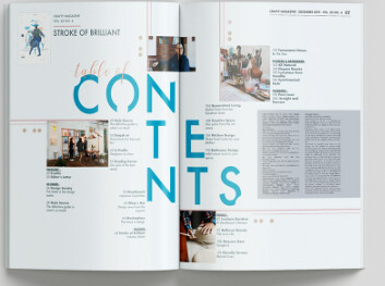
Either place a space between the paragraphs or use indents. Don’t do both.
The layout is awfully text-heavy. Add some photos of public art (with cutlines) and use pull-out quotes to break up the space and provide additional entry points for readers. Possibly use photos of people interacting with public art — people in your target audience demographic. Photos of engaged people always help draw in readers.
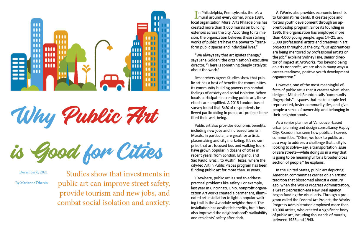
Don’t be afraid to use a big illustration and headline that dominates the page. The article is, after all, about art.
Consider using a large drop cap to start the story — not the anemic little two-liner you’ve used. Again, don’t be afraid to do bold things and take control of the page.
There’s too much leading between the lines of type in the headline. I’m not sure about that typeface and the colors, but that might be more of a personal preference thing, so I won’t dwell on it.
Why did you make the chunk of text beneath the headline flush right? Everything else on the page is flush left. Flush right, ragged left is almost always a little weird and not done very often.
Just some advice… Pick up a few real magazines and thumb through them. Notice all the graphic devices that are used to convey information and add visual interest.
That big blank hole at the end of the story needs to be filled.
Where are the standard rules, page numbers, publication names, dates, and that sort of thing that go on most magazine pages? Have you looked at real magazines? Did you not notice those things that are always on every page? They need to be on yours too.
Not that this doesn’t have production issues - it would need to be centre fold of a section - or else it would be difficult to line up the gradient.
That’s something you can ask your tutor about.
Para-spacing is a tricky thing. You might need to work with the editor to make sure, on the same page, both columns have odd or even number of paragraphs, so that the top and bottom line up (unless, of course, it was intentional, although I don’t quite understand why).
… and why is there a date on the opening page? What does it signify?
This is student work. I’m in a class that teaches the basics of graphic design for those who don’t necessarily want to pursue it academically or professionally. Apologies if this doesn’t belong here, but this is what the professor has us do as an assignment and it didn’t seem against the rules of the forum from what I can tell. I do appreciate the comments given; it makes me appreciate the eye for detail professional graphic designers have
Sometimes when students post in the non-student section, they get advice and comments more appropriate for other working professionals instead of students who are still learning the ropes.
As I said, no big deal. Since it’s been mentioned, I’ll move it to the student section.