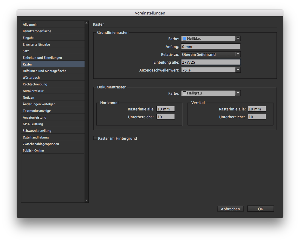
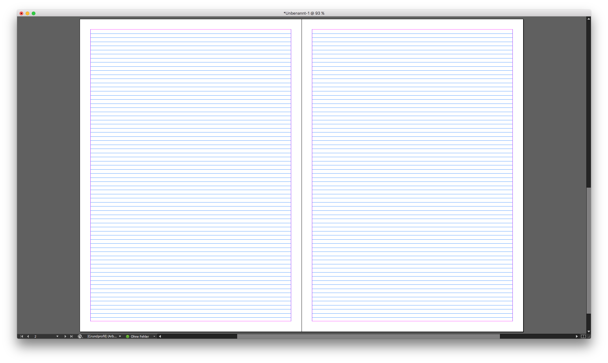
I have made a gridsystem and using the baseline in indesign. The baseline is set to 14pt as the leading of the body. This works good for body copy ofcourse but I feel really restricted with other copy.
I wanted to make the kicker / intro in 12pt but then 14 leading is to small but I need to go all the way up to 28 for it to work with the baseline.
Is this the way to work with magazing or am I’m going about it all wrong?
I don’t use baseline grids on most projects for much the same reasons as you mentioned. In theory, it sounds great, but in practice (at least for me on most things), it’s just too confining.
I typically end up just vertically justifying the columns. The lines of text no longer line up perfectly, but getting them to line up requires strict adherence to the grid. And since not everything I typically want to do comes in multiples of that baseline grid, I just don’t use it.
If I were laying out a novel, a technical journal or most anything else where speed and consistency were more important than design flexibility, I’d lock the text to the baseline grid. Otherwise, no, I just don’t bother with it.
Hi
No, grids are not too confining. They are your best friend.
First, the leading of the body of 14 pt is too big in my experience. This means that your body type is around 11 or 12 pt since for body copy leading of 120% is a standard.
What I do when I work is this! First I set up the size of the body copy. Let’s say 10 pt. Leading should be 12.
in preferences you set up a baseline grid of 4 pt, not 12. Why 4? Because then you can set up other text elements with a leading that is multiplied with 4.
For example your kicker can have a leading of 16 pt, headlines can have a leading of 28 or 32 or 40, depending on the size of the headline font.
You can create a baseline grid of 3 pt and then you have even more options.
This on the other hand will create lots of baseline grids and you will have to manually adjust columns and it is a bit tedious work but it pays off.
Try it out and see how it works.
The advantages of a baseline grid are primarily related to both efficiency, speed and keeping various elements, like body copy, cutlines, bottoms of photos, etc., lined up. Once that grid is reduced to 3- and 4-pt increments, I no longer see the point of having one since positioning starts approaching being arbitrary anyway.
Just using your example of 10/12 body copy, I might decide that in a particular magazine the author’s byline looks best when set in 13pt type with the writer’s title set in 9/10 pt type immediately below it. I might decide, in that same publication, that credit lines for photos need to be set in 6pt caps with 4pts of space between the cap height and the bottom of the photo. Cutlines in that same publication might look best at 11/14. I might also decide that I wanted the leading between bulleted items to have an extra 5 points of leading.
I could go on, but my point is that, even though all these things might look just right to me, the inconsistencies in the measurements just don’t lend themselves to lining up to a baseline grid. Yes, I could start making compromises by shifting things by two or three points here and there to accommodate a modified baseline grid that’s been divided up into smaller units, but this brings me back to what I just mentioned about the advantages of a baseline grid becoming less and less meaningful once that grid is chopped up into smaller units.
Baseline grids also get in the way of dealing with orphans, widows, articles that are a couple of lines too short or the insertion of odd-ball elements of various sorts which I could write an additional paragraph or two about. My point, though, is that for some things, like books, scientific journals and other things that depend more on structured consistency and efficiency than they do visual dynamics, a baseline grid can indeed be one’s best friend. For the other things that require a bit more fluidity, they can be a counterproductive pain in the butt.
Wow man… So much text about nothing. You are complicating stuff.
Guy wanted and answer how to set up a grid to work. I provided simple explanation.
Grids are good. Do they have limits. Yes. Do they help organize the stuff. Sure they do…
For example National Geographic uses 3 pt grid. And everything is neat and perfect. No need to complicate. It’s not nuclear science.
You’re right, it’s not nuclear science, so there’s usually no need to complicate things by forcing elements to align to baselines grids in those instances when more layout fluidity is required.
National Geographic does use a baseline grid, as do most magazines for their boilerplate pages — including some of the magazines and newspapers where I’ve worked. Baseline grids can be great for highly structured pages and for, especially, body copy (although I still see no point in breaking grids down into quarter-sized units). Personally, I’ve gotten away from using baseline grids most of the time because most of the niche publications I’ve designed over the past few years do not get a net benefit from them.
The original poster’s question related to his/her observation that baseline grids were getting in the way for many things, even though they worked well for body copy. The question was whether or not it was OK to abandon them when they didn’t work, to which I agreed that it was perfectly fine to not use them in those instances where they caused problems.
Perhaps I’m mistaken, but your response seemed to indicate that we were wrong and that most everything benefited from being aligned to a baseline grid. If that’s the case, I disagree. If not, we’re probably mostly in agreement and just approaching the question from different directions.
Many many thanks!
It seems too me that you are both leaning towards the same direction. Anyways this information is really helpful. This was exactly what I needed to hear to get a better understanding of how to move on with the publication. And it is great to hear from people with real life experience, I only just started working with this and understand I still have a lot to learn, even though I have studied this for many years now and learning on my own for ages.
Anyways I really appreciate the comprehensive answers.
I don’t want to make a new thread so I’m using this one.
You with more experience then me. The magazine I’m making is 12 pages so it’s a short one. Would it be okey to change the font style on the body copy for 1 of the articles in the magazine? Or should I stick with the same through out.
Unless there’s a fundamental difference between that article and the others, no, it’s usually not a good idea to change typefaces or point sizes.
By fundamental difference, I mean something that’s meant to stand apart from everything else. For example, a letter from the publisher or CEO or whatever at the very beginning that needs to look different because it is different from the other articles in style, content, purpose or importance.
There’s also the issue of sidebar stories (which you likely won’t have in a 12-pager), but sometime publications, as part of their official style, might set sidebars, for example, in a sans-serif face as opposed to its usual serif face.
Maybe another useful tip on grids: When I start making the layout I decide how many lines I want it to have, then I divide the page format by it. Notice how the grid ends exactly at the bottom of the type area.