Hello, I’m new to this forum, but I’m looking for some advice and ideas. I’m the designer of a monthly Sunday magazine for a newspaper in Connecticut and this coming month we’re doing a feature about the efforts to open a Black college in New Haven in the mid-1800s. I have two or three vaguely related historic images, but for the most part, I’m trying to come up with an interesting, eye-catching layout with almost no imagery. I have no idea what to do with this article. I thought about going in a more graphic/vector/type direction, but I don’t want to do anything that would detract from the significance of this article by potentially taking it in a direction that might be perceived as “cartoony” or not taking it seriously. I’m a white woman, so rather than trying to pretend like I know what’s up, I figured it was better to ask. I could really use some advice and ideas for how I can approach this article appropriately and make sure to do it justice. Thanks in advance for any help!
I used to be the design director of a metro daily newspaper. The Sunday magazine was always fun.
Off the top of my head, I might be tempted to give the layout a heavy woodcut look using typography that simulated wood type from that time period. I’d make it bold and limit the color palette to the basic blacks, blues, and reds with a letterpress look
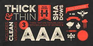
Illustrations to match might be good, but that likely exceeds your timeframe or time budget.
For example, something along the lines of this sort of look — but using appropriate type and subject matter.
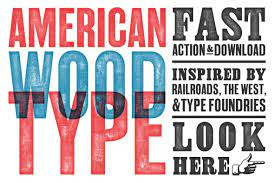
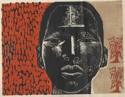
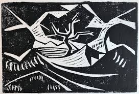
It’s a difficult subject to tackle because it’s potentially charged with emotions, yet it still needs to evoke an emotional response that is simultaneously uplifting, powerful, sensitive, and real. Making the woodcut look primative would be a mistake, but so would making it look like something for an Ivy League school. Much would depend on matching the character of the story, though.
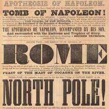
Just B’s solution is one I see quite often when working on exhibits in museums involving Black history.
It can sometimes be quite jarring, in many different ways, to use the old newspaper headline style, which I’ve come to associate with the 1800s runaway slave broadsides that I print so often for those exhibits. It might just be me becoming sensitized over the years, but if done properly it can be quite powerful. If not done right, it can be very cliche and maybe almost patronizing. Tread carefully.
You may even want to seek out a Black historian to give you a proofread.