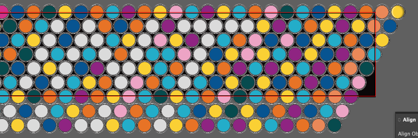
So I’m making a paint sign for an Ace Hardware. Customer wants to have top view of open paint cans with the letters spelled out in color, already tried steering them towards a different approach but they’re adamant.
Since I found a quality paint can shape to use and duplicate, how would I make the steps between the the opposite sides of the light source I’m adding in using illustrator? I was able to make it using the transform each command but is there an step process I can use that will rotate each one a set degrees automatically so it completes a full 180 degrees between my end points? I’m looking at 75-ish steps in between each side. I thought blend would work but it doesn’t recognize that my anchor shape is the same just reversed.
I hope I described my problem and what I’m trying to figure out adequately enough.
Hey @nk.gd, try the radial repeat tool - you can’t set a specific degree for each rotation, but it’ll allow you to create as many duplicates as you want around a center point. Here’s a quick tutorial in case you need. Once you’re done creating the duplicates, expand and ungroup them so you can use them individually.
Hey @Smurf2, sorry if my response looks suspicious here, not trying to be!
From the screenshot provided, it appears that what is trying to be done here is to get 75 duplicate rotations of the original object on a 180 degree radius. In the post, it says the blend tool was tried, but that only gives duplicates, not the rotations needed. So, I thought of suggesting the radial repeat tool, which would provide the duplicates and rotations as needed (and I provided a tutorial for the tool in case it was needed). But, of course, I could be wrong here…
Basically was seeing if there was a way to recreate what you can do in Photoshop with the actions box. What I ended up doing was transforming each the first time and then duping the action again which kept the rotation going.
I agree with Joe. I see nothing to be gained from making the light source appear to shine on the cans from different angles. This is a detail that will be lost on everyone. Instead, I’d make the shadows all the same as Joe suggested.
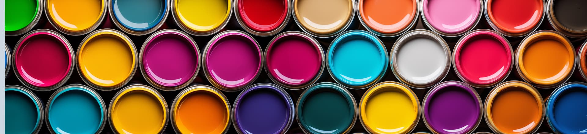
And speaking of shadows and highlights, there would not typically be a highlight on the paint inside the cans — only a shadow. Adding a highlight would make the paint appear to bulge above the top of the can, like a rounded button. If you want a highlight on the paint in the can, you will need a more complicated set of shadows, edges, and reflections, like those in Joe’s Adobe Stock photo.
If it were me (which it isn’t), I would concentrate on getting a single can of paint exactly right, then duplicating that same can with the light coming from the same direction, and then simply changing the color of the paint.
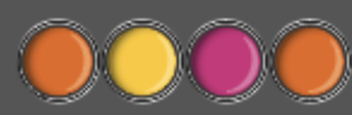
As to the image below, it looks a bit like a color blindness test. I think you need to increase the contrast between the letters and the background. For example, make all the background color pastel cool receding colors while making all the letters dark and warm advancing colors.
I know you tried to convince your client to do something else, but from a distance, this sign will look like a printed version of a low-resolution digital display with extra-large pixels. I’m not sure the paint-can thing will even register unless someone gets up close to examine it.
I don’t think it’s necessarily a poor idea, though (I’ve seen clients insist on far worse). However, the challenge is emphasizing the good in the idea while minimizing the bad.
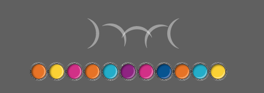
It really will be. I don’t have any control over colors. They went back to using the reference photo colors as the background but now want to do flourescent/neon letters that are one can thick. I’m talking to the middle man to the boss so I’m not sure how much he’s passing along or if it’s the bosses way or the high way.
One-can-thick flourescent letters? At some point you just need to make a clear in writing why you recommend something else, then do exactly what they say. You can’t fix stupid. If they’re unsatisfied with the results, tell them that you warned them and that you’ll fix it for XXX extra.
I’ve gotten to the jaded point in my career where I don’t need the hassle of clients who won’t listen to common sense and waste my time, so I just walk away.
They just told me the boss likes and wants it more abstract and kind of hidden than bold and easy to read what a help that would’ve been to have at the very beginning. Very much at the same point where the clients wishes are the clients wishes It’s their project, just as long as I get paid, I’ll put whatever they want and make it look as great as I can.