hey everyone, could I please get some feedback on this logo for a local court mediation department? What should I do? I like the simplicity but i believe its lacking somewhere.
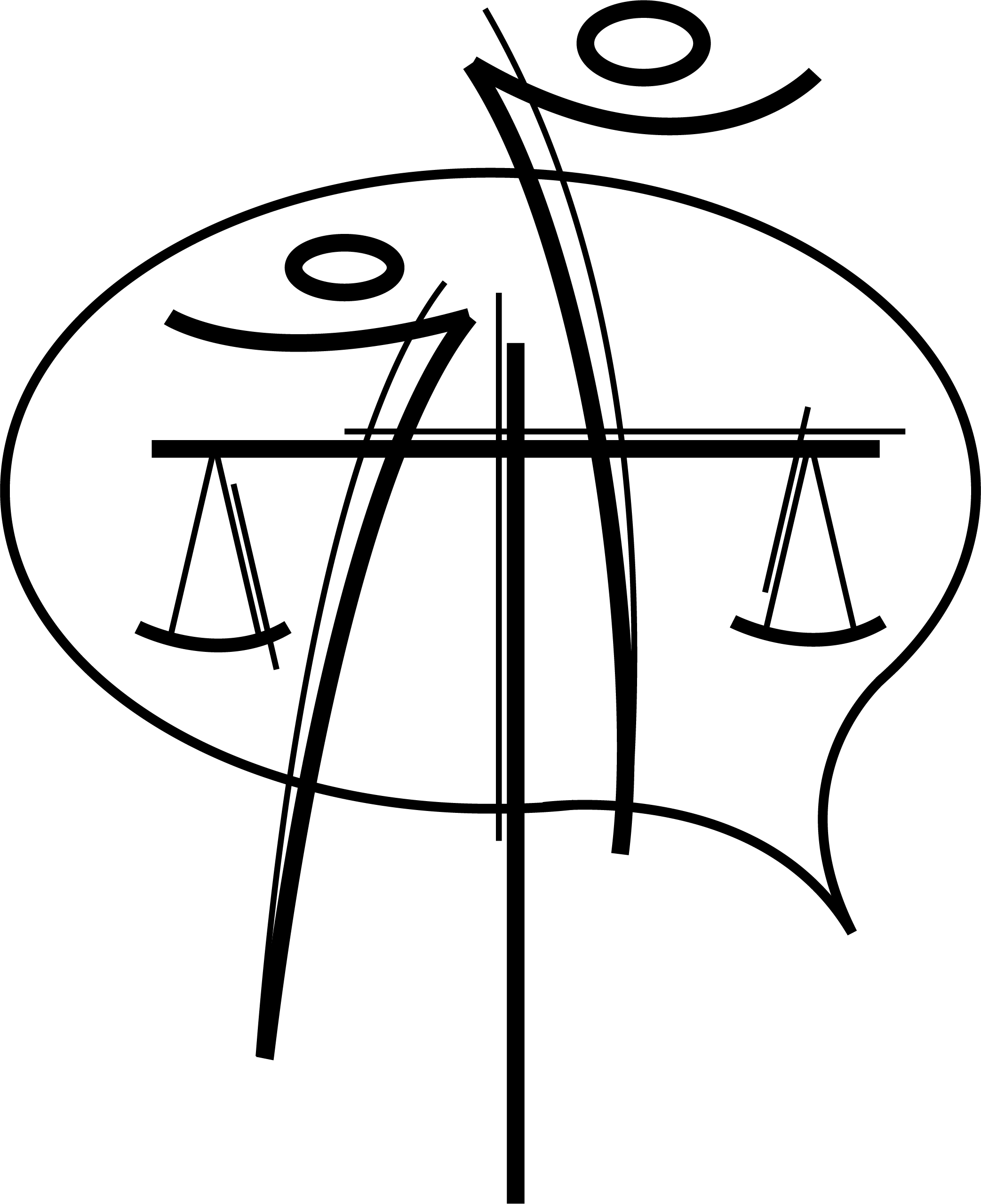
To be honest, I think it lacks simplicity. I struggle to see what is happening here. I see a speech bubble with the abstract scale symbolism but it is quite busy.
1 Like
It’s way too busy and done in a style that seems inappropriate for the subject matter.
1 Like
I see the speech bubble, the scales, and two people; but, like @BenBerryBiscuit, I don’t see simplicity. Not totally, but it has a bit of an eastern or car pinstriping feel to it (think Von Dutch or Ed Roth). It’s interesting, and I’ll give you credit for working a lot of concepts into the mark, but I don’t see it working very well as a logo.
1 Like
Simpler is better.
This is not simpler…
Thank you, I’m trying to find a way of making it more simple yet communicating the idea of mediation.
Thanks! do you have any thoughts as to how i could get it to work better as a logo?
What style do you think might be more appropriate for a court mediation department?
A logo doesn’t have to literally depict a company’s goods or services. Think about Apple. Their logo doesn’t have anything to do with computers.
mediATION, not MediTATION. ![]()
(PS, i read it as meditation too.)
In my opinion, I agree that in an age where potential clients have the option to focus their search for legal services and compare between competitors, opting for more universal logos gives a more confident and intelligent image.
However, another aspect to take into account is to adapt the shape, color and alignment to the personality of the brand. Preparing and following a brief to make a logo is not optional. If your department follows serious and firm guidelines, perhaps it does not need brushstrokes in its logo, but rather more compact shapes.
This topic was automatically closed 365 days after the last reply. New replies are no longer allowed.