Found a font that looks similar to the Persona 5 Royal logo call Futura STD Bold but the ‘5’ is not the same does anyone know of a font that looks almost identical to Futura but has the right ‘5’?
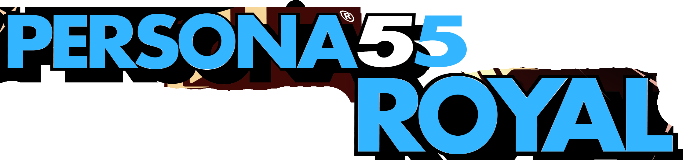
It’s entirely possible they used a different font for the 5. People mix and match all the time.
To me that 5 looks like a squashed Helvetica Black
1 Like
Now looking for the Devil Surivior font. Found some font that look similar to the logo but aren’t the same. Help finding the actual font is much appreciated
still looking for the font of the Devil Survivor image. I’ve only found similar looking fonts but no the exact font yet. Hopefully I can find it soon
It looks like it’s been heavily modified from a font like Futura.
But you could probably use any sort of geometric sans font to get started. Avenir, Proxima Nova, Eurostile, Gotham etc.
It’s not a particularly difficult one to recreate.
SFU Insignia. You will have to skew it and smoosh it the same way they did on the original.
1 Like
That’s not the font… Its one of those font I mentioned that looks similar, but is not the exact font
That’s absolutely the font but like Kitty said it’s been manipulated.
1 Like
It isn’t, but sure believe what you want. I’ll continue to find the actual font used in the image
The only major difference aside from the awful squish-stretch the original ‘artist’ applied to the font is that the capital S looks weird and the smallcaps R’s look a little off too - moreso than you’d think if it was kitty’s font with some stretch/squish applied.
It might not be “that exact font” but I’m willing to bet it was a poorly copied derivative or bootleg version of it.
1 Like
The image was edited before it was posted here as well ![]()
We’ve been down this road before. Fonts are distorted when used all the time. But, if the OP wants to believe all fonts are found as is, so be it. We can only do so much ![]()
That makes more sense. The R’s are still weird looking to me, vs my version of it - Insignia LT Std Roman is what I have handy.
It’s heavily distorted from the original glyphs, but that’s your guy.
Here, with some stretch and some extra stroke to add a little more weight than normal.
1 Like
I’m unsure why many people (designers included) seem to think every word mark and logotype is typed out from a font.
I might start with a specific font in mind, but I’ve never designed a word mark yet without altering and redrawing the letters to get them to work as a cohesive composition. The result is always a bit different than the source typeface.
2 Likes
It isn’t, but sure believe what you want. I’ll continue to find the actual font used in the image
But you’re not doing so well areya?
I’m currently looking for the font used in the “Nocturne” of the SMT Nocturne logo and someone told me to look into a font called Mael by Utopia fonts (aka Dale Harris, formerly known as: Dale Thorpe).
I looking for info on whether ATLUS licensed a modified version of Mael and if so where and who made this modified version of Mael.

Also in the credit of the 2003 release of nocturne there was credit called:
Font Design Corporate: FONTWORKS INTERNATIONAL LIMITED.
So this may be clue that can help