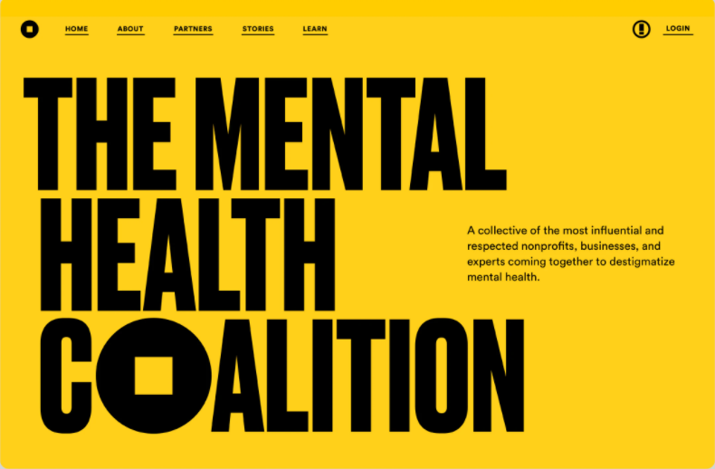
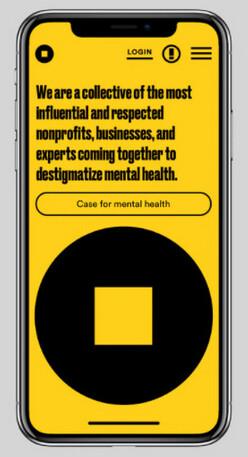
I’m liking this new branding work for the Mental Health Coalition from Pentagram. From their website:
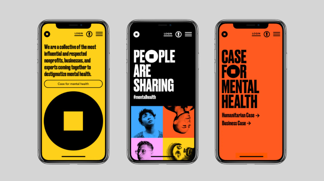
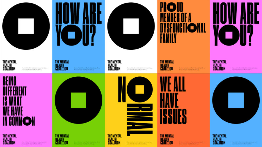
“Pentagram has created a brand identity for the Mental Health Coalition that centers on a “square peg in a round hole” to represent that there is no “normal” when it comes to mental health and that everybody fits.”
Really lovely. As soon as I opened the post I had a little ‘Now, there we go!’ moment. Finally someone’s posted some really good work for a critique.
Thanks for posting that. You always gives a little lift to see examples of the very best, when we seem to be increasingly surrounded by DIY mediocrity (at best) purporting to be professionally designed work.
That’s right up my alley, aesthetically. Uncluttered, clever, elegant, ideas-driven design, that does its job. There’s a reason pentagram are always up there.
This is the sort of work students should be aspiring to.
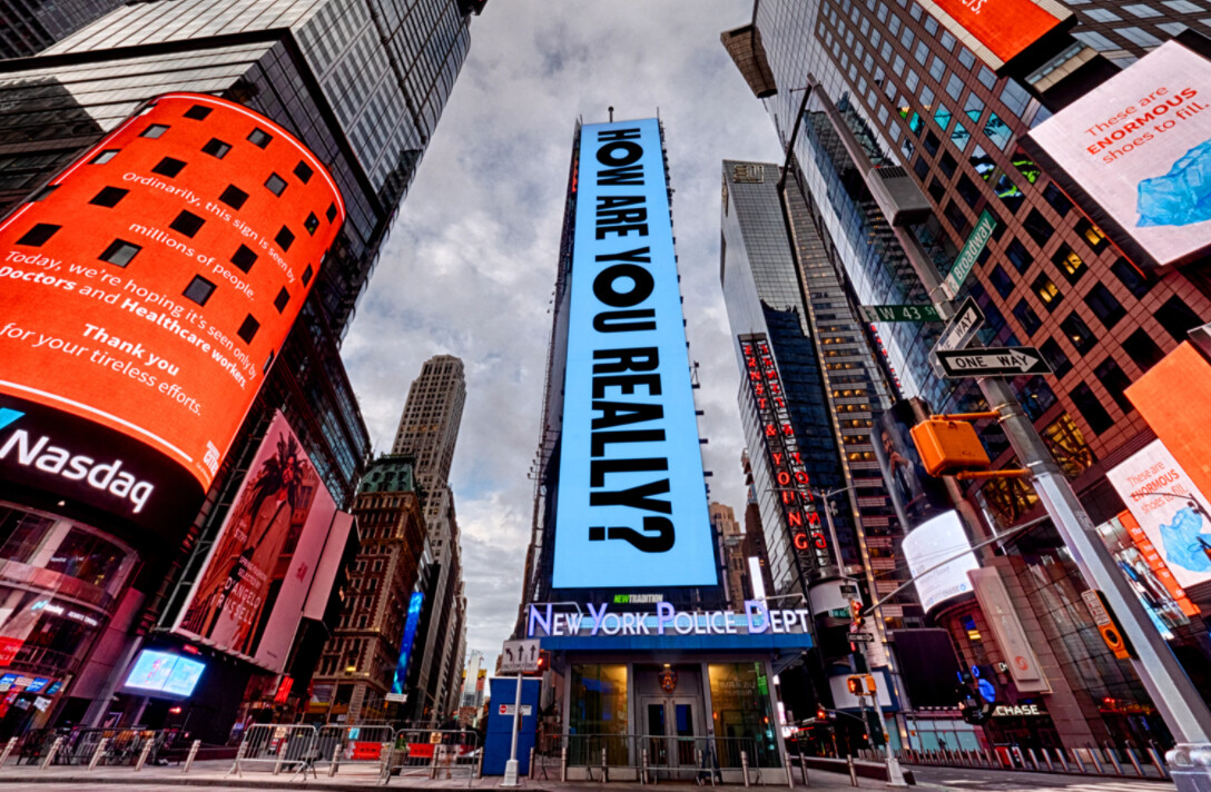
I found it quite jarring. And jammed up claustrophobic with the condensed all cap lettering.
And for some reason “square peg in round hole” kept popping into my head.
Repeatedly.
edit:
Ha, ha!
Which I guess is the point (I didn’t read the words above the first yellow poster at first.)
A worthy cause assuredly.
Yes. I’m guessing the intention was the very reaction you had to it — jarring, claustrophobic, and suggestive of something uncomfortable, like a square peg in a round hole that demands attention.
Aesthetically, I really like it too. The bold, raw colors are difficult to ignore. Definitely an important issue — especially these days.
I actually had the same visceral reaction as you, I found it attention grabbing, albeit little bit uncomfortable.
I think it’s the contrast of the bright colours and the choice of typeface and the way the mark contrasts them both and works to reinforce the concept of a misfit. Interestingly though I don’t think this was their intention:
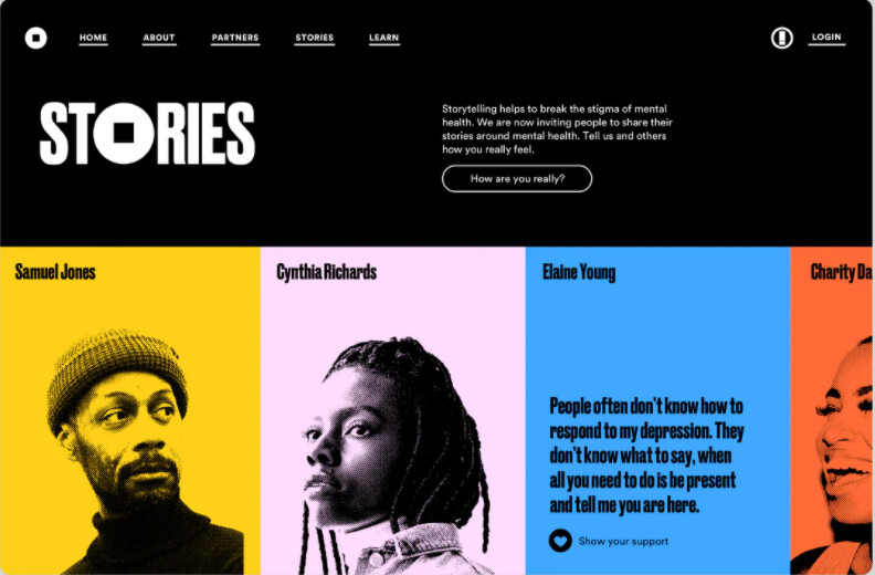
The bright, modern color palette suggests the broad spectrum of mental health conditions and captures a sense of optimism and hope.
The only thing that I don’t think works from a legibility point of view, is the choice to use the same typeface used for larger amounts of text: