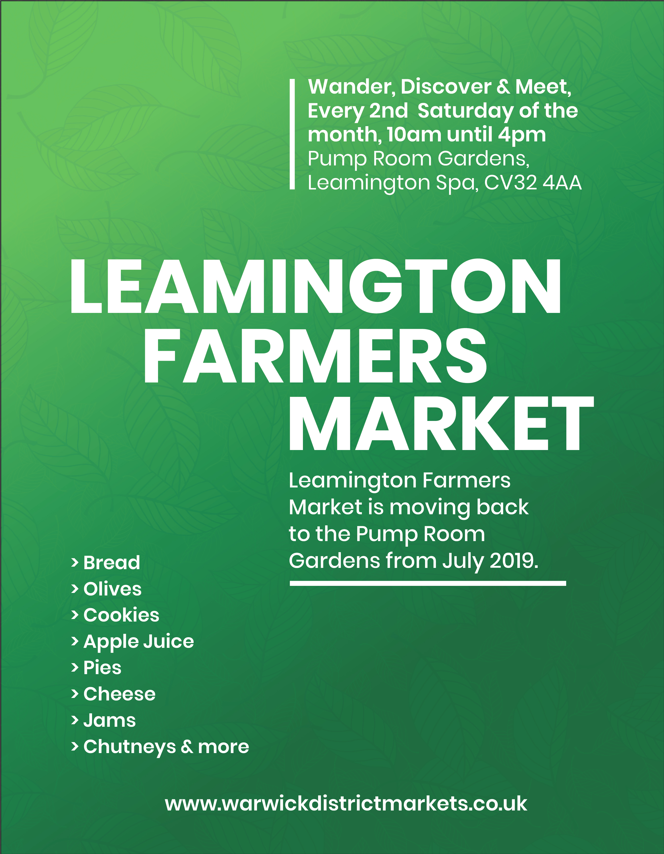
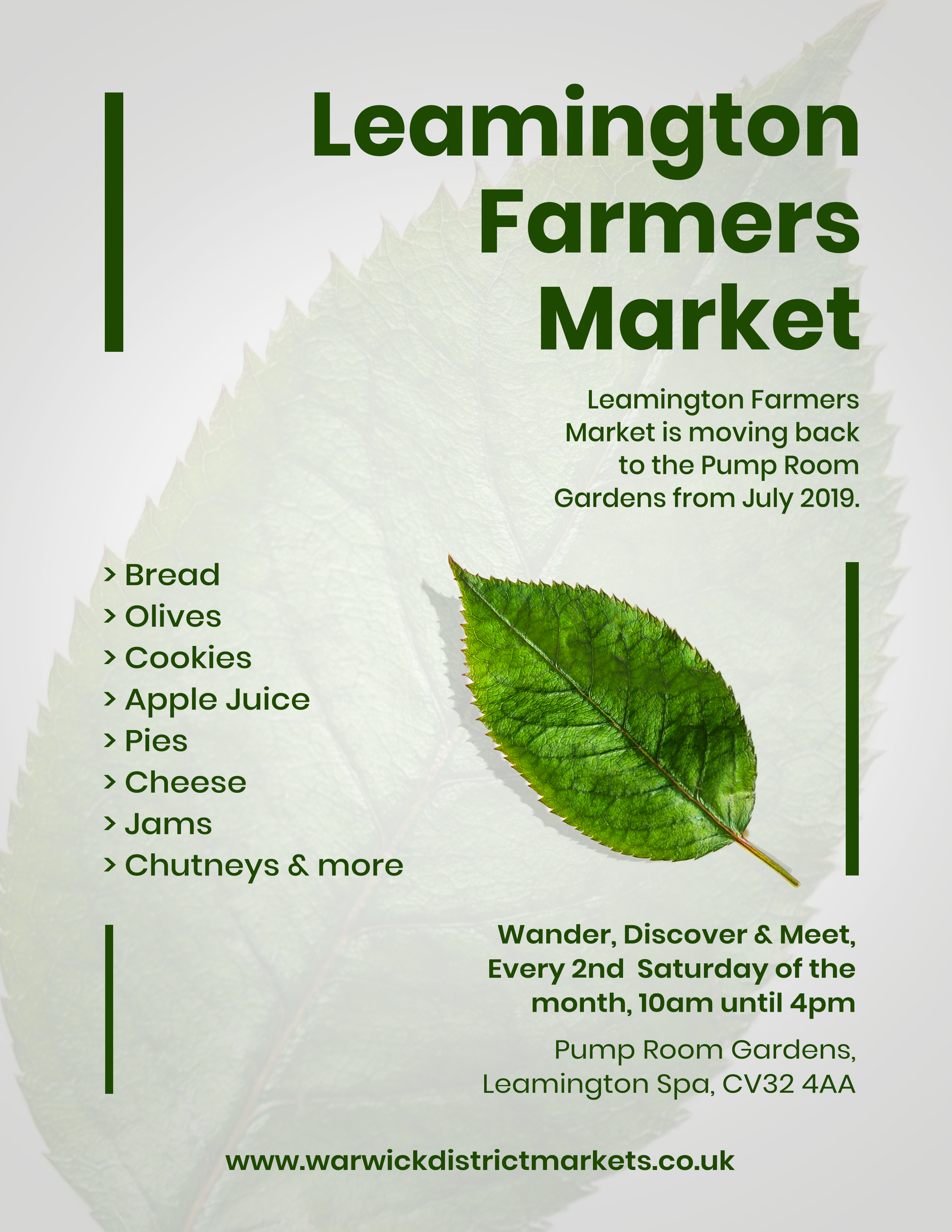
Hello Friends I’m trying my hands on minimal Flyer Design so could you please provide your reviews for this.
The one thing that isn’t working on either of these is your text break up in the smaller body copy.
have you tried:
“Leamington Farmers Market
is moving back to the
Pump Room Gardens
from July 2019”
2019?
Same with
Every 2nd Saturday of the Month.
From the list of availables, how have you decided on green leaves to represent the market? Is it possibly an apple tree leaf?
And while you’re considering those line breaks, think about the actual words too.
I don’t know whether it’s a tourist attraction, but I wouldn’t expect anyone other than Brits (and possibly some European neighbors), to really get what is meant by “from” [date].
The other word I’d immdiately question is “back”. It’s moving back to the Pump Room Gardens? Does that mean it’s been there before, and if so why would that be significant? It’s important to remember that an advertising message should be geared for people who are unfamiliar with the subject, and not those who already know all the historical context. Or, does it mean that Pump Room Gardens is at the back of the venue? If that’s the case an unfamiliar reader wouldn’t know that either, and directions should be more explicit.
I would definitely take care of the line breaks… I used a leaf because it’s related to farming.
It’s a dummy text (2019)
But what did feel about the overall look of the design
I would definitely be careful about the line breaks…
It’s a dummy text
So overally which design you liked the most?
This is a farmers’ market, so the main image of non-edible leaf seems inappropriate.
Depending on how one reads it, farmers is arguably a plural possessive, as in the market belonging to the farmers as opposed to it being a market full of farmers. If possessive, it needs an apostrophe after the s. If not, none is needed. A quick Google search turns up both.
I like the general look, though. It’s clean, simple, and easy to read and understand. I like the unusual alignment of the words on the first one.
@Just-B thanks a lot man for your valuable feedback
Actually as it was a dummy text I didn’t focus much on the Farmer’s part but I would take care of these in future
Have to say I’m not a fan of the typeface in the lists - some of the text looks stretched horizontally. Also I think the arrow bullets could be something else, like some nice vector list icons? Overall I think the layout and use of space is good, and the color theme is nice, but agree that the leaf could definitely be something more appetizing to humans ![]() Great job, keep up the good work!
Great job, keep up the good work!
2 Likes