I currently am working on a school project where we are going to create a one-page advertisement for a magazine. I am creating mine for Sunsilk shampoo. There seem to be something “off” about my advertisement, but I can’t seem to pin-point it.
I would appreciate any feedback on the advertisement!
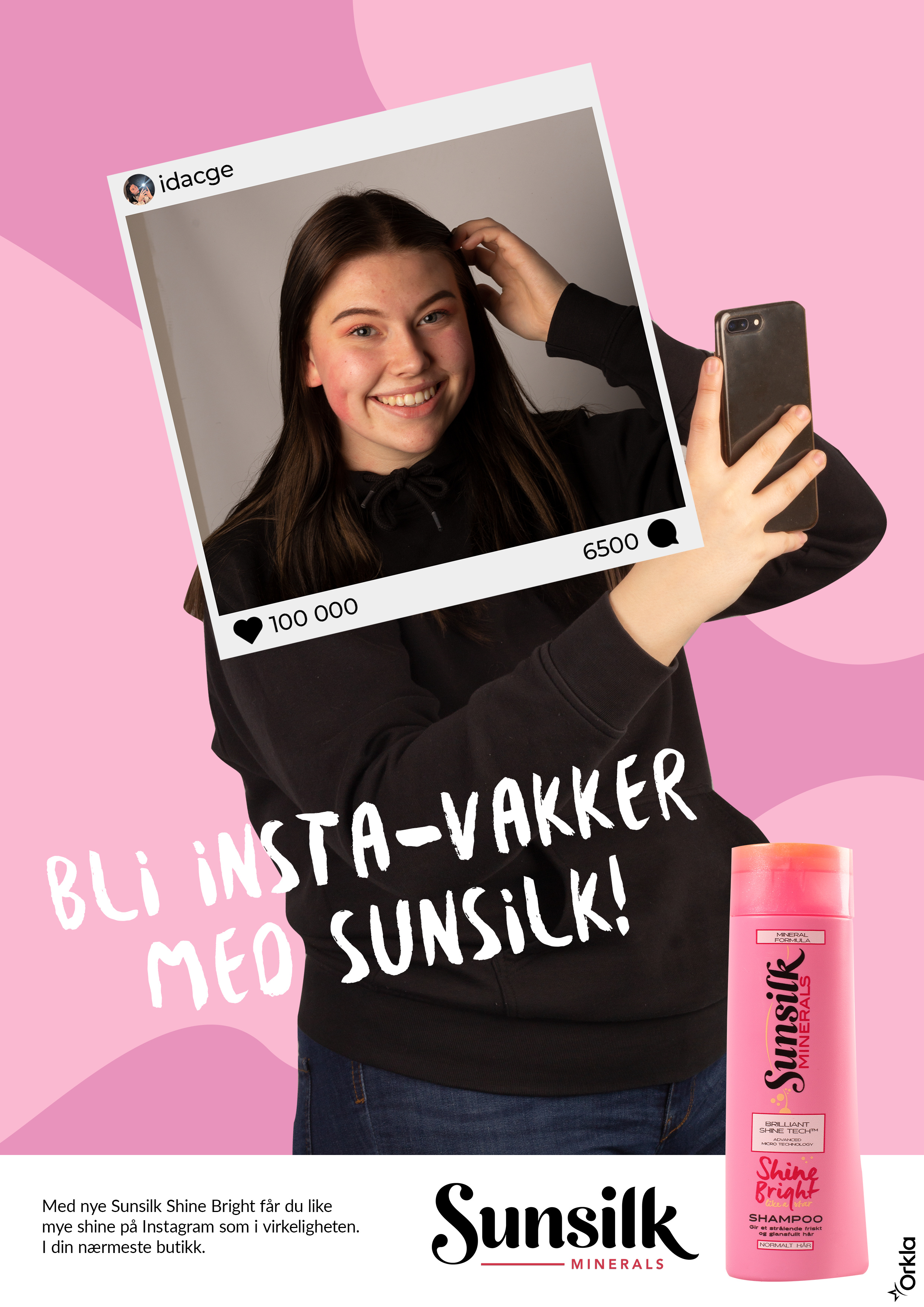
The head and shoulders in the photo are too small for the torso below it. Increase the size of the head and shoulders frame relative to the rest of the image.
You could try making the hand taking the shot come in front of the photo frame. I know that wouldn’t make visual sense, but it might just create a visual illusion – an impossible image. Might not work when you have tried it, but worth a try.
Design is alright but, shape of the body outside of the frame and inside the frame got no similarity, by this away meaning of the advertisement can be change like, before she was fat after using this shampoo she looks slim, so i think in this area you should work more so that shape of the body looks perfect.
Sprout said precisely what I was going to say. The head/shoulders must be at least proportionate, you could even go larger to create a bit of perspective. And, as stated the hand holding the phone should be your putter most layer in the foreground.
The typeface could also be something more sophisticated. Pay mind to the product branding, your typeface should compliment this.
The product might benefit from being a bit larger, and have some sort of effect to separate it from the background (something subtle, nothing crazy)