Just to chime in with a summary of the great advice above and a bit of perspective.
If you’re doing serious prepress work, colour accuracy matters more than colour coverage. Lots of monitors boast 100% Adobe RGB or DCI-P3, but that doesn’t guarantee accuracy unless the panel quality is high and you can hardware-calibrate it. Without that, you’re just chasing numbers that may not mean much.
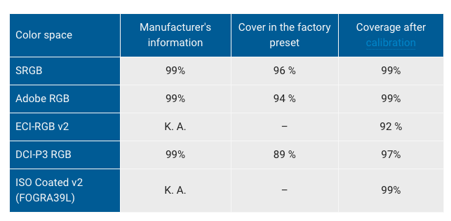
Jakub’s point is spot on coverage claims (like 100% Adobe RGB) are meaningless without proper calibration and uniformity. A $400 AUD monitor might tick the right boxes on paper but won’t hold up for critical print proofing. Eizo’s CS series, or even something like the BenQ SW line, are purpose-built for this kind of work.
Also agree with Joe’s suggestion you don’t need two perfect monitors. Just one top-tier calibrated display in the centre, and cheaper ones for your panels and tools.
If colour is part of your deliverable, your monitor is not the place to cut corners. Get the best you can afford, calibrate it properly, and don’t worry too much about size accuracy beats inches every time.
You can’t fully calibrate for print without knowing the output intent or print conditions. Calibration by itself only sets your monitor to a known, neutral, repeatable state. What really matters for soft-proofing is the ICC profile of the printer, paper, and press process you’re targeting that’s your output intent.
Monitor Calibration
This is step one. It gets your screen to a known, consistent baseline.
- Set luminance (e.g. 80–120 cd/m2 for print)
- Set white point (often D50 or D65, depending on your workflow)
- Set gamma (typically 2.2)
Load a monitor profile using a hardware calibrator (like X-Rite i1Display Pro or Calibrite devices)
But this doesn’t make what you see match a printed sheet. It just ensures your monitor isn’t lying to you.
Soft-Proofing via ICC Profiles
To simulate what a print will look like, you load a soft-proof setup in Photoshop, InDesign or Acrobat using
- Exact ICC Profile for the press (e.g. ISOcoated v2, FOGRA39, GRACoL)
- Rendering intent (usually Relative Colorimetric with Black Point Compensation for print)
- Paper colour simulation (if you want to see how dull uncoated paper will affect colours)
This is where you’re visually proofing for output intent. No matter how good your calibration is, if you’re proofing to the wrong print profile (or none), it’s useless.
What If You Don’t Know the Output Conditions?
Then your only real option is to soft-proof to a conservative standard like
- ISOcoated v2 300% (ECI) standard for European offset-coated stock
- FOGRA39 also widely used in Europe
- GRACoL 2006 or 2013 common in North America
This gives you a ballpark simulation of how a typical high-quality CMYK print will behave. It’s not perfect, but it’s miles better than proofing in Adobe RGB or sRGB with no simulation at all.
So yeah calibration is essential, but without a known press profile, you’re flying blind when it comes to prepress colour work. It’s like tuning a guitar but not knowing what key you’re playing in.