Hi everyone ![]()
So according to my school assignment I gotta make a monogram logo of my initials and then put on a visiting card with an appropriate design. I’ve made something but I cannot determine which business/profession could it be appropriate for, what would you guys say it could be used for?
1 Like
Wow, that’s completely arese-backwards.
When designing a logo, you need to know the industry up front and design to it and its brand image, not come up with a logo then think of a business that fits. That never happens in the real world.
1 Like
those oil grasp tools to remove the oil filters in automobiles?
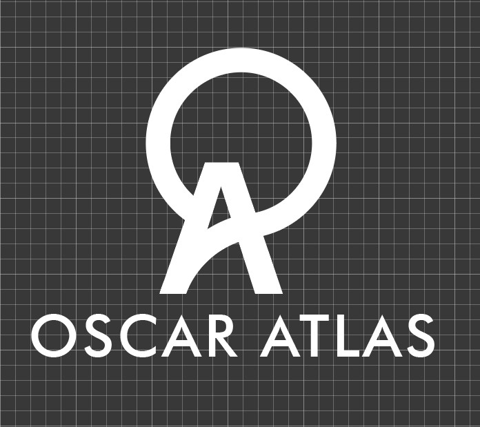
i like the logo, i would make that interesting with thinned-thicker lines.
if your last name is Atlas, have the upper circle part arms clutching a globe
1 Like
i laughed! i think you are the last person to type what they really mean on the Internets in a constructive manner.
I agree with PrintDriver, note for yourself that this never happens in the real world. No one builds a company around a logo. That being said, the logo resembles a ferris wheel or a mountain peak with a sun/moon behind it.
1 Like
True of course, but as an exercise for students I can see the value in typifying the type of busines to the style of a logo, even if it is after the fact. No one is just born with those associations. Designing the logo in a vacuum isn’t real-world practice, but it is practice, and the subsequent analysis and discovery of innate tendencies will help teach peer and self-critique.
To me, the sans-serif type, integrated initials, and gridded background suggest a techy brand; possibly a provider of specialized professional services, consulting engineer, architect…along those lines.
1 Like
I was thinking more along the lines of a gym. Atlas holding the Earth and all…
The gridded background is an annoyance. The lines already too ephemeral at the size they show on my monitor. They will totally vanish if reduced in scale too much more.
While I agree that backwards association may be a method of teaching associations, I’d much prefer the teacher think in a more practical manner and maybe require the student to think of the associations they are trying to convey rather than guess what the associations were. Well, that’s not making sense…
Constructive rather than deconstructive I think is what I mean. Sure, build a slide deck of obscure logos and discuss them in class without revealing what the company does until after the discussion. Then use that to move forward on an assignment. Don’t just throw them into making a “pretty picture” and we’ll worry about whether or not it is effective later. That’s wrong.
1 Like
I’d remove the background and the background grid. I just don’t see it as being part of a logo. The thin lines would disappear and, even when then didn’t, they’d cause registration problems unless the background was just a flat, lifeless screen tint of black. Then again, maybe you just put the logo on the background to display the logo.
As for the backwards nature of the assignment, I’ve read through your text three or four times now, and I still can’t figure out exactly what the assignment is. Is that your real name? Are you trying to invent a fake profession to put on the card? Just say you’re a designer and be done with it. Is that an important part of the assignment or is that just you trying to be thorough?
I do like the notion of the A (Atlas) holding up the O (the world), but if that’s the concept, it’s obscured by the off-center relationship between the letters and how the crossbar of the A blends into the O. I do, however, like those features from a compositional standpoint.
1 Like
Thanks a lot for your reply, the grid isn’t part of the actual logo, I took a screenshot from Illustrator.
The assignment is to make a monogram logo for any industry I want using my own initials, later I’m supposed to design a visiting card using the logo I’ve made.
1 Like
Personally I like the monogram/logo you created. I like the that the A is a little off center. Nice job Oscar ![]()
1 Like