This assignment is to create a montage using at least five images, it is based on the current news topic of the fires in the amazon. It seems a bit too simple to me but when I add more drawing elements from Illustrator then that doesn’t look right either. Do you have any suggestions on how it could be improved?
Do you think some sun rays/light source could help? Any tutorials on how to do this?
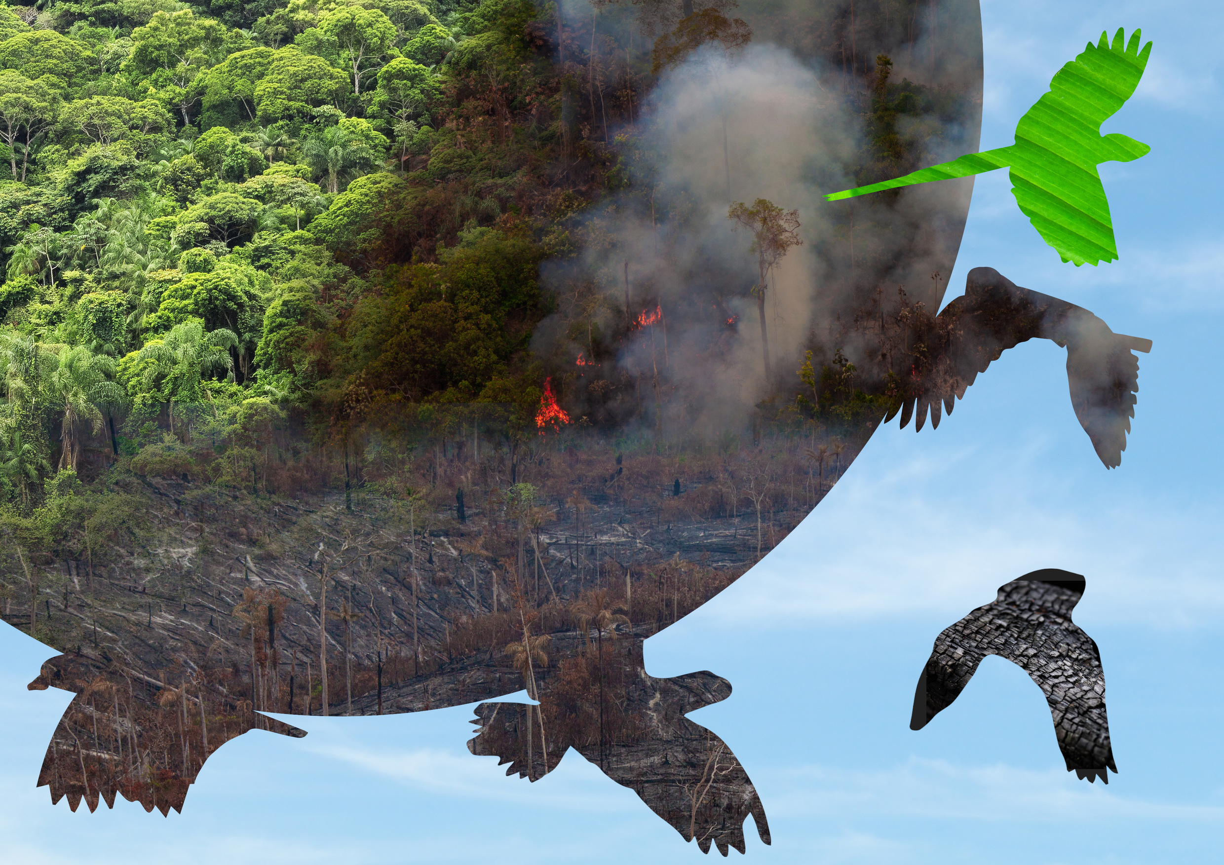
What is the on bird on the right with the green stripes. Either that is extremely out of place, represents “agriculture,” or maybe it’s a phoenix rising from the ashes. In any case, it doesn’t fit the narrative. It gives some meaning of a “new green hope” when I think you might mean the opposite.
Never make a frivolous design decision. Everything you do has to have a purpose. Wanting a different image is fine, as long as it fits the narrative. What purpose would a dark green leaf serve other than to be your 5th image?
Other than jamming 5 images into a collage effect, what is the narrative of your piece?
You have some probably inadvertent progression from upper left to lower right, from green to burned to trapped birds in the burn and a charred bird. What is the green one? And why is it there?
ok, I get what your saying, the charred bird is the drooped/dying bird, the green bird is pointing up. There are two choices to live or to die and birds and wildlife are dying. It also serves to break up the images and add a different texture. I am not sure why it doesn’t fit, there is a choice to burn fires all be it a very complex monetary and political one.
That’s what I was looking for. An indication you’d made a clear choice and can defend a decision.
Good job!
I don’t think it is fitting because it’s too dichotomous in texture, and possibly because the angle of the texture opposes the upward tilt of the bird. If you are looking for an up-and-out escape from the devastation, maybe emphasize that more in some way.
I could not agree more. There needs to be an overall goal, theme, etc to the piece. If you just keep adding and taking away visual elements you’ll be frustrated and it won’t be fun. You start feeling a sense of accomplishment once you push yourself (hard, at times) for a concept, and then work off of that concept.
Concept concept concept! It’s what makes graphic design fun and fulfilling.