Mother Design Refreshed the Tripadvisor Logo

Founded on the premise that real humans give the best advice, Tripadvisor provides travel guidance for nearly 460 million unique visitors each month. Twenty years after its inception, the company knows the world of travel has evolved, so it only makes sense that the platform’s branding follows suit.

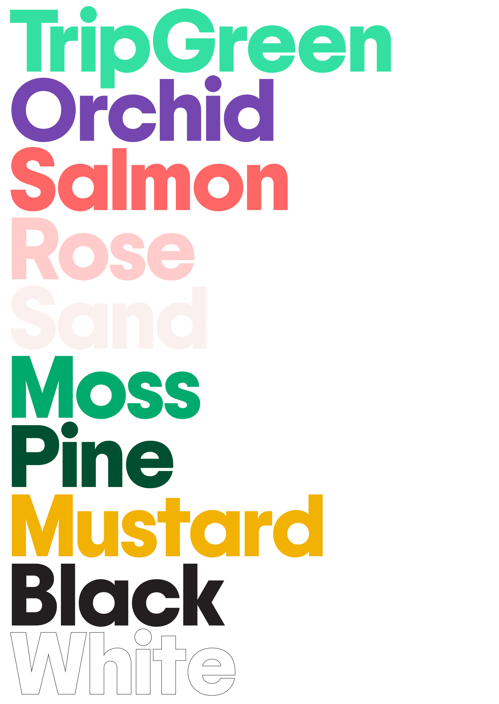
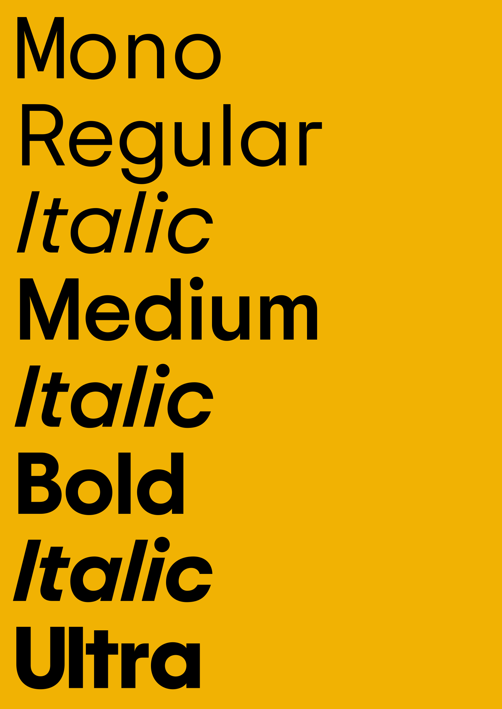
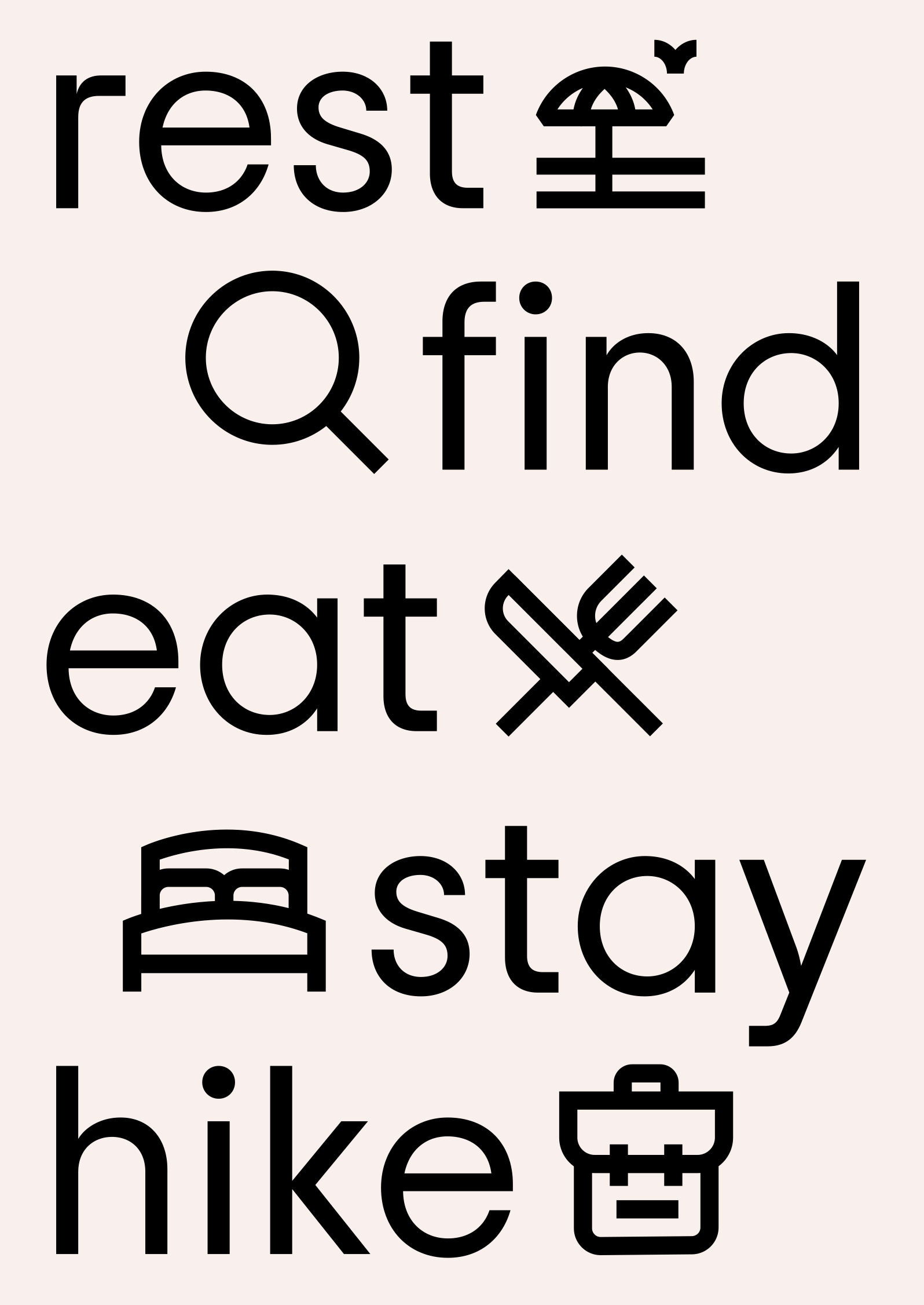
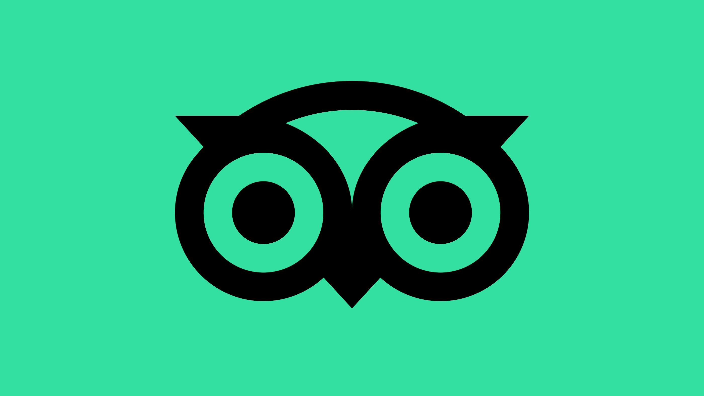
Appreciating the current love for and global recognition of the iconic logo, we retained its inherent personality but refined its geometry for better reproduction at all sizes. What was an exercise both in reduction of complexity and amplification of character resulted in a much simpler owl, and a complementary custom typeface by Colophon Foundry which could carry the weight of the real, global, human connection the brand believes in.

And because Rome wasn’t revealed in a day, Tripadvisor’s refresh won’t be, either. The company intends to roll out their updated look and feel in full over the course of the coming year.

2 Likes

I feel like you need the old one to compare.

For the icon, the one-color was definitely an improvement. I’m not sure how I feel about the wordmark in one color, as I think it makes it more difficult to read.

7 Likes

I like the changes to the mark, but like SurfPark, I’m not sold on unifying the name into a single noun.

They preserved what’s good about the mark while unifying the width of the outlines. They’ve also gotten rid of one of the concentric circles. Other than that, it’s the same logo. I doubt most people would notice much difference, which was probably the point — keep all that is good, get rid of what isn’t quite working and make the changes in a way that sacrifices none of their brand equity.

I can’t say the same about the type. Before, the type came across as two words with informal lowercase initial caps. Now, they’ve removed any distinction between the two words and unnaturally concatenated it into one, big, long, odd, word complete with an initial cap that cements it as an ungainly proper noun. I do like the typeface they’ve used, however — its personality fits the logo mark and helps unify the entire composition.

As for the rest of the branding, the typography works, as does the matching icons. The changes to the color palette are similar to the changes to the logo in that their essence has been kept but refined and unified across the entire brand. I like it. :grinning:

1 Like

They did what they were supposed to do. Nothing to get excited about but still a job well done.